Here at Small Multiples, we specialise in User Interface (UI) design for data-driven applications that are beautiful, innovative, intuitive and effective. Our dedicated designers are on a mission to make data interesting, accessible and enjoyable – for everyone.
You know your data could change the world. Or at least the part of it under your watch. You’re just not sure how to get people interested. After all, if there’s one way to put even the most committed of insomniacs to sleep, it’s with long, dry lists of facts and figures.
The solution? Transforming your data with User Interface (UI) design. Design that people can’t help but look at – because it’s dazzling. Design that fascinates – because it tells a compelling story. Design that’s clear – because it makes complex ideas easy to understand. Design that’s accurate – because it gets the cold, hard facts right.
TRANSFORMING YOUR DATA WITH UI DESIGN
The purpose of our UI design is simple: to come up with better ways for people to interact with intelligent machines. By better, we mean more engaging, more fun, more powerful and, most importantly, more impactful. Essentially, UI design is the bridge between idea and action – and between information and knowledge.
OUR DATA VISUALISATION DESIGNERS CREATE:
- visualisations that turn data into images and insights
- interfaces that are intuitive and easy to navigate
- interactive maps, graphs and charts
- software that crosses time zones, continents and cultures
- brand identities that embody your values and mission
- chocolate boxes (yes, really)
We don’t believe in confining ourselves to the constraints of time, space or tradition.
EXPLORING ENDLESS POSSIBILITIES
UI design is exciting because its possibilities are endless. There are no frontiers. And, with technology advancing at lightning speed, projects that were mere castles in the sky just years ago, are now realities. Every time we start a new project, our data visualisation designers explore new ways of doing things.
Take, for example, the Multi-Omics Visualiser, which we designed in 2019 for Iggy Get Out, a not-for-profit research organisation devoted to neurodegenerative diseases. It’s a cutting-edge, online visualisation tool that enables the study of biological big data from numerous angles – by combining the genome, microbiome, epigenome and many other ‘omes’. Our map-like interface allows the user to transition seamlessly between system-level macro views and entity-level micro views, while maintaining both simultaneity and continuity.
Have you been playing around with an idea that seems impossible? We’d love to hear about it. Key to the way we work are extensive co-designing sessions, aimed at uncovering every idea that anyone can come up with, including you. We find that free, open creative processes lead to the best solutions. And, sometimes, they’re groundbreaking.
DESIGN THAT THINKS LIKE THE USER
It’s not enough for user interface design to look pretty. It also has to make your data appealing, approachable and navigable. In other words, it has to communicate directly and clearly with your users.
Our approach to user experience (UX) is effective because it’s informed by data. Our tried-and-tested research methods delve deep into troves of reliable data, so we can create accurate, perceptive profiles of your users. We work out exactly who they are, what they want and how they’re likely to react to our UI design. And this happens before we start creating your product – saving you valuable time, money and uncertainty.
An example of our sophisticated UX in action is our holiday planner, which we designed and built for fun. Fuelled by data from the Australian Bureau of Statistics, covering 11.1 million international trips taken by Australians in 2018, it lets the user see how many people travelled where and when, how much they spent on hotel rooms on average and what the weather was like. From this, we came up with the ten best and ten worst destinations for the year. It’s definitely a more reliable source of information than Instagram feeds crowded with filtered photos.
DESIGN SYSTEMS THAT EVOLVE AS DATA DOES
Data is evolving at an astonishing rate. With every new technological development, data works in whole new ways. That’s why our UI design is based on systematic approaches to problem solving, which we can build on easily and quickly. Whenever your data changes, we can change your applications to meet your needs. You don’t have to deal with the hassle and inefficiency of building entirely new systems.
For the user, this means a reliable, consistent experience. It also ensures that usability and accessibility standards are at their optimum at all times.
UI DESIGN PROCESS THAT’S PRAGMATIC
We’re an end-to-end data visualisation consultancy. But we’re pragmatic. In other words, you can access our data visualisation designers when you need them – and not when you don’t. Whether you’d like to stick with us for years or you’d prefer occasional support for your in-house staff, simply let us know.
Are you ready to take your data to a new level with beautiful, innovative, intuitive, effective User Interface Design?
Please feel free to ask questions, suggest ideas or book a consultation anytime.
Related projects and articles
-
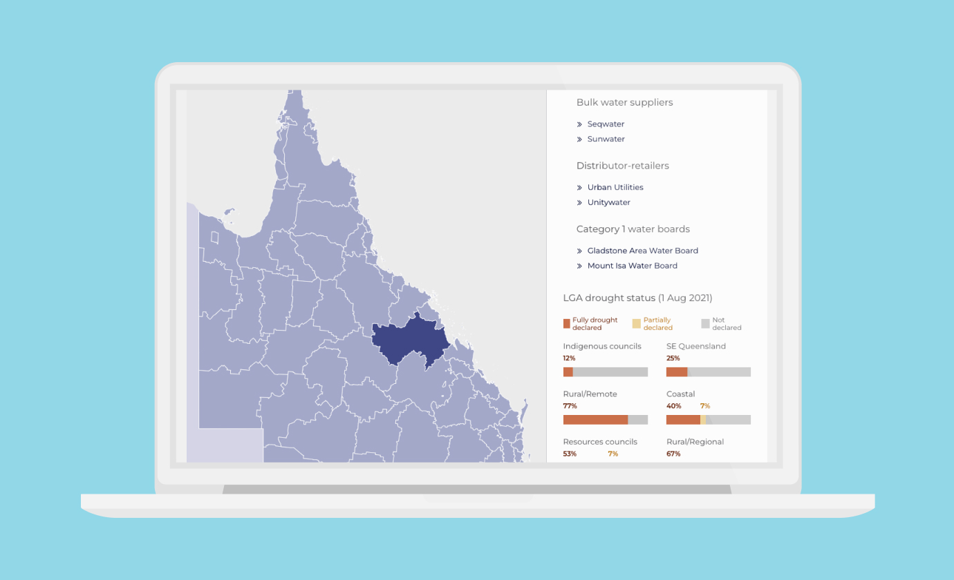
Dynamic Dashboards for Data-Driven Policy Insights and Transparency
Queensland Audit Office
-
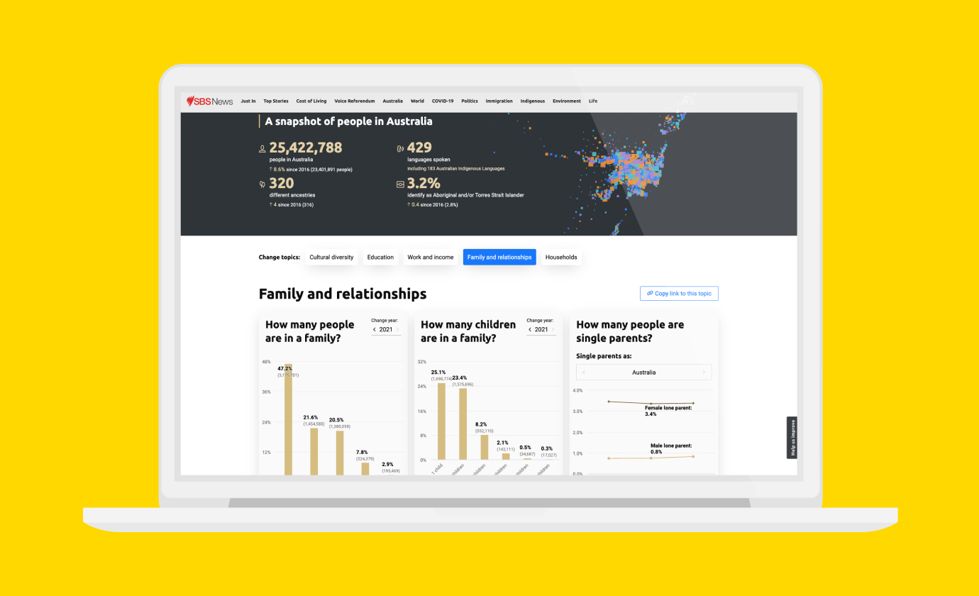
Improving Community Access to Census Data
Special Broadcasting Service (SBS)
-
Small Multiples wins gold at the 2021 GOV Design Awards
Article
-
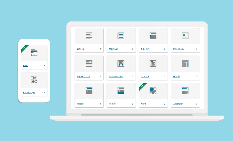
Data Visualisation in Government Design Systems
Article