We create interactive maps that turn data into compelling experiences – and experiences into valuable knowledge.
Are you struggling to turn complex data into meaningful stories? Are you juggling multiple strands of facts and figures? Are you looking for new ways to captivate your crowd?
An interactive map is just what you need. Whether you want to locate every ice creamery in your city or forecast 50 years of population growth, you can.
Bespoke Interactive Maps Based On Your Data
All you have to do is bring your idea to us. And we’ll transform it into a bespoke map visualisation, based on your unique data and designed for your audience.
Our interactive maps give you the power to:
- turn multiple data sets into engaging narratives – compare and contrast data sets across places, times and cultures – look at old issues from new perspectives – analyse the past and forecast for the future – give your audiences exactly what they’re looking for – captivate crowds with dazzling insights and – anything else you’re imagining …
Turning Complex Data Into Valuable Knowledge
If you’ve ever lost sleep over the piles of complex data in your hands, you’re not alone. We have access to more facts and figures than ever before. But, working out how to tap into their colossal power isn’t easy.
That’s why we love map visualisations. They’re among the most versatile, useful and engaging tools around. Whether you want to chart simple information, like popular restaurants in your town, or complex data, like an entire national census, we can make it happen.
Take our passion project, Hanzi Universe. We transformed 8,615 Chinese characters (hàn zì) into a magical map that resembles a night sky. It invites the user to explore the language’s complexity, by discovering visual similarities between characters – and their relationship to phonetics.
Creating Insights That Inspire Change
An interactive map enables you to transcend time and space. Compare and contrast behaviours across nations, analysing changes over the past 50 years and projecting likely changes over the next 50. Or, stick to what’s happened in your local neighbourhood during the past three months. Whatever the scope of your data set, our data mapping tools give you deep insights that empower you to change the world – or at least the bit in your care.
In 2019, we worked with the Victorian Government to visualise public transportation of the past and the future. Our bespoke map visualisation charted a whopping nine million possible journeys, combining routes at local, regional and state levels. It plays a crucial, ongoing role in effective planning.
Interactive Maps That Grow As Your Data Does
Every day brings another wave of data. To make sure you don’t drown in it, you need interactive maps that are flexible and capable of rapid change.
That’s why we take a building block approach. We work with open-source data mapping tools and commercial application development interfaces (APIs), to create maps that grow with you, your data and your business. Among our toolkit, you’ll find Carto, Mapbox, DeckGL, QGIS, D3js and Google Maps. And they’re just the beginning.
One day, you might need a map visualisation that performs a few basic functions for a target audience. The next, you might need a powerhouse capable of handling terabytes of data. When it’s time to make a change, simply give us a call. As a full-service agency, we have the tech and staff to look after your map as it evolves, to meet the changing needs of your business or organisation.
In 2016, we worked with Transport for NSW, to create this interactive map for Sydney Light Rail. It offers a wealth of ever-changing data, including light rail routes, future pedestrian zones, interchanges and construction notifications. Plus, its responsive mobile design puts up-to-date information at commuters’ fingertips.
Interactive Maps That See The World Differently
We’ve dedicated our lives to data because we believe in its power to change the world for the better. Map visualisations are at the heart of our vision. By seeing the physical world from an array of new angles, we gain fresh perspectives and unexpected insights. Time and time again, we’ve helped to revolutionise workplaces, policy and lives with data mapping tools that improve quality of life, increase efficiency and enable better planning.
How could we transform your data into a life-changing map visualisation?
If you’d like to ask a question, chat about an idea or book a consultation, please don’t hesitate to contact us.
Related projects and articles
-
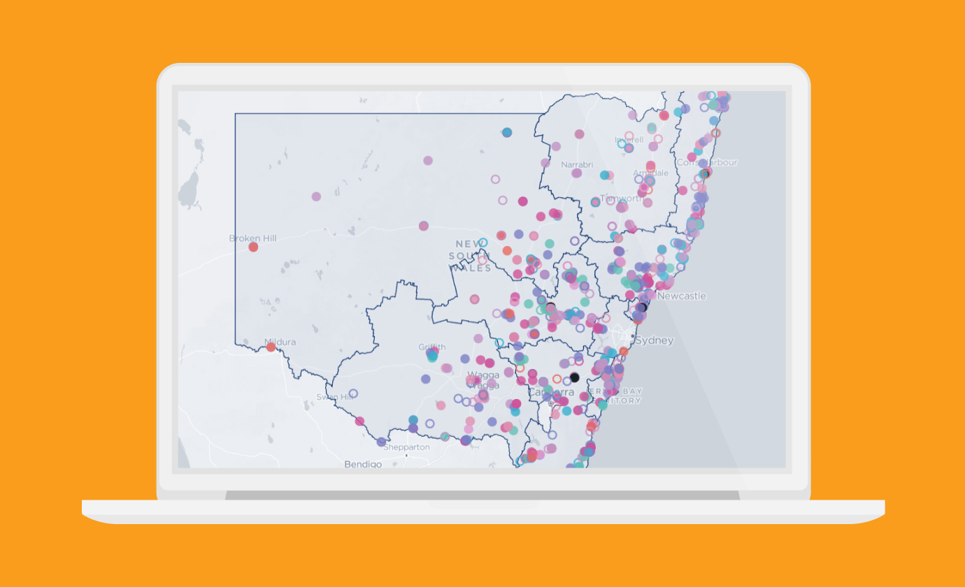
Mapping Project Activities and Funding in Regional NSW
Regional NSW
-
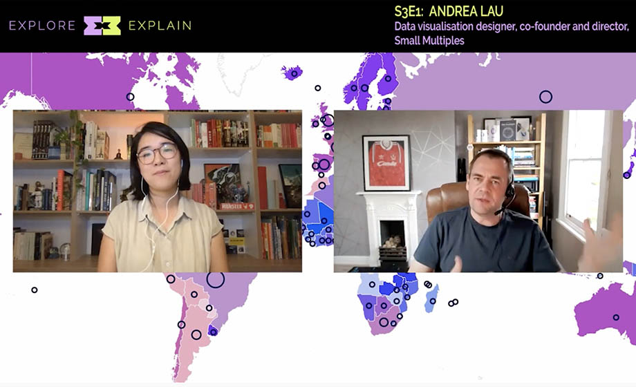
Andrea Lau in conversation with Andy Kirk: Explore Explain podcast
Article
-

Mapping Indigenous Literacy Foundation's Reach and Transformation
Indigenous Literacy Foundation
-
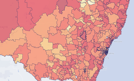
Occupational Risk due to COVID-19 in NSW
Article