View All


Australian Government websites are becoming more consistent in how they design and manage content. This is largely because of guides like the Digital Service Standard, tools like the Australian Government Design System, and common platforms like GovCMS (Drupal).
As a result, the quality of Australian Government digital services and web content is improving, but there is still a lot of information to manage.
The Digital Transformation Agency (DTA) suggests that there are over 40 million .gov.au pages on the internet today. One huge challenge for government web teams is reducing the number of pages while increasing the effectiveness of content. Good information design with data visualisations will reduce the volume of content while improving comprehension.
Information Design
Information design is the process of presenting (sometimes complex) information clearly and succinctly, so that it results in effective understanding.
Information design sits at the boundaries of User Interface design, Graphic Design and Data Visualisation. Good information design requires an understanding of all three fields and the ability to relate this to user needs.
To make information design easier we can translate information needs into a set of consistent patterns, just like in a design system.
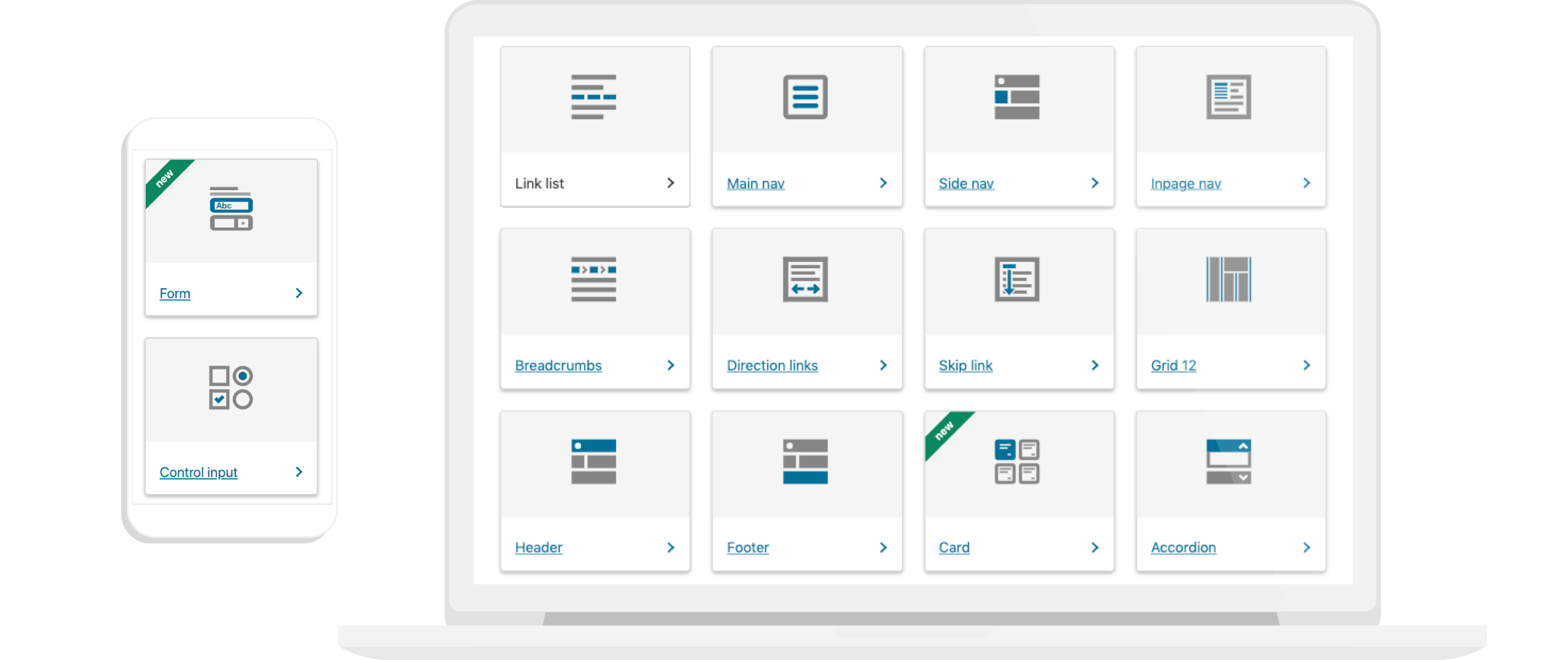
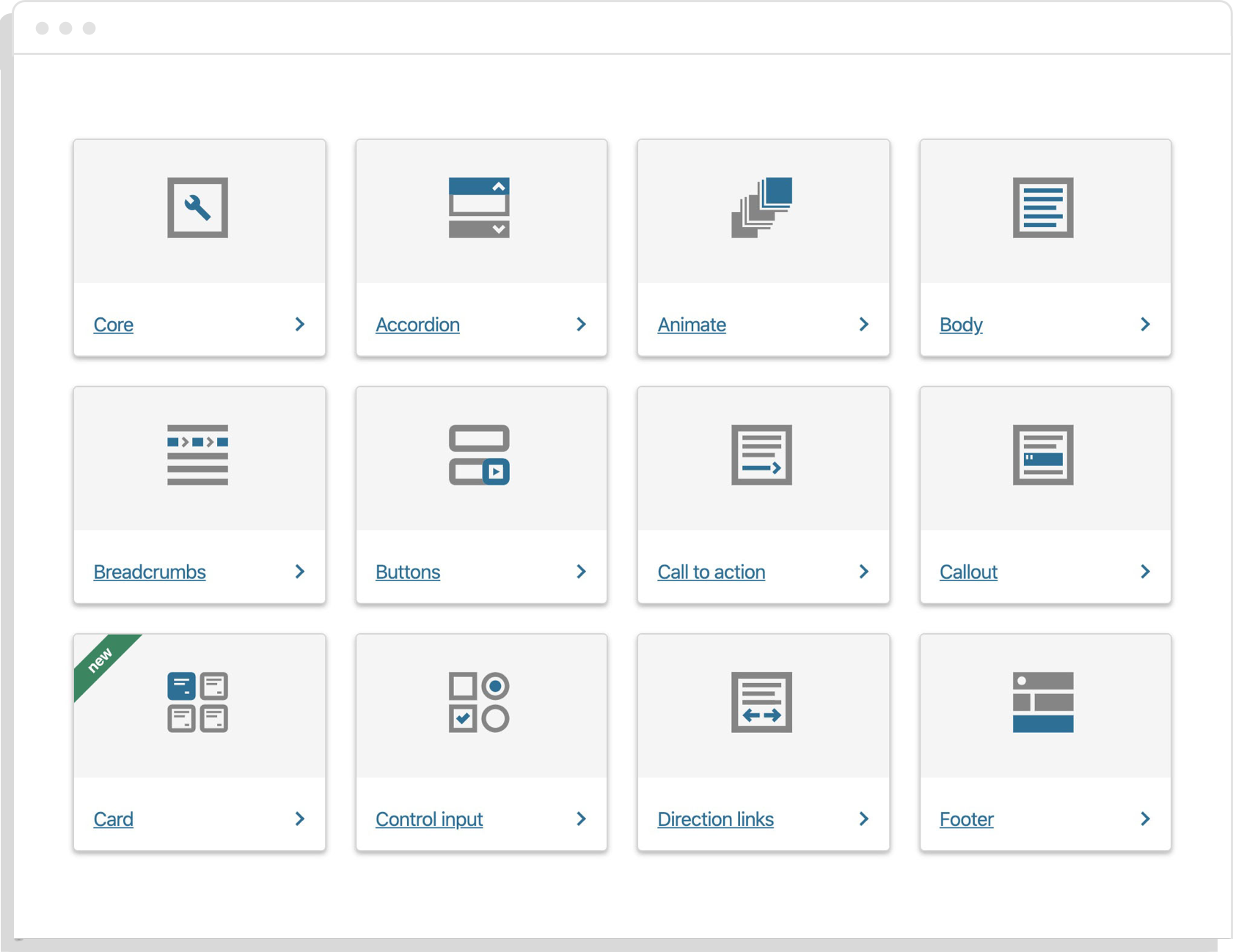
The Australian Government already has a consistent set of design patterns and guidelines for User Interfaces, as laid out in the components section of the Australia Government Design System. When it comes to the presentation of data and visual information however, there is less consistency and fewer guidelines.
At Small Multiples we work with a large number of government organisations and are producing guidelines to help select the right types of visualisations for different types of data and information needs.
A Design Language for Data
Tools like the Australian Government’s Component Guide allow users find information faster by helping web teams to produce consistent User Interfaces.
- reduce development costs
- distribute the benefits of accessible design, and
- reinforce a design language with users
That last point is especially important. A design language is more than just an internal framework for thinking about design. It provides semantic meaning to elements of design.
When applied consistently, a design language helps visitors to develop an intuition and understanding of the UI that they can hopefully apply across multiple government websites. The same principals are important in the presentation of data.
Consistent Data Visualisations
The GovUK Design System is perhaps the leading example of design systems in government sectors. It has a strong component library and guidelines that have wide adoption across many .gov.uk domains.
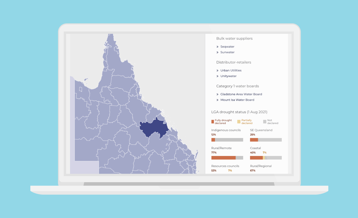
Although the GovUK design system lacks specific guidelines for data visualisation, it has a strong design language. This has resulted in some websites applying its principals to data visualisation. petition.parliament.uk is an example where consistent patterns for data visualisation help users understand complex information quickly.
In addition to highlighting key statistics related to petitions, there is a map for each petition showing where in the UK people signed it, with coloured regions showing the relative density of signatures.
The example below compares two petitions with roughly the same number of signatures, yet the maps tells a more detailed story.
This type of detail is not easily conveyed with words or tables and this is where data visualisation is an important tool providing transparency to the public as well as context for decision making.
Many large companies are starting to include components and guidelines for data visualisation in their design systems. IBM’s Carbon Design System has a central place for data visualisation in their component library and design guidelines. Google’s Material Design System is another example with both guidelines and components for data visualisation.
Australian Government websites are well on the way to a consistent design language for user interfaces, but have fewer resources to help with data visualisation and information design.
The first step is to identify common patterns:
Data Visualisation in Design Systems
Component libraries for corporate design systems like Carbon and Material categorise components by the type of chart or map. Both design systems have strong guidelines detailing use cases and when different types of visualisations should or should not be used. The chart models section of the Carbon design system and Google’s data visualisations guidelines also do a good job of breaking down smaller design elements such as labels, use of colour and behaviour.
Government agencies should aim to include this type of information design in their design systems but also have the ability to look more closely at user behavioural patterns related specifically to the services and information they offer.
When people engage with government sites, generally their behaviour is highly transactional. They want to find specific information and complete a precisely defined task, rather than browse for general interest. We can group these behaviours into two categories:
Services
- Where are services located?
- Who has access to a service? (geographic or demographic)
- Who is using a service? (geographic or demographic)
Performance
- Did a project meet targets?
- Are outcomes changing over time?
- What are projected future needs?
There is also a third category that is less transactional:
Research and data exploration
- Compare data
- Discover relationships between socioeconomic factors
- See how trends changed over time
For each of the categories above, there are types of visualisations best suited to delivering the desired information. There is also an opportunity to create consistent user interfaces across different types of visualisations.
Including these categories and use cases in design system documentation and matching them to appropriate types visualisation will help users locate and understand complex information faster.
How to make information more accessible
At Small Multiples we’ve built data visualisations for government agencies that often align with research and data exploration user stories. In doing this we’ve also seen a growing need for consistent design patterns related to data visualisation for information about services and government performance.
We’d like to help agencies make their information more accessible and easier to understand by including data visualisation guidelines as part of their design system.
We’ve started this work by:
- Developing components to present data consistently across similar government services
- Researching and implementing consistent data formats (APIs) for use within Drupal/GovCMS and other platforms
- Applying UI components from the Australian Government Design System within data visualisations
- Preparing guidelines for design elements such as labels, use of colour, responsive behaviours and other concepts to make it easier to understand and apply a consistent design language
- Preparing guidelines for the selection of visualisations including use cases, do’s and don’ts and how to prepare and match data.
There’s more to do in this space, but lots of positive changes have already been happening. We’re excited to be working in this area and helping make government information ever more accessible and consistent.
Do you know other initiatives tackling these problems? Want to talk more about design solutions for government data? <a href="https://smallmultiples.com.au/contact/">Get in contact, or find us on <a href="https://twitter.com/smallmultiples">Twitter.