We live, breathe and love data. But don’t get us wrong. We know it can be confusing, complicated and even terrifying. Have you ever found yourself trawling through your data for hours, wondering how on Earth you’re going to make it speak to other people? You’re far from alone. People like you call us every day, asking for help.
Let’s turn your challenge into inspiration
We transform data into visualisations that captivate, inspire and tell powerful stories.
If you’re looking for:
- infographics that are appealing and easy-to-understand
- maps that invite audiences to interact and explore
- apps that turn dull tasks into playful adventures
- online portals that engage a variety of audiences
- analytical tools that provide incredible insights
- or a revolutionary data visualisation that’s never been dreamt up before …
These are just the beginning. Since founding our consultancy in 2011, we’ve helped government agencies, media companies and businesses turn their data into dazzling visualisations. Today, we’re the leading data visualisation consultancy in Australia and the Asia Pacific.
Connecting your data with the world
First, your data. Second, the world. We connect you with your data, so you can connect your data with millions of people. Data, like music, is a universal language. And we design data visualisations that anyone, anywhere can understand.
To ensure your data makes a successful connection, we base every data visualisation on four key elements:
- accurate, high-quality data
- a question worth asking
- a well-defined target audience
- the perfect balance of form and function
Helping you get your data right
Every visualisation begins with accurate, high-quality data. Are you worried that yours is too simple, too complex, too sparse or too disorganised? Don’t worry. It doesn’t matter what your data is like. We’re here to uncover its potential.
We work with data of any size or kind – from basic spreadsheets to big data Application Programming Interfaces (APIs). Even the simplest data set can inspire intriguing visualisations. See this app we created for The Guardian, which charts every team in the English Premier League over the past six years, comparing finances with on-field success.
Would you like to improve your data? We’re here to help with that, too. Working out which data is useful and which should go in the garbage isn’t easy. But, our experts can help you decide. We’ll work out what data you need, where to find it, how to organise it and the best way to use it.
Data visualisations for every occasion
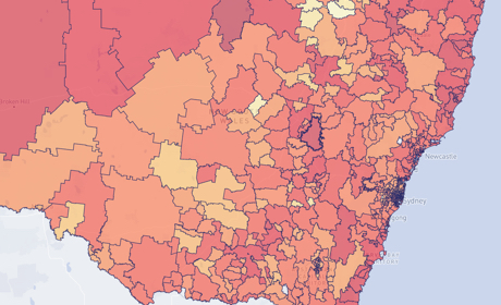
From infographics and maps to online portals and apps, we create data visualisations for every context. Do you need to connect quickly with a general audience? Infographics that grab attention on social media might do the trick. Take a look at these maps we created for Transport for NSW, which visualise the future of transport across the state, covering everything from car crashes to overcrowding on trains.
Are you thinking of an online tool that will attract a target audience, encourage interaction and clarify complex data? An innovative, custom-designed solution might be the best idea. In 2017, we did just that for Australia’s Special Broadcasting Service (SBS), when we created the Census Data Explorer. It invites visitors to explore Australia’s Census data from 2011 and 2016, discovering general information, such as population growth, as well as obscure facts, such as the percentage of Australians who speak Hungarian.
Perhaps all you want is a straightforward but good-looking report, to present in-house. Whatever you’re after, we can deliver it.
Are you wondering which data visualisation is best for you? Why not give us a call? We love hearing about new projects.
Working with you and your data – every step of the way
We’re a full-service consultancy, so we work with you – from beginning to end. Our services include everything, from data research and analysis, to generating ideas, to sketches and prototypes, to design and development, to support and training.
Along the way, we invite you to get involved. Or, if you’d prefer to leave it with us – and take a holiday – you’re welcome to do that, too. We’ve always based our work on great relationships.
We believe in democratising data
And those relationships don’t have to end when your project does. On top of creating data visualisations, we enjoy sharing our knowledge. We’re passionate about helping other people unlock the potential of data.
Our friendly educators have taught at universities and government agencies all over Australia. We can help you understand your data more deeply, improve your visual literacy and even create data visualisations of your own.
Ultimately, our goal is to democratise data. With the right data, communicated in the right way, we can create a better, more informed and more positive world. Data gives us the power to make more intelligent decisions – for today and for the future.
Would you like to learn more about data visualisation, chat about a project or book a consultation with us?
Related projects and articles
-
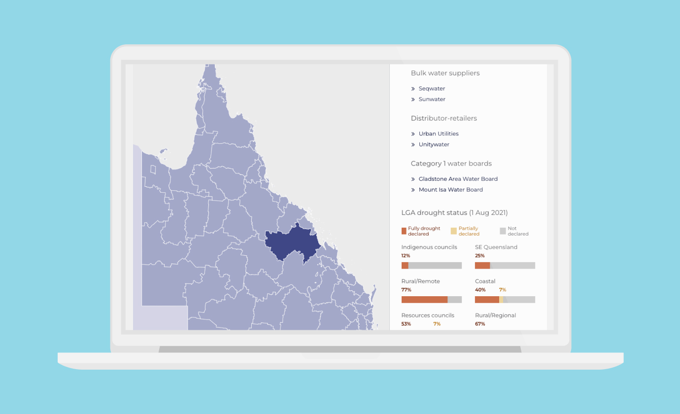
Dynamic Dashboards for Data-Driven Policy Insights and Transparency
Queensland Audit Office
-
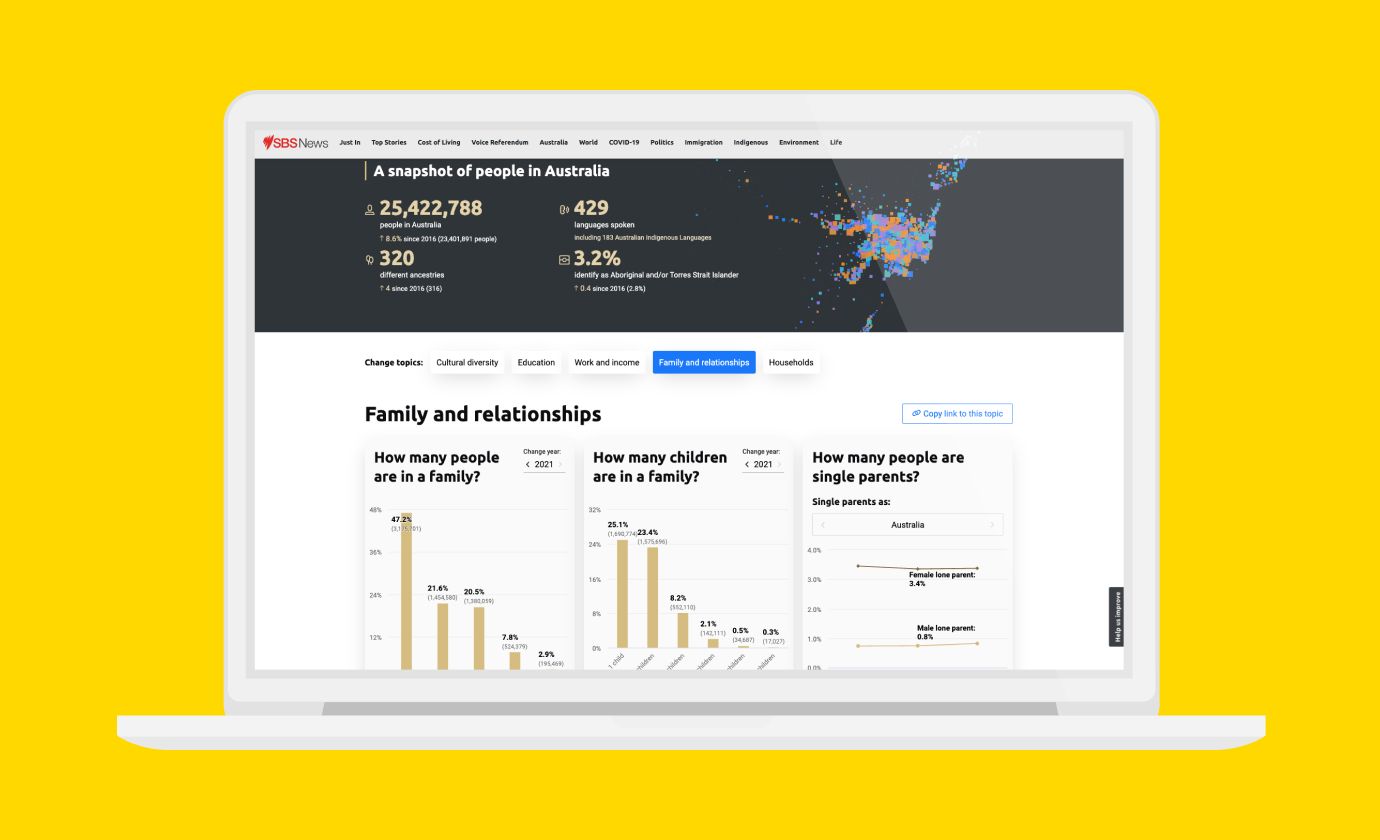
Improving Community Access to Census Data
Special Broadcasting Service (SBS)
-
This episode of Bluey is called colours
Article
-
Occupational Risk due to COVID-19 in NSW
Article