Finding a scoop is the first half of the battle. The second is telling it with a bang. And that’s where data visualisation can make a big difference.
Whether you’re telling a story about a local school or a national policy, cutting through the noise isn’t easy. Your initial challenge is getting readers onto the page. Then, you need to persuade them you’re telling the truth. Finally, to make an impact, you want your story shared – all over the country, if not the world.
A well-designed infographic, map or animation will get your message across instantly. Use it to tell the essence of your story in seconds. Or to present data that proves your claims. Or to get readers to interact with your content. Or to suggest new perspectives, by comparing the present with the past, or new possibilities, by looking into the future. Whatever the case, data visualisation is at the heart of powerful media.
Telling human stories
Retrospect, a data-driven storytelling project for ABC Radio
We’re passionate about data because we’re passionate about human potential. Data might sound like it’s all about numbers. But those numbers are only useful for their ability to teach us about who we are. Our mission is to find the most insightful, useful and compelling data, then transform it into meaningful visual narratives.
Sometimes, we uncover hidden stories. Take, for example, this dot density map we created, to dig deeper into the results of the 2019 Australian Federal Election. Where conventional choropleth maps use blocks of colour to portray majority opinions, ours give a more accurate picture of our democracy, by representing every single voter with a single dot. The result is a map of Australia that looks a bit like a pointillist painting.
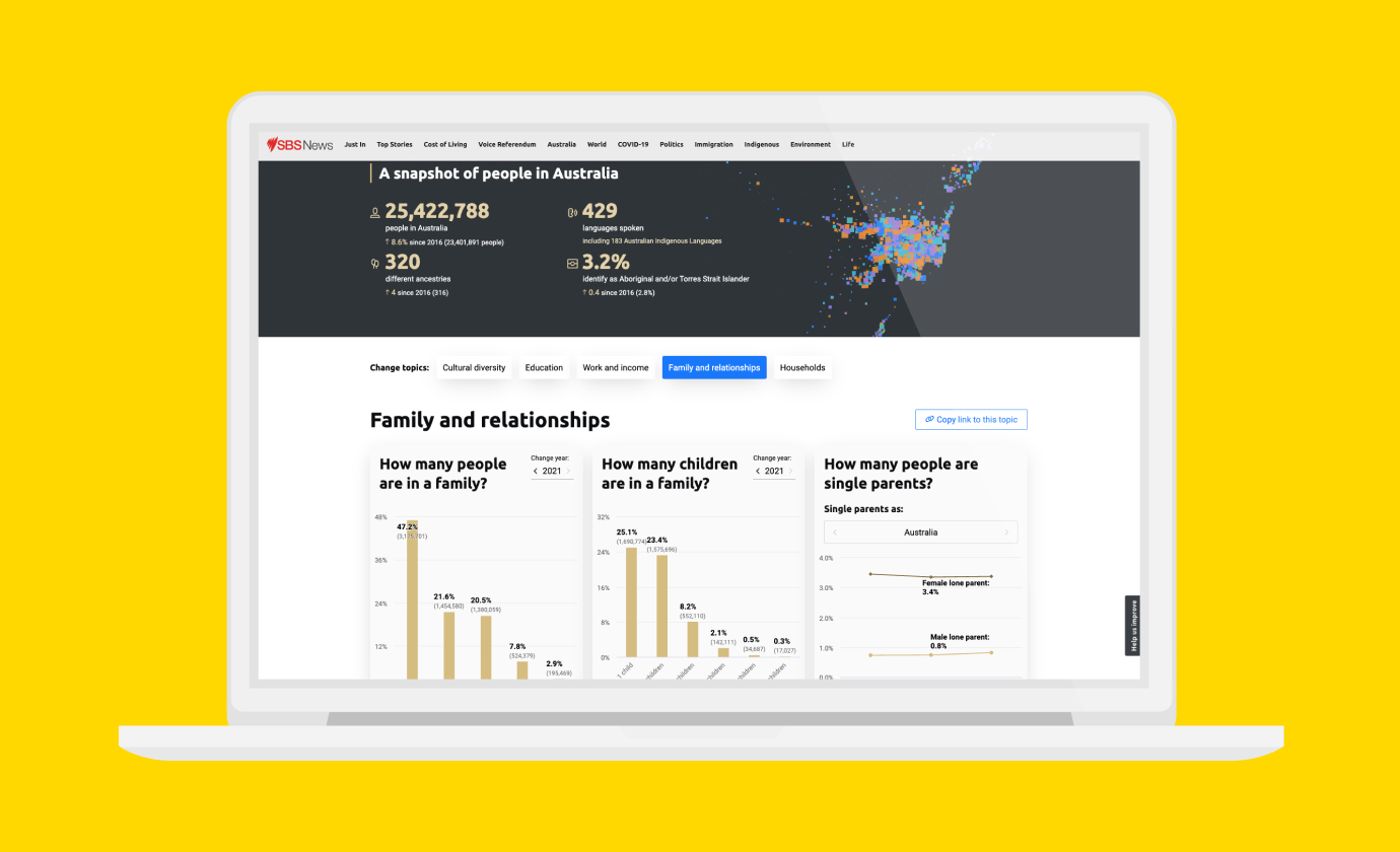
Then there’s How Diverse Is My Suburb? – an interactive data visualisation we designed and built for SBS. It helps users learn about their hometown, by allowing them to search their neighbourhood according to ancestry, age, religion and birthplace. Multiple, complex data sets combine to tell unique, important stories.
Capturing the big picture
State of Play (The Australian)
Big picture stories – from urban development to national changes in legislation – shape the lives of every one of us. It’s crucial that media companies tell them. But here’s the problem. The details can be so complex, it’s not easy to get the story across. Well, not without boring, confusing or alienating your readers, anyway.
And here’s the solution. Data visualisation can transform even the most complicated information into a clear picture. The trick is striking the right balance between detail and context. On one hand, you want to inform, enthrall and inspire your audience. On the other, you don’t want to overwhelm anyone with too much information or a narrative that’s difficult to follow.
In addition, you can bring together multiple data sets to create new insights, discover new relationships and dig into deeper levels of understanding. Or, take a single data set and look at it from multiple perspectives, formulating a 360 degree view.
Take a look at State of Play, an opinion poll simulator we created for The Australian. Our task? To represent polling data in the most engaging way possible. Rather than bombarding readers with facts and figures, we began with a simple approach, then invited them to explore. Through maps, infographic, graphs and interactive slider, users could see projections based on polling data, as well as visualise the impact of swings, at electorate, state and national levels.
Deepening our understanding of ourselves and the world
Charting Homelessness (ABC)
Ever since founding Small Multiples in 2011, we’ve been motivated by a desire to understand both ourselves and the world. Through deeper knowledge and greater transparency, we can build a kinder, more sustainable and fairer world. That’s because data empowers us to make decisions that are better informed and more logical.
In this way, our motivations are much the same as those of most journalists. We’re driven to uncover the stories behind big data because they’re the stories that can change the world – whether we’re charting homelessness or mapping where burglaries are most likely to happen.
Partnering on innovative data visualisations
English Premier League Performance (The Guardian)
Got an idea that might blow the world away? Curious about data visualisation, but need a collaborator to get you going? More interested in partnering with us than commissioning us?
We work on media projects of all types. That includes everything from news stories and long-form features to press releases, advertorial and microsites.
We’ve collaborated with numerous media bodies, from (relatively) young independents, like Junkee, to longstanding companies, like the Guardian and the ABC. And, sometimes, our data visualisations become stories in and of themselves. For example, this data-based box of chocolates we created to represent Sydney’s diverse suburbs went a bit viral.
Meet our flexible, multi-disciplinary, fast working team
When it comes to news, speed is of the essence. In this age of 24-hour connectivity and citizen journalism, you have to break your stories like lightning, to have any realistic chance of competing with other media outlets.
Our nimble, agile team can transform data into striking visualisations, even when racing against the clock. Our multidisciplinary staff – which includes data experts, UX/UI specialists, designers, developers and project managers – are all based in our Sydney office. And that makes us a full-service, one-stop shop.
If you’re looking to save as much time as possible, all you have to do is drop your data in our hands and let us do the rest. But, if you need just one or two services, or a staff member to help your in-house team, that’s absolutely fine, too. We also offer expert data visualisation training for journalists, editors and content creators.
Are you ready to discover the potential of data to tell more accurate, more powerful and more engaging stories?
To ask questions, book a meeting or get started straight away …
Related projects and articles
-
Improving Community Access to Census Data
Special Broadcasting Service (SBS)
-
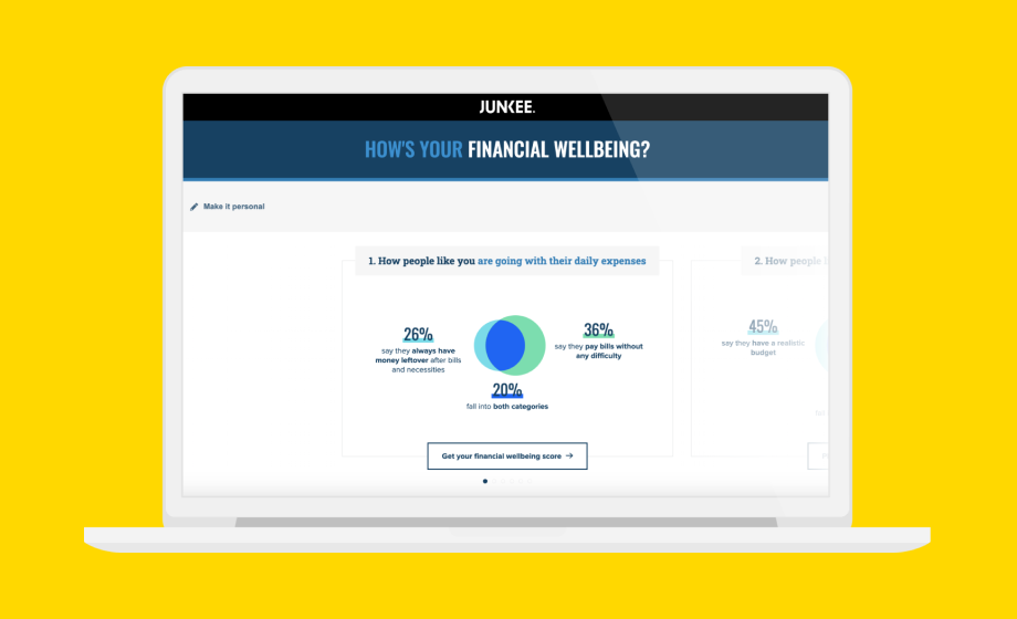
Financial Wellbeing during COVID-19
Junkee Media, ANZ