 View All
The Future of Transport
Visual Design Web App Development Interactive maps Data Visualisation


The Challenge
Create an interactive dashboard which visualises the unique Transport challenges that face each region in NSW, to be embedded within the new Future Transport website.
![]()
Our Process
We started with some sketches of the type of dashboard we wanted to create, brainstorming and rapid prototyping to get a sense of the project and its scope.
![]()
Through various iterations, we narrowed down the purpose of the dashboard to be informative - putting aside the traditional idea of a ‘decision making dashboard’. We created structured the layout to present all information to the user straight away, the header navigation acting as anchors to various topics within the region. Each topic section would contain an insightful visualisation that summarises the topic.
![]()
After finalising the wireframes and content, we started designing the animations based on data provided by transport. This included forecast data for both public transport and road usage and current data, like road incidents for cars and cyclists. It also detailed current travel habits from OPAL and population growth estimates.
![]()
The Solution
The tool lets the user navigate via an interactive map and key topics. Each location utilises spatial representations of the data to create engaging animations that explain future consequences of not investing in Transport Infrastructure.
The interactive dashboard has insightful animated visualisations for key issues in the state - including population forecast, transport capacity forecast and historical road safety data. Each visualisation is specific to the selected region, providing meaningful observations from an otherwise inaccessible set of data.
Animations
Below are just some of the animations we created for Future Transport - head to the website to explore the whole dashboard.
Opal Trips
This animation depicts the intensity of public transport use throughout a 24 hour day, based on Opal data. The lines depict opal trips, where brighter concentration of lines correlate to the number of people taking the same trip. Not unexpectedly, the brightest spot and concentration of lines surrounds Sydney CBD.
Population Forecast
Population growth has been forecast for the next 40 years. We developed an animation that visualised that growth by area, with each peak representing the amount of people.
Crowding on Public Transport
Congestion on the public transport system is evident today, but what will it be like in the next 40 years? The animation below depicts the amount of people on trains, buses, ferries and light rail through the thickness of the lines. The colour conveys the quality of transport experience - including seat and total capacity of the vehicles.
Road Safety
Using historical road crash data, the following animation depicts the trends of road casualties from 2011 to 2015. Yellow represents injuries, with dark grey representing fatalities that have occurred in the region.
Related projects and articles
-
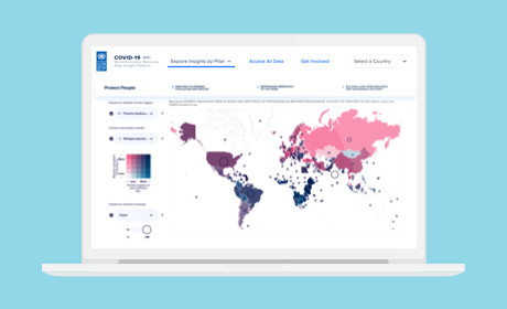
COVID-19 Socio-Economic Recovery Data Insight Platform
United Nations Development Programme
-
Using dot density maps to visualise complex population data
Article
-
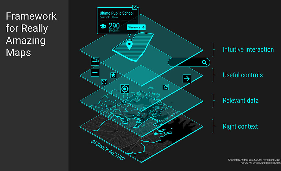
What to think about when designing maps
Article
-
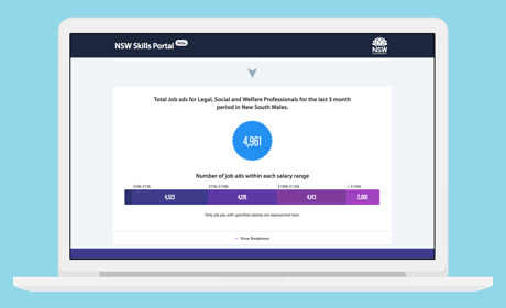
Skills & Occupations Portal
Department of Industry