 View All
Census Data Explorer
Data Visualisation Visual Design Web App Development Interactive maps


The Challenge
Issues with the data or old tech stack? Issues with old browsers/mobile? Communicating such large datasets with useful.
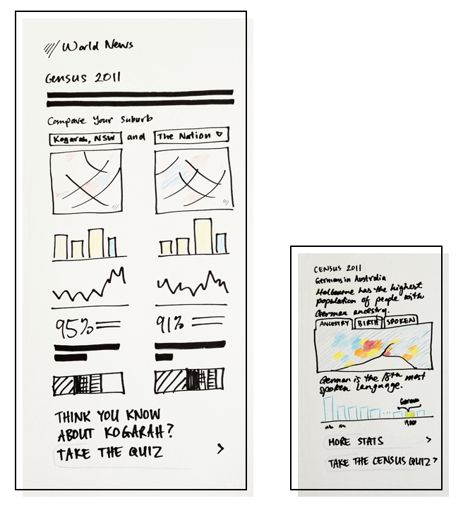
The Process
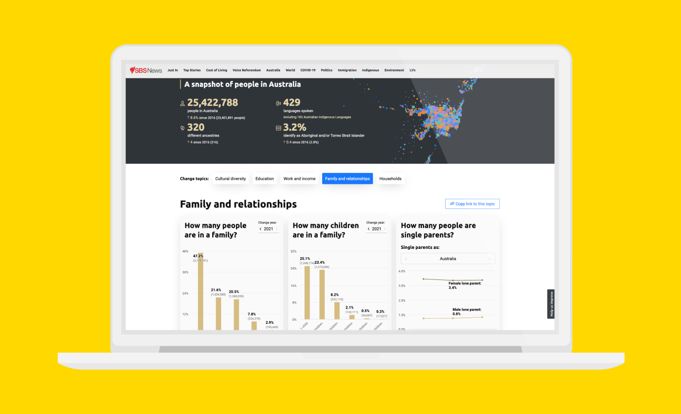
Although simply translating the Census data into graphical form helps people to understand the numbers better, it’s more about how you choose to interpret those charts. Maybe it’s that spike in arrivals after the Vietnam war, or the large proportion of university-age Mandarin speakers, or how a greater proportion of Hungarian speakers are Australian citizens compared to Australia as a whole!
The Solution
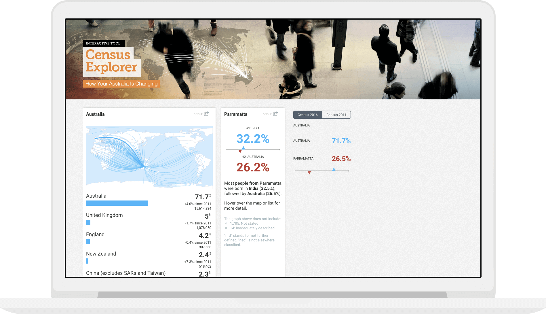
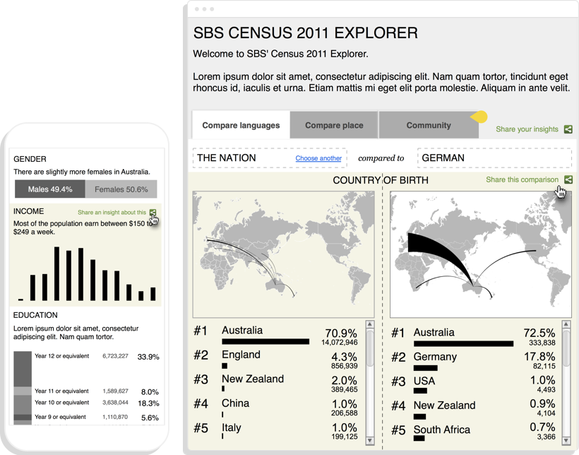
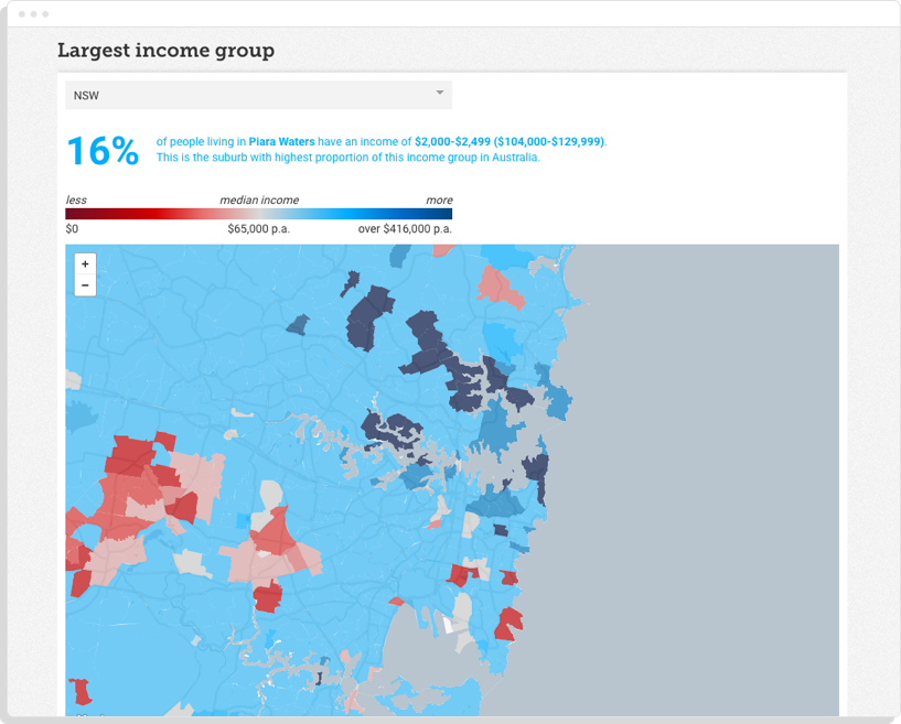
This project took the form of a data exploration tool visualising the key demographic indicators. The SBS Census Explorer is an accessible tool for learning more about who we are and where we’re heading as one of the most multicultural countries in the world.
The visualisations show statistical analysis about the people who live in Australia. Users personalise their experience by choosing their native language and location to compare themselves with other people on a wide variety of metrics.
Related projects and articles
-
Improving Community Access to Census Data
Special Broadcasting Service (SBS)
-
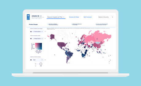
COVID-19 Socio-Economic Recovery Data Insight Platform
United Nations Development Programme
-
Using dot density maps to visualise complex population data
Article
-
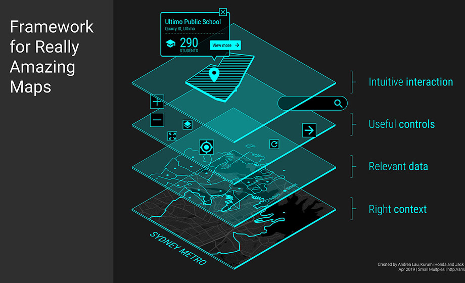
What to think about when designing maps
Article