 View All
Buildings Alive energy consumption dashboard


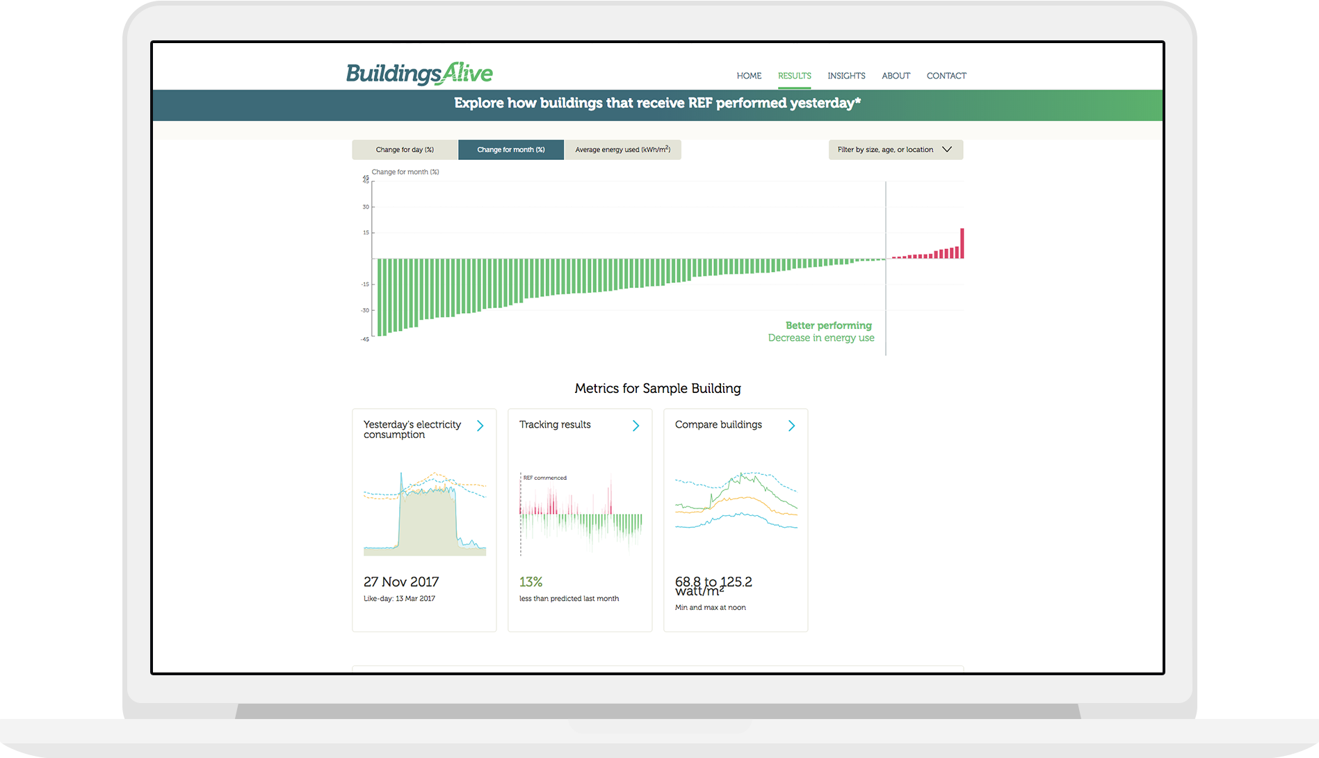
Tracking building energy consumption
The technology behind this dashboard tracks buildings at 15 minute intervals.* Our graphs show energy use for a given day, either in total, or as a breakdown, and the energy savings and increases day by day, week by week, and month by month.
*EventZero created the back-end behind Pulse and provided the API.
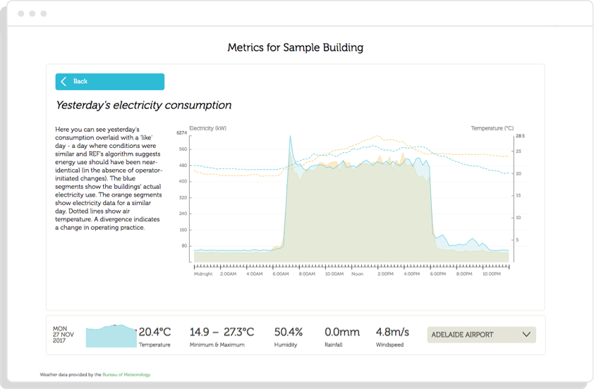
Yesterday’s Consumption
This is a load profile which shows the energy consumption of a building for one day, compared to a day with similar weather conditions. The temperature for that day is also plotted on the graph. This distinctive shape is caused by the power kicking in for the start of the work day, and ending after workers start to leave work.
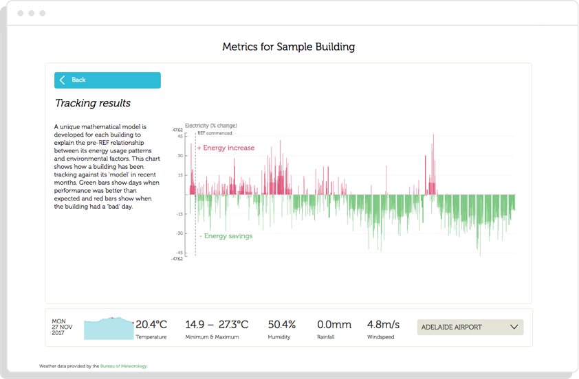
Tracking Results
This visualisation aggregates daily measures of energy savings and increases by either week or month, giving an indication of the fluctuations in the short term as well as patterns over time.
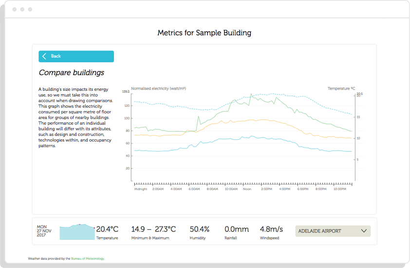
Energy Breakdown
Not only does Pulse track total energy consumption, it also allows consumption to be broken down into specific areas (submeters), such as lifts or lighting.
Sustainability is a big focus for us at Small Multiples. Check out the sustainability portal we made for Westpac, our Building Sustainability Dashboard for Investa, and the NSW Environmental Data Portal. Need to visualise your own data? Passionate about data and sustainability? Get in contact.
Related projects and articles
-
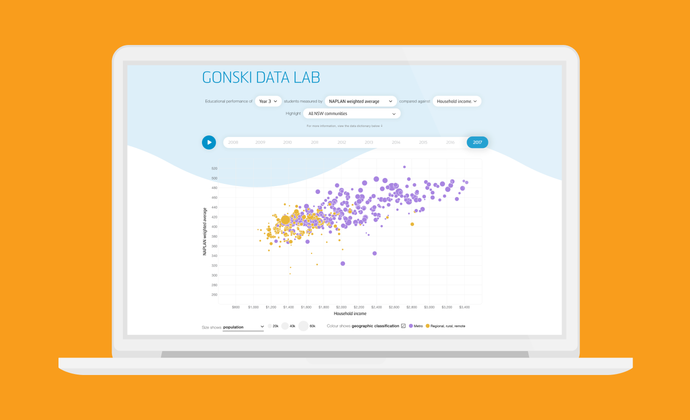
Revealing the social factors behind school performance
Gonski Institute for Education
-

Degree Chooser
Barlow Advisory
-
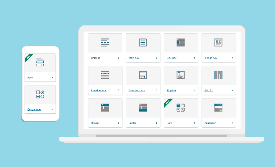
Data Visualisation in Government Design Systems
Article
-

Using dot density maps to visualise complex population data
Article