View All


I was invited to present this talk on 14 November 2019 at the FOSS4G SoTM Oceania conference. That’s a bit of a mouthful, but FOSS4G stands for ‘Free and Open Source Software for Geospatial’, an initiative of the Open Source Geospatial Foundation (OSGeo). ‘State of the Map’ or SotM is the conference of the OpenStreetMap Foundation (OSMF). This conference merged the two into one exciting Oceania-centred event.
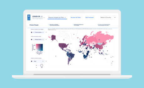
My main focus for this talk was mapping techniques that convey the richness and complexity of human data. I’m a big fan of dot density maps for this purpose, as they avoid a lot of the generalisations and oversimplifications that can sneak into choropleth maps. In terms of subject matter, my personal work focuses on multicultural Australia, and providing a nuanced perspective on that complex human landscape. In terms of sources and techniques, I’m a big beneficiary of open data and open-source tools.
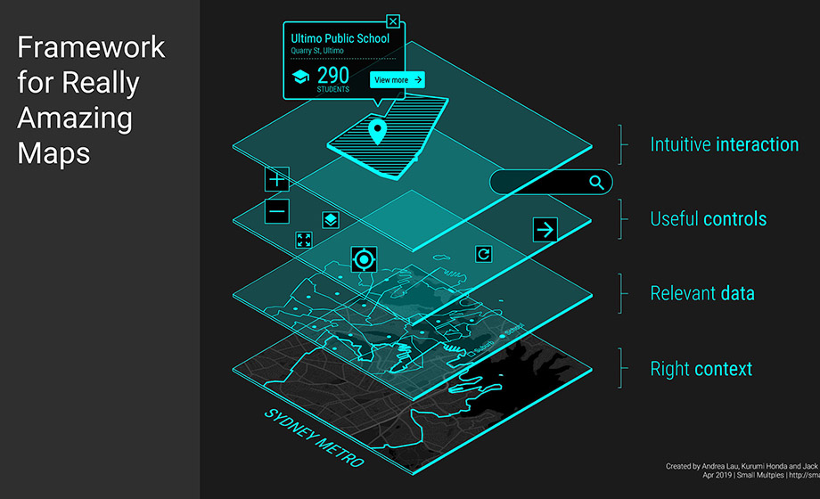
The goal of my talk was to encourage people to appreciate the beauty of complexity, and its importance in the field of cartography. Maps can help us see the unpredictability of the individual and the permeability of the group at local and national scales. Below are the main points from my talk:
Limitations of choropleth maps
Choropleth maps, while good for showing regional differences, have disadvantages:
- Diversity within regions is ‘papered over’ with the attributes of the majority.
- Polygons representing different data attribute values of the same region will overlap and the resulting colour (through transparency) is difficult to interpret
- The different shapes and orientations of the areas increase cognitive load without additional benefit
- Larger polygons will appear to have more weight, adding bias to the visual comparison
Advantages of dot density maps
Dot density maps have the following advantages when visualising population data:
- Dots enable overview (when zoomed out) and detail on-demand (when zoomed in)
- The added benefit is that dots blend to create intermediate colours from a distance, giving a sense of the ‘mix’ of attributes in a certain area. This technique is related to that used by the Pointillist art movement.
- Because the atomic visual element (the dot) is consistent throughout the representation, there will be less cognitive load for the viewer
- Viewers of the map will be able to identify patterns from the dot density map aided by Gestalt Principles - Proximity, Similarity, and Continuation.
Limitations of dot density maps
- The number of classes that can be shown is limited by the number of easily differentiable colours. Because the dots are small, minor color differences are hard to detect and different fill patterns are not possible.
- Overlapping dots is usually unavoidable. This can hinder the visibility of small populations and lower layers when the layers are created independently.
- Evenly distributing dots in large regions is the easiest technique when using dot density maps, but it can create false impressions. The dots are normally clustered within regions (e.g. people in cities).