 View All
Revealing the social factors behind school performance


The Challenge
The mission of the Gonski Institute for Education is to address growing inequality in Australian education. Adrian Piccoli (institute director and former Education Minister) wanted to provoke questions about the effect of social influences and policy changes on student performance.
The aim was not to draw inferences about cause-and-effect, but simply to present the data in a way that encourages further exploration.
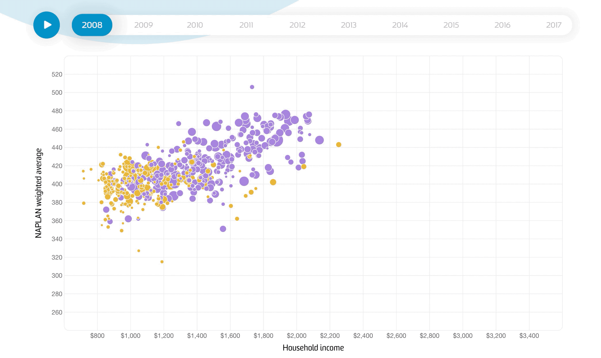
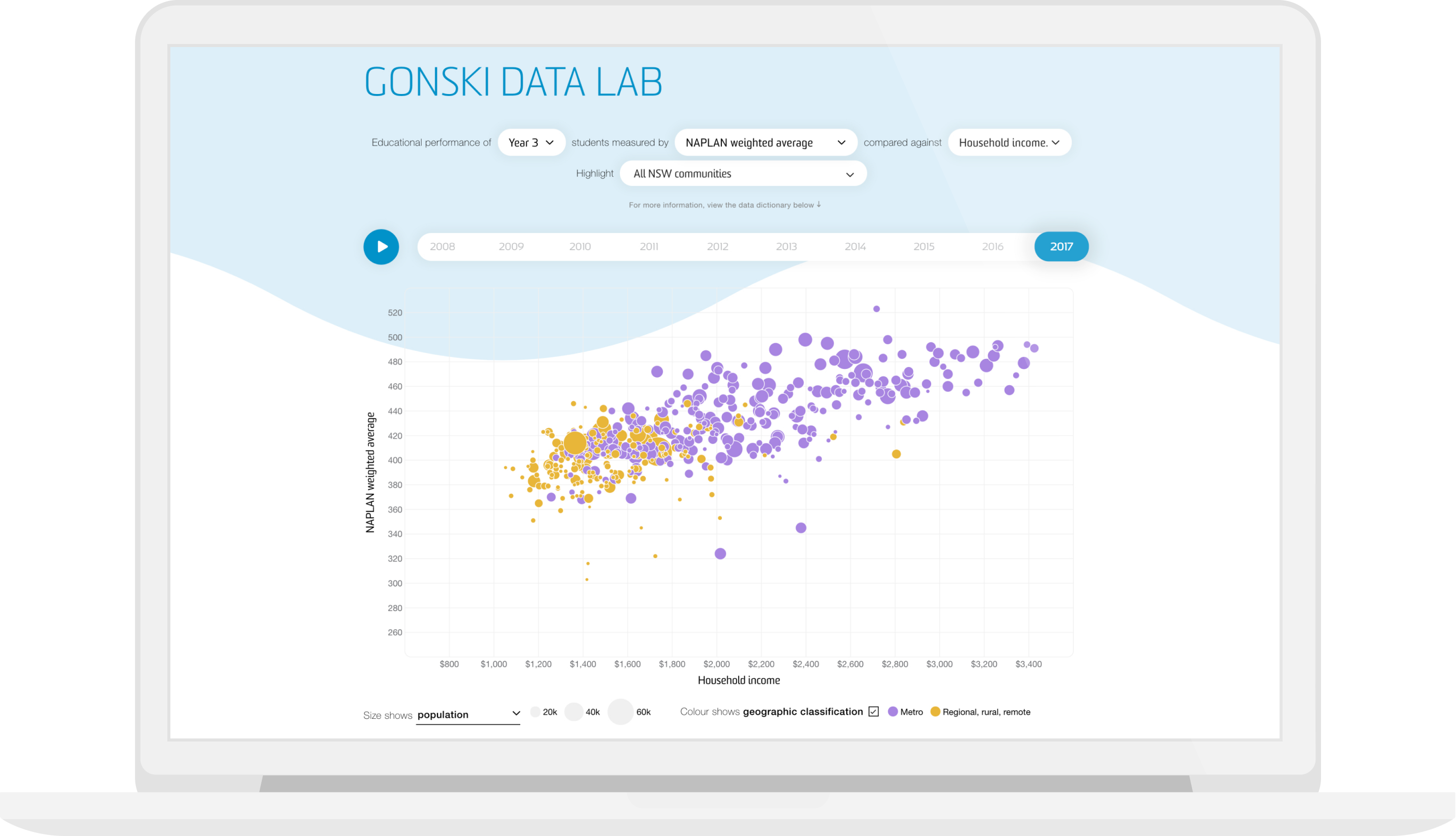
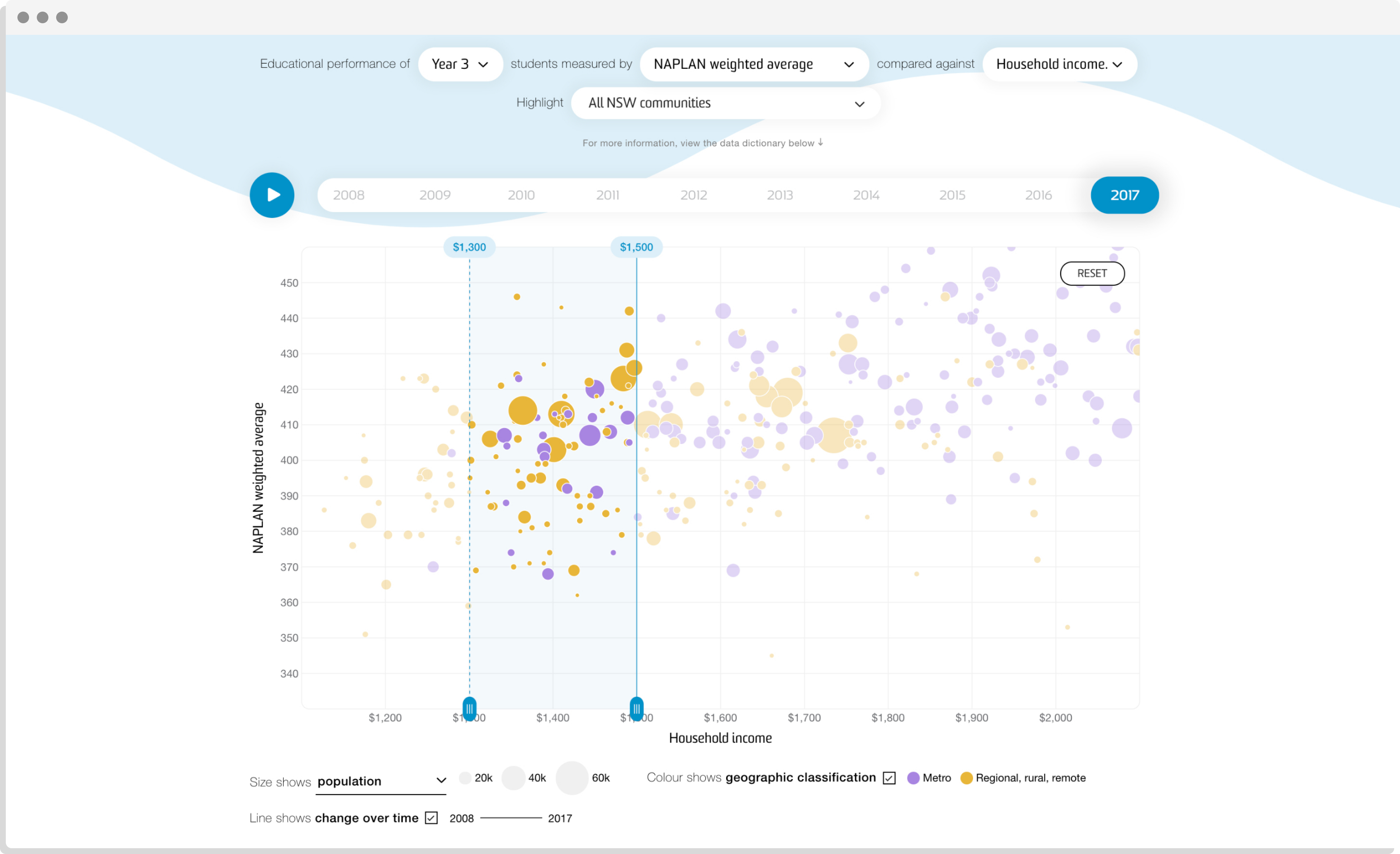
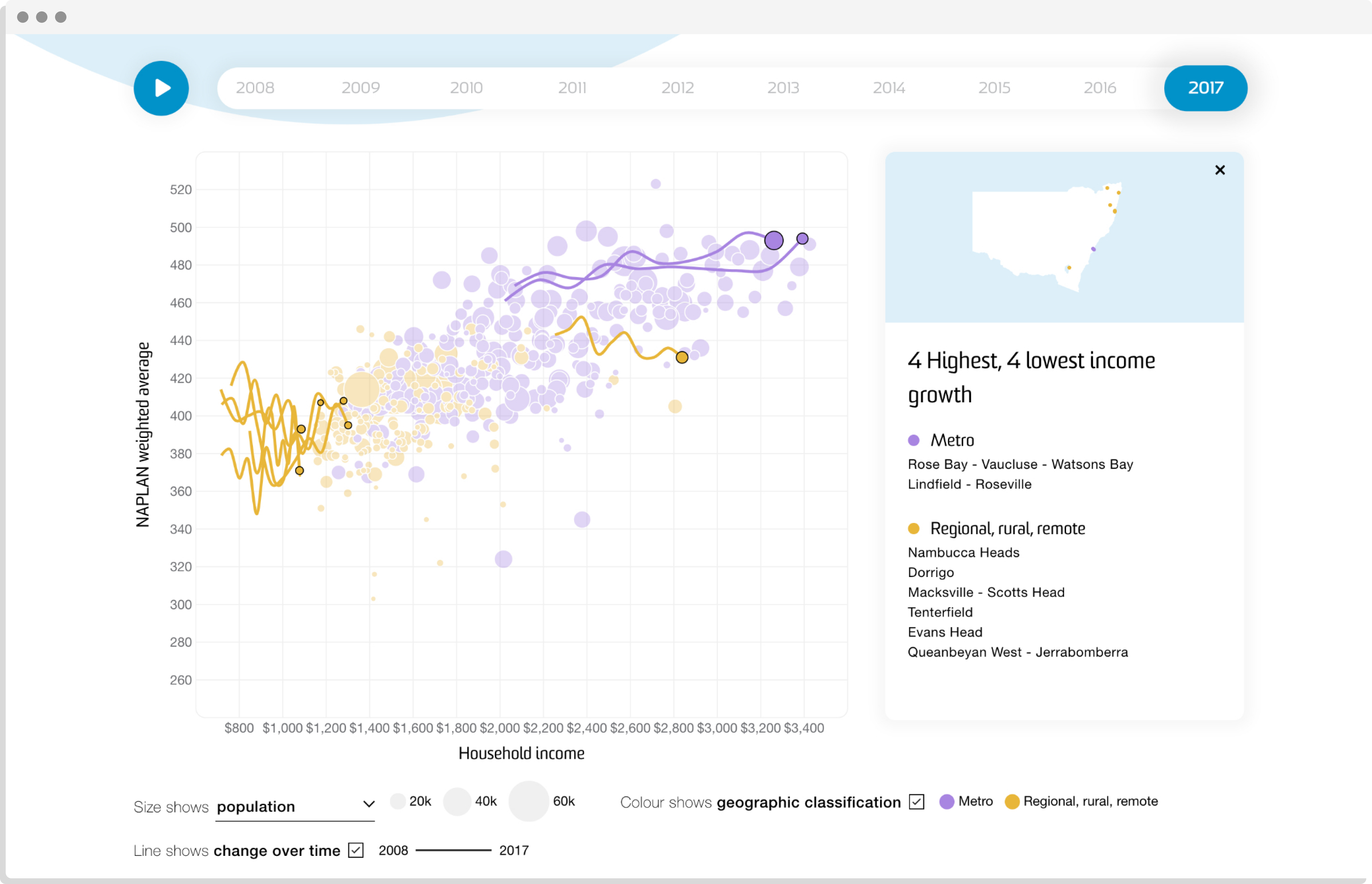
The correlation between household income and NAPLAN results over time, in both metro (purple) and rural (yellow) areas
The Solution
Creating a design that promotes investigation without injecting bias was key. The result is a data exploration tool, which allows users to compare the performance of geographic student cohorts against many variables, including household income and local unemployment levels.
On the technical front, fast automatic data load, a simple and accessible CMS and seamless animation were essential criteria. To ensure this, we conducted regular engagement with stakeholders to prepare and package the underlying data.
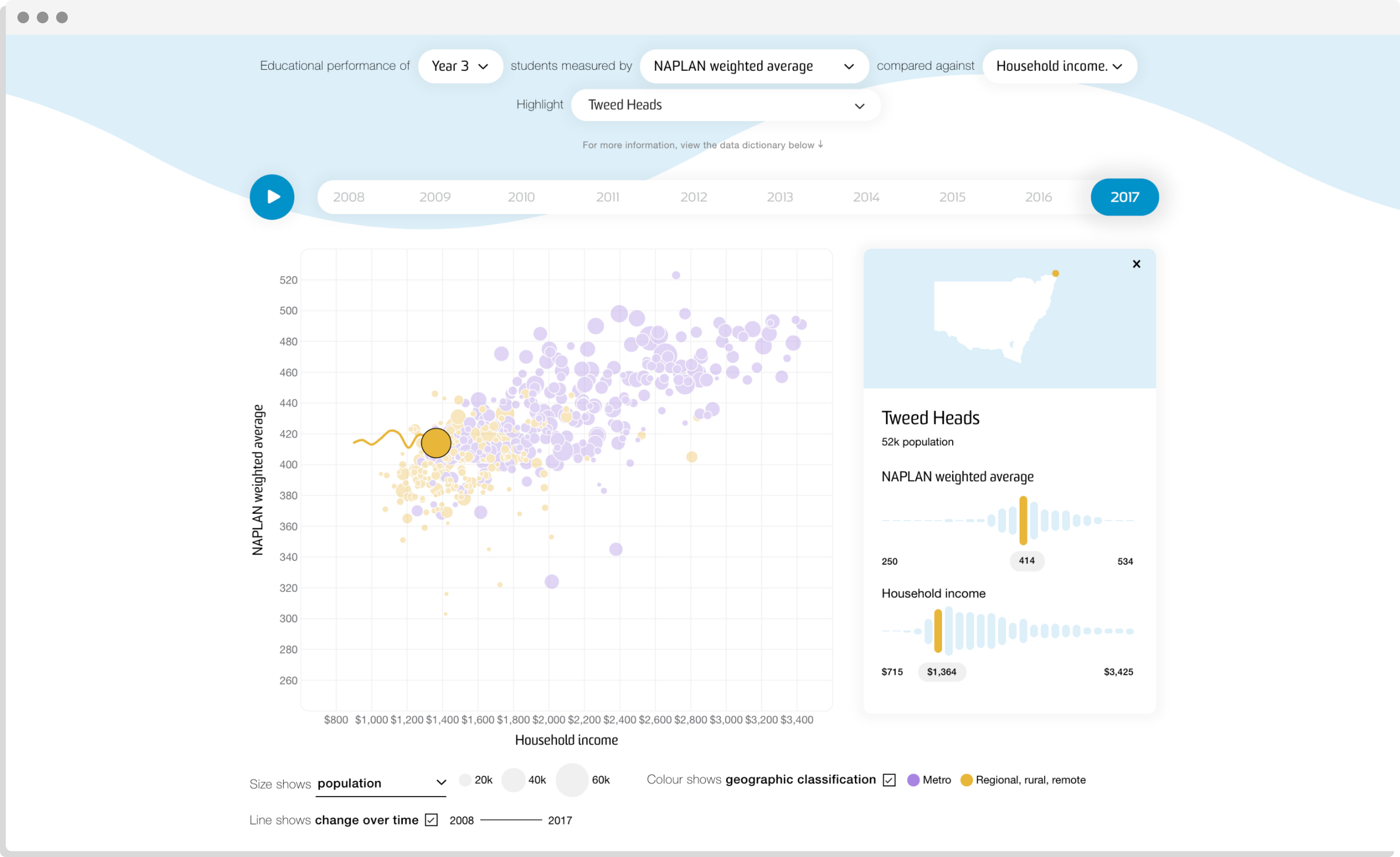
Highlighted regions on the graph and slide-out data cards for each town and suburb allow users to hone in on details and areas of interest.
Animation
We wanted to show not just educational outcomes and social factors, but also how the relationship between these has changed over time.
A ‘play’ feature allows you to see the interplay of these variables for each town or suburb between 2008 and 2017. Line graphs can be toggled on and off to see the course of this movement visualised.
If you’re interested in visual analysis of social data and trends, check out our interactive dashboard for the UN Development Programme to showcase their 2020 HDR report, or our Poverty and Inequality website for the Australian Council of Social Services (ACOSS) - or get in touch.
Related projects and articles
-

Degree Chooser
Barlow Advisory
-
Data Visualisation in Government Design Systems
Article
-
Using dot density maps to visualise complex population data
Article
-

Hello, Sun. Augmented Reality app
Small Multiples