People Matter - Employee Survey
The challenge
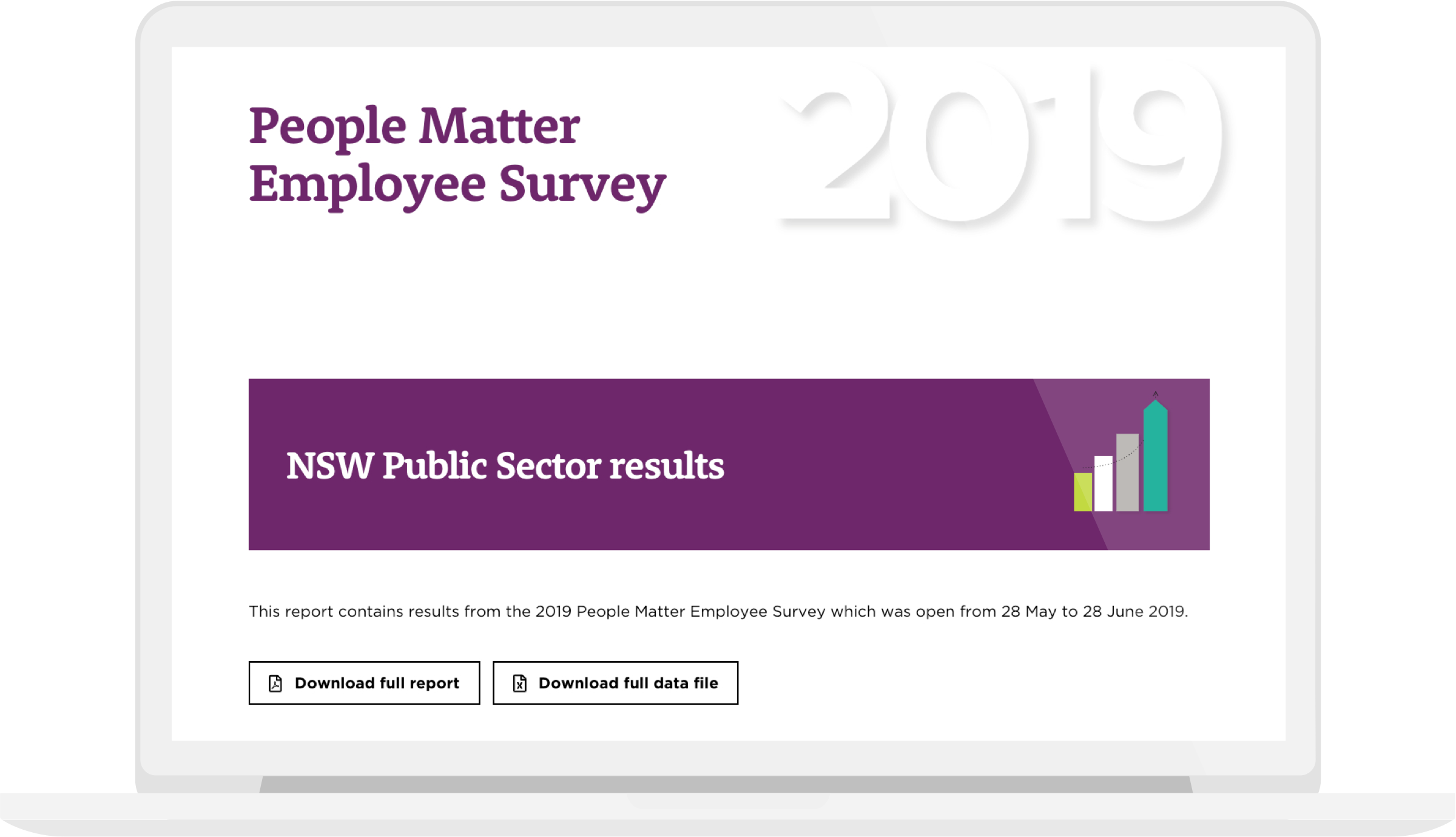
The results of the NSW Public Service’s ‘People Matter’ employee survey were previously available only in PDF format. The Public Service Commission needed a new and more accessible way for people to engage with the results of the survey.
We needed to improve:
- Accessibility - Create an accessible version for the vision impaired
- Non-linear consumption - Create an engaging tool for people to find data useful for them that isn’t too long to read
- Scalability - The ability, eventually, to create a reports per team to supplement the PDF report. Having a clear data trail between exported data and the final tool
- Context - Giving people enough context, background and information to understand and not misinterpret the data and findings
- Comparison - Making it easy for people to make comparisons relative to themselves
Our solution
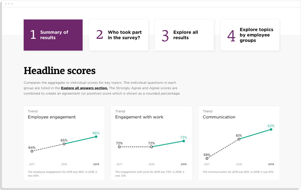
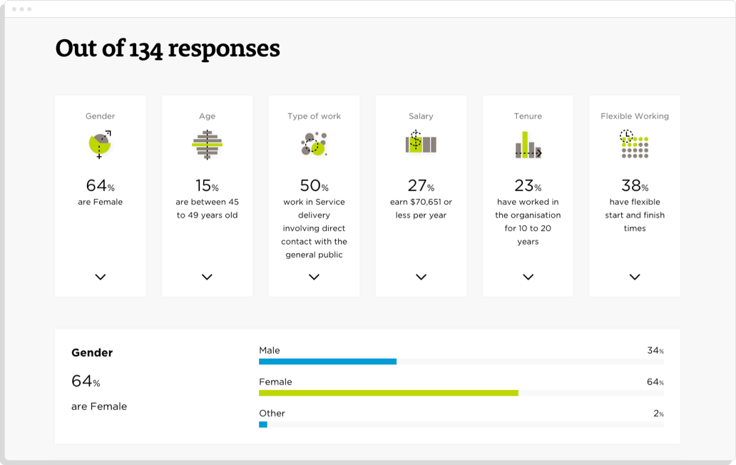
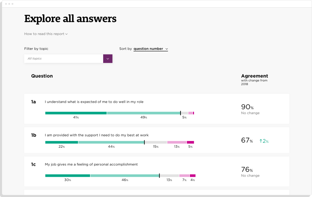
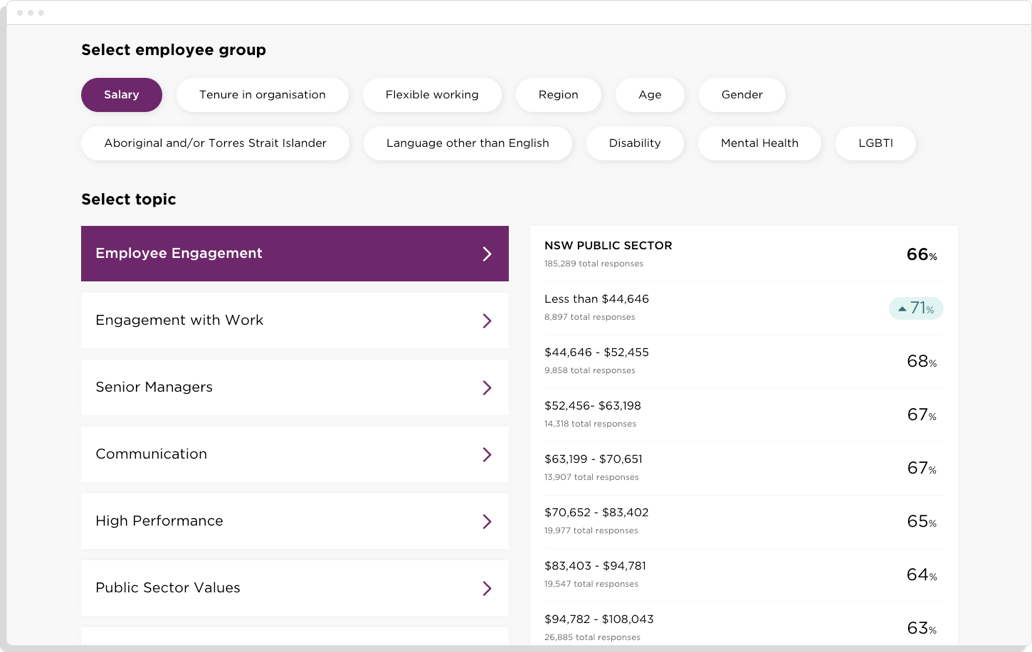
We created a visual and interactive way for people to view the survey data online, which was simpler and more digestible than the PDF report. The results were clearly broken down into a summary view and an ‘explore all results’ view, as well as a breakdown of who took part in the survey. Staff could also filter the results by employee groups, such as age and gender, to find out how people like themselves responded.
Every view met high levels of compliance for accessibility, being screenreader optimised and having the ability to tab through different sections.
You can see some more work we’ve done visualising survey results here (SBS & the Museum of Australian Democracy). Have some data that would benefit from visual presentation? Get in contact.
 View All


