View All


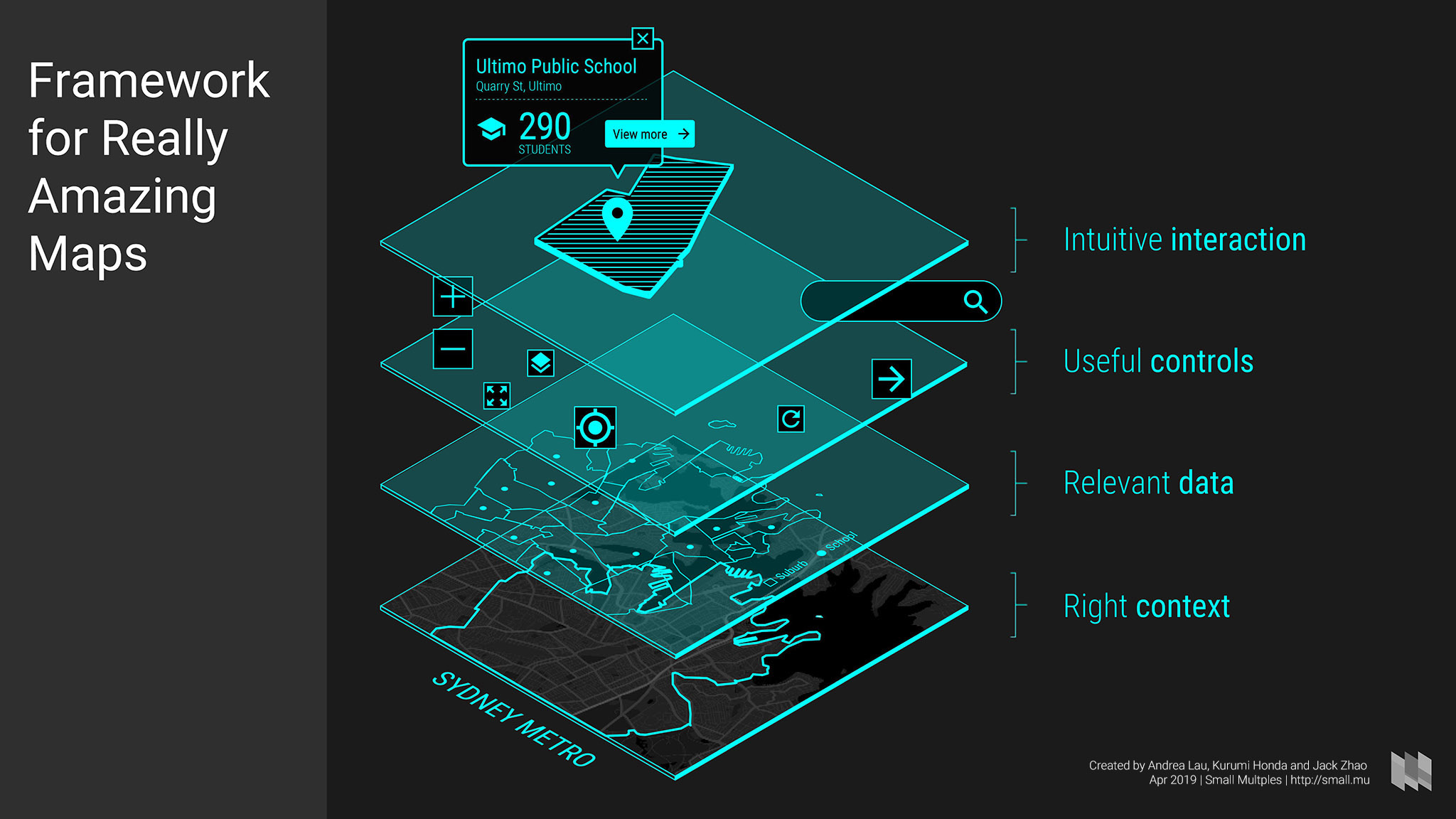
What to think about when designing maps: the Framework for Really Amazing Maps

At Small Multiples, we’ve been creating data visualisations for almost eight years, including over 60 maps. I put all of this knowledge together recently and gave a talk at Web Directions Design 2019 last week (12 Apr). The aim is to give designers the foundation to critique and create maps, turning them from generic maps to amazing ones.
A great map is one that is useful and intuitive for the people using it but also beautiful and a unique reflection of its designer.
What follows is a framework for designing really amazing maps and two walkthroughs, as delivered at the conference. The original slides, additional notes and links are also included.
With thanks to John Allsopp and Rosemary Allsopp for organising Web Directions Design and the Arts Centre Melbourne for hosting the conference.
The four parts of designing a map: a Framework for Really Amazing Maps
1. Context

The right context is the basis of a good map

Context lets people know where and what they are looking at
This could be described by a globe – I am looking at the world, to landmasses, boundaries, parks, water and streets all the way zoomed into house numbers – I am looking at my street.
- The physical environment and familiarity the audience has with a place is used to situate.
- Points of interest like national parks, buildings and streets to provide a sense of place.
- Boundaries to provide a literal scope for what the map is about.
- Labels to make it obvious to someone not familiar with all the context as to where they are looking.

Different types of basemaps
Most of these details can be added to a basemap. A basemap is the bottom layer of the map.
There are four options for choosing and designing a basemap, the first of which is to have no basemap at all. This may be because the viewer doesn’t need any context, or you don’t have enough room. The second is a simple shape or boundary, eg: Victoria. The second and third options are to have a satellite view or an abstract view.

Satellite basemap
Let’s take a look the satellite option first.
There are many sources of satellite views which may come from different satellites and different aerial photography which have been stitched together and cleaned, for example to remove clouds.
In the design of day-to-day maps, satellite views are helpful context in some situations such as knowing what a potential home looks like, or to show the physical environmental when mapping parks.
But most of the time satellite views are the less desirable option as basemaps because:
- There’s a limit to how far they can be zoomed in.
- They have far too much detail and variation which makes consistent design on top of it hard.
- They cannot be designed inherently because the imagery is fixed
Technically, they also take longer to load than most abstract representations of maps.
We’ve used satellite imagery for projects visualising the spread of a bushfire and a video lighting up regional towns in NSW using the NASA black marble.
And that’s why we see street maps more often.

Streetmap basemap
Colours tend to follow a few different palettes:
- Familiar grey / blue / green / yellow
- Dark greyscale
- Light greyscale or desaturated
- Something completely different.
It’s useful to have a familiarly-designed streetmap when people need directions or location information. Light and dark basemaps are common because they help accentuate data overlaid on top. And a completely different map can be used to make a visual statement.
Here’s an example of the most common street map: the Google Map default. Here it is on the left versus realestate.com.au on the right which you can use the (light grey) slider to move between.
You can see real estate has removed points of interest – businesses and restaurants – leaving education only. The map marker is slightly different but still part of the regular options given by Google Maps.
This is domain.com.au version of the same property.
The colours have been tweaked, the roads have lost their outline, and labels have been removed. This makes for a cleaner map that lets viewers concentrate on their point of interest – the property they are looking at.
In both cases, even though the Google Map provides a familiar UI there hasn’t been much thought around how to design the map to best help the potential property buyer get more context.
What Domain has done is create a style for their map via a specific tool created by Google at https://mapstyle.withgoogle.com/ which is a free service that you can use without logging in. A similar service is https://snazzymaps.com/.

Google maps basemap
This starts with a few base styles to choose from. Then, options for changing the amount of detail, tweaking colour, removal of some noise, and highlighting different types of context in a basemap including transport, roads, parks, locations and businesses. You can even choose to remove everything but parks.
Once you’re done, you can save the JSON for use later or to handover to another team member.
However, there are lots of things that cannot be customised. For that, you will need something more advanced like Mapbox. Other ways of creating custom basemaps include Carto and enterprise software ArcGIS but we use Mapbox most.

Mapbox studio basemap
In Mapbox Studio you have complete control over:
- Typography
- Colours
- Detail at different zoom levels.
In terms of typography, you can upload any font you would like to use, and Mapbox even has multilingual support. Unless you are designing something very specific, typography for digital maps is usually sans serif, narrow for labelling space constraints, and uppercase especially for roads to avoid descenders. But really, anything is possible.
The key to designing labels is to plan out the visual hierarchy as you would do in web with headings and paragraphs.
You can also upload custom icons.
Mapbox, however, is extremely fiddly and it can be a matter of trial and error to know the effect of what you’re changing. Once mastered, Mapbox is very powerful and gives you have complete control over the design.

Working with maps in Sketch
Once you are happy with what you’ve found as a satellite view, tweaked in Google, or fully designed in Mapbox, it’s time to take a screenshot and integrate it into your design.
There are SketchApp plugins out there that – given a Google Maps style or Mapbox link, can insert a map with the right dimensions into your Sketch file. However, we’ve found that screenshotting is the most direct and flexible method. Here’s a good primer on these plugins from Anjan Shrestha.

Different companies' map attribution branding
Finally, in all cases – attribution is required, usually at the bottom of the map.
This is because the imagery and data used in satellite views, Google and Mapbox all come from somewhere and must be attributed as such.
2. Data

If context shows people where and what they are looking at, data gives people a reason why a map is relevant to them.
There are three types of geospatial data:
- Points (sets of latitudes and longitudes)
- Lines (sets of connected points)
- Areas (enclosed sets of points).
Points
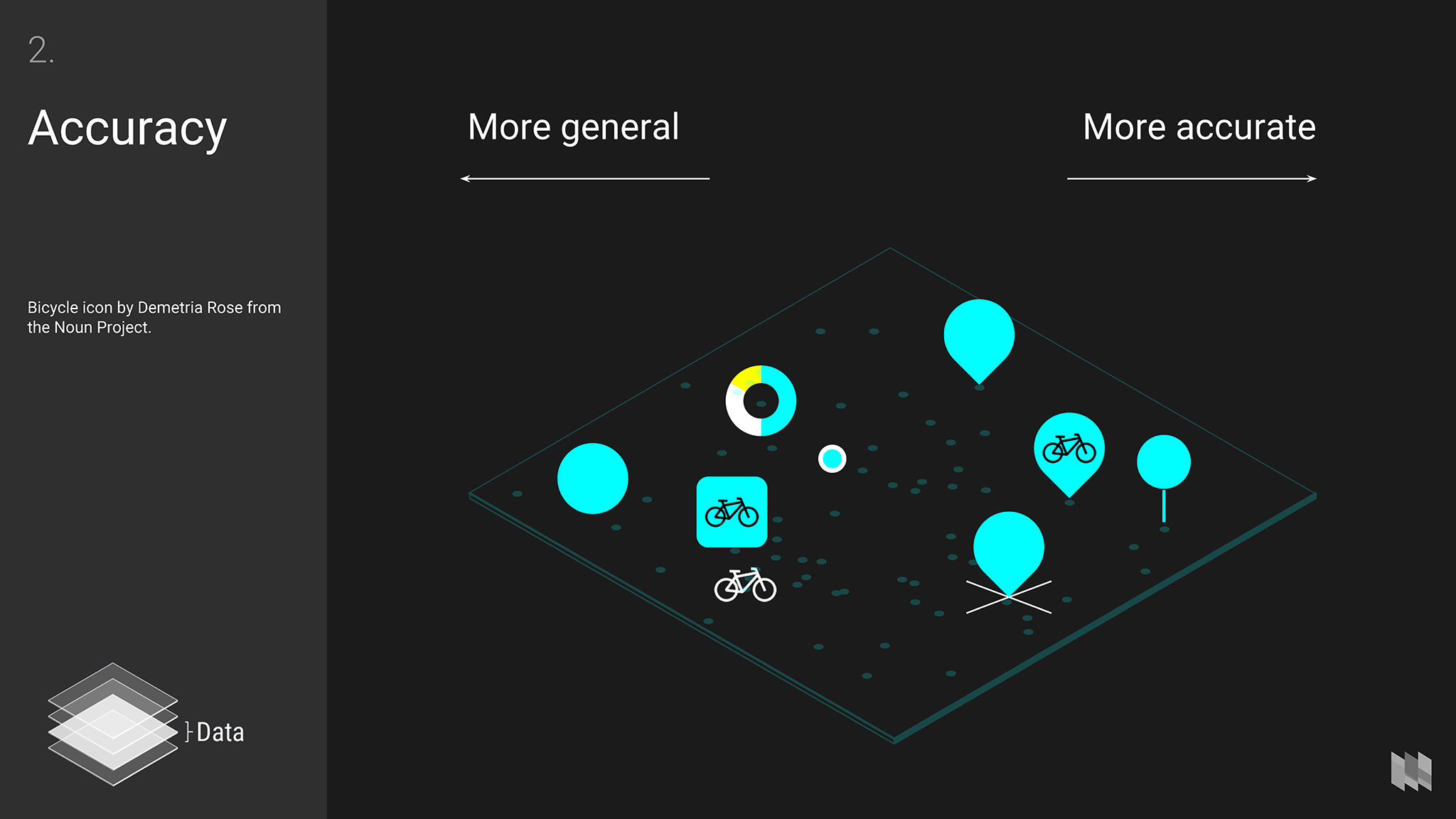
More general vs more accurate map markers
There are a couple of things to consider when designing for points, or markers: accuracy and encoding.
In designing a marker, take into account accuracy. Markers may be used to show a specific location (pinpointed to an address or building for example) or a more general one (simply suburbs).
It would be misleading to pinpoint a marker to a specific location when it was not that exact street address or location. So, there are general markers that can be designed that are usually centred on the location. A general marker could also be an icon, shape, or even a little chart.
If your information is accurate, for example: a full street address, then you could choose the well-known map marker shape, a cross, or any other shape with an obvious point.
You may also choose to use larger accurate markers for more important information and smaller general markers for less important.

Different types of marker encoding
The choice of marker will go hand in hand with what type of data it might encode. Cartographer Jacques Bertin called some of these encodings the retinal variables in his famous book the Semiology of Graphics from 1967, a handy reference to have even today.
The most common are colour, shape and iconography, which are all self explanatory.
- Colour usually means different hues for categories of data, or perhaps different saturations or values for number values.
- Shapes and icons might be useful where the shape means something. Google Map markers are only 20 x 32 pixels. At this size, detailed shapes and icons are hard to see. Icons especially are often placed inside other shapes like circles to keep them consistent, but reduces their size.
- Texture includes working with repeating elements of an icon and can be good for relating different things.
- Using length, area, or volume – making things 3D – is useful for number-comparisons
- And finally different angles might seem like a specific design for cardinal directions, but can also be applied to things like the swing of election results, see this NYTimes example https://www.nytimes.com/interactive/2018/11/07/us/politics/how-democrats-took-the-house.html
In all cases, the key to a good marker is that it should stand out against your basemap, providing visual contrast for the viewer to see them clearly.
Lines
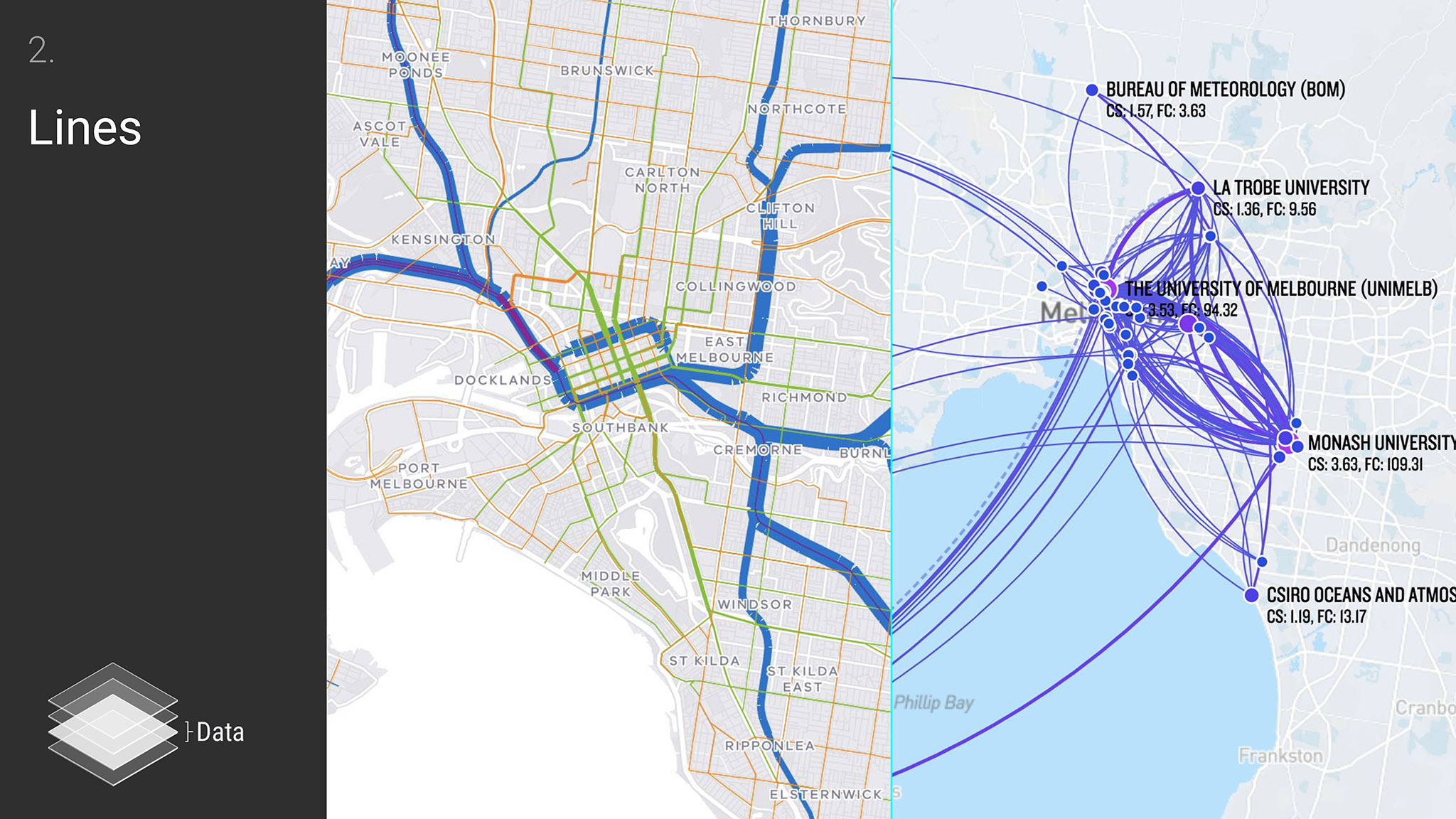
Only a quick note about lines as, at Small Multiples, we don’t seem to design line data as much. This might be because lines can be a little bit more fixed in their representation, eg: roads, train lines, and directions (as seen on the left).
However, what we have done a lot of is connecting points in an abstract way (on the right: https://smallmultiples.com.au/projects/a-tale-of-two-cities/). Here, the key is to use arcs – not a straight line, not a semicircle and not a scaled circle for smooth nice looking lines. This will help to give enough space for whitespace and labels, help to reduce crossovers and distinguish individual lines.
Areas
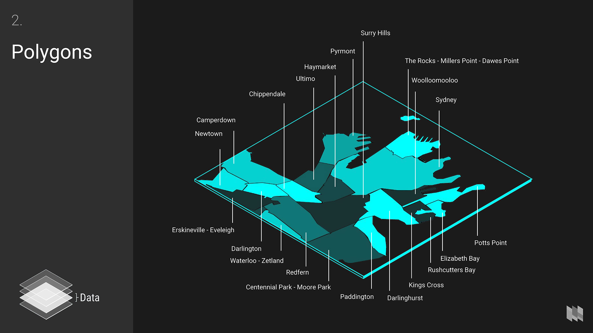
A map that encodes data into areas is known as a choropleth. For example:
- In a map of electorates across Australia, colouring by the controlling party
- In a map of suburbs, colouring by the percentage of mortgage stress in each.
But how do you even get these areas in the first place? One way is tracing images, which was and sometimes is still a common method to get geospatial data.
Another way is asking your client for geospatial files. Some formats might be Shapefiles, Mapinfo, or GeoJSON files.
For example, you can download standard polygons like suburbs and states from ABS https://www.abs.gov.au/geography and there are often other easily searched sources. Then:
- Use a web service called mapshaper https://mapshaper.org to drop your file in and see the resulting shapes
- You can zoom around and download as SVG for use in Illustrator.
- You can also simplify these files. This is because the shapes are too complex for the zoom level you are designing for, so you can simplify them in mapshaper too.
A more advanced option for manipulating geospatial files is using QGIS https://qgis.org/en/site/, which is very powerful but for advanced use and another presentation/article!
QGIS is actually quite good at prototyping encoding, but more likely you’ll have to do it manually once you’ve gotten it out of mapshaper and into your illustrator or sketch file.

There are many options for encoding the fill of the area, the most common and straightforward method being colour.
- Colour
- Hue (quantitative)
- Saturation
- Value (qualitative) (also transparency)
- Other fills could be
- Texture/pattern.
Colour gradients are vitally important. How could we see the worst part of a storm clearly if it was just a continuous gradient? On the other hand, the number of colours used is quite large.
And for a typical colourblind person who has troubles with reds and greens, the gradient makes no sense at all.
This is where understanding the type of data you have is important.
- Categories: like parties in an election
- Sequential: like mortgage stress, where you want to place emphasis on those with either very low or very high
- Diverging: like income, where you might want to juxtapose the rich and the poor on the same map.

Color Brewer http://colorbrewer2.org is a great tool for exploring colour palettes for choropleths. It also helps you understand different types of data, and to design for accessibility.
Legends

Now that you have all your data on the map, how might your viewer understand it? The legend.
The best thing is to have a very clear map that doesn’t require much extra information, but often any map is still going to require some key.
Your usual designerly knowledge will come out here. My only tip is if your encoding is good it’ll stick so the audience doesn’t have to keep referring back to the legend, eg: initiatives here are not filled in yet, but projects are.
3. Controls

Controls are how people change the context of what they are viewing.
Typical controls are:
- Zoom in and out
- Pan (usually inherent in dragging the map around)
- Search by location/geolocate
- Reset to a default state
- Change the basemap
- Go to fullscreen
- Turn on and off layers.
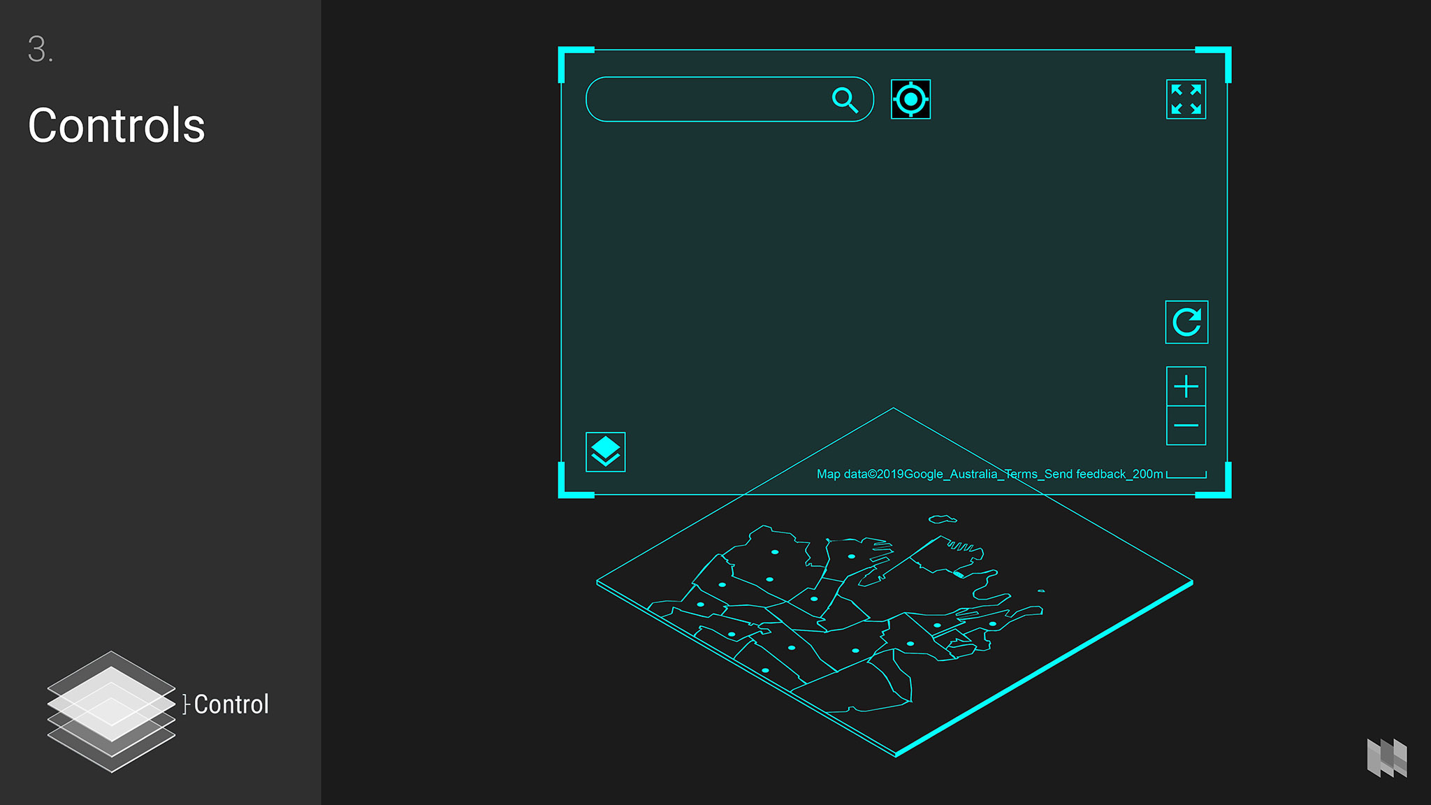
You can follow these rules in designing the controls:
- Place them within the bounds of your map to show what they control
- Place controls at the edges to ensure the focus stays on the map itself
- Use familiar icons to conserve space but if a function is less obvious, use labels as well.
Of course, there are some functions that don’t require direct interaction with the controls, eg: zooming can be achieved through the scroll wheel, pinching on a touchscreen, or the + and - keys. That being said, the presence of the zoom controls at least hints to people that zooming is available, whatever method of interaction they use.
4. Interaction
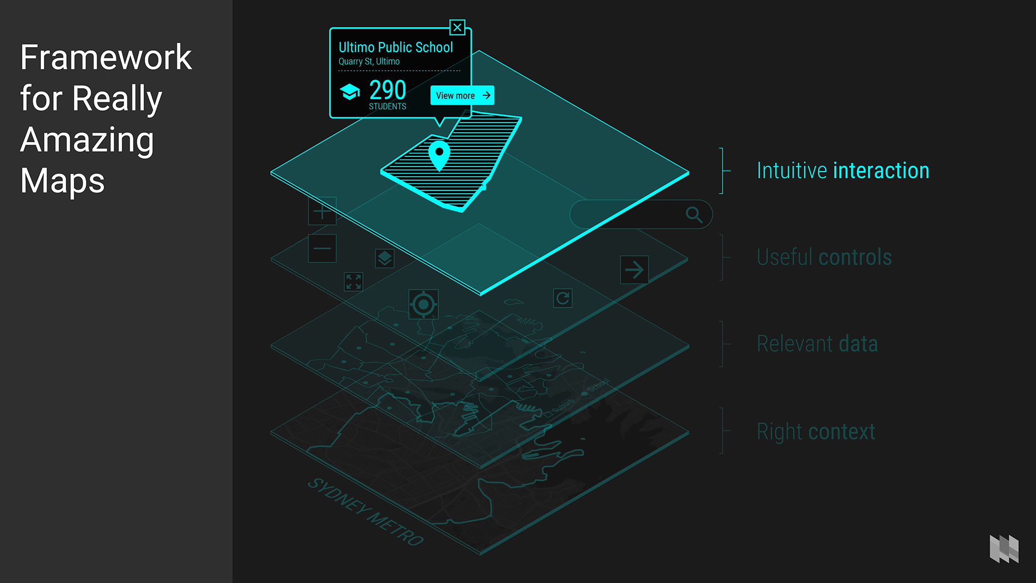
Interaction is how people can find more details and information in your map.
Interaction on maps can be viewed as fairly similar to regular UI design. It shares the same opportunities and challenges such as:
- Being clear about what is selected or filtered by designing a good selected state.
- Having a well-defined hierarchy, prioritising information and designing this in a way that’s obvious for the person using the map.
- How to use transitions and animation to support hierarchy and selections.
Just remember that no matter how small your map’s pop-up boxes may be, they should be treated like regular content, with a hierarchy and structure to make information clear and actions obvious.
Two examples: a simple static map and an interactive map
Simple static map redesign: Arts Centre Melbourne Visit page
The conference talk was held at the Arts Centre Melbourne so it seemed fitting to use an example from the webpage that involved a map.
Here is the example, found at the bottom of the Visit page.

Arts Centre Melbourne visit page map
The purpose of this static map is simple: to help people locate the Arts Centre so that they can plan their visit. Let’s break down this existing map down:
- Context. Generic Google map showing default colours and default points of interest.
- Data. One point, represented as a generic red marker.
- Controls. None.
- Interaction. A click takes people to maps.google.com with the Arts Centre pre-filled as the destination.

Now let’s think about how this could be improved:
- Context. Why do people look for a map in a visit us page? To figure out how to get to the Arts Centre. The map is focused on transport for this reason, removing all other points of interest. In addition:
- The Yarra River needs to be prominent (and still blue for familiarity)
- The CBD and some roads need to be marked to situate the user
- The map has mostly been reduced to greyscale to focus on the transport, water and data.
- Data. We attempted to include the Arts Centre logo into the marker, but it was a bit too intricate for the small area. The final redesign uses the brand pink and a little customisation on the marker, creating harder edges reminiscent of the triangle motif.
- Controls. Zoom in and out buttons have been added to hint at the ability to interact.
- Interaction. Unchanged, but is made a bit more obvious by showing controls.

There are of course some limitations to this redesign:
- We’ve made some assumptions about the purpose of the map
- Once implemented, we would probably need to move the marker to the centre of the map for technical reasons
- We kept the same dimensions as the original, but most likely it could be expanded to include more context.
Technical notes
We just used https://mapstyle.withgoogle.com to style the basemap and turn off features. https://snazzymaps.com/ provides a similar service that predates Google’s tool.
Interactive map redesign: Service NSW “Find a Service NSW location”
For the second example is an interactive map found at https://service.nsw.gov.au/service-centre.

The purpose of this map is for people to find their nearest Service NSW centre (to “apply for a licence, get a permit, register a birth, pay most fines and more”).
Breaking down the map using the Framework for Really Awesome Maps:
- Context. Generic Google map showing default colours and default points of interest.
- Data. Many points (around 200).
- Controls. Zoom, full screen view, Street View, switch between street and satellite basemaps.
- Interaction. People can:
- Search by location (typing or using geolocation)
- Click on a point for more details.

In terms of improvements:
- Context. We made the colour in the basemap less prominent in order to focus on the markers. Otherwise, we left the detail provided as it’s important for familiarity in finding location.
- Data. The mass of markers is not helpful because of all the overlapping. To solve this, we used clustering where the size of markers reflected the number of markers being grouped, helping to show distribution. Another effect of clustering is that it gives people a shortcut to zoom into an area.
- Controls. Nothing has changed, except the addition of a “Back to NSW” reset button.
- Interaction. We removed the duplicated information between the list and map to reduce complexity.

In addition, some general design improvements were made:
- Moved the map to the left, closer to the location search
- Reduced the size of the location search
- Ordered the list alphabetically
- Added a selected/hover state for the list that follows any interaction with the map
- We included Lord Howe Island which often gets left off of NSW maps for convenience.

Technical notes
- To style the basemap, we used https://mapstyle.withgoogle.com
- To get the marker data, we used React Developer Tools in Chrome (but a client would usually provide geospatial data in Shapefile, GeoJSON, or CSV for example)
- To cluster the markers, we built a prototype based on https://leaflet.github.io/Leaflet.markercluster/example/marker-clustering-realworld.388.html
Summary
I encourage you to apply the Framework for Really Amazing Maps to design your next map and hopefully we can give all users great map experiences by redesigning generic maps one at a time.
With a great map, you can go anywhere.
Reference and tools
Context
- Looking for standard Australian geographies like states, suburbs, local government areas (LGAs)/councils or electorate boundaries? https://www.abs.gov.au/geography
- Map Style with Google and https://mapstyle.withgoogle.com Snazzy Maps https://snazzymaps.com/ to style Google Maps.
- https://www.mapbox.com/mapbox-studio/
- https://carto.com/platform/vector-mapping-cartography/
- Satellite imagery and basemaps
Data
- Mapshaper https://mapshaper.org/ for viewing, zooming into, simplifying, and downloading geospatial files into SVG.
- Color Brewer http://colorbrewer2.org/ for helping you choose and understand different colour palettes for different types of data as well as accessibility.
Controls
- The Noun Project (find a good library?)
- Font Awesome (there’s a map-ee group?)
Further reading
- “How Useful is Tufte for Making Maps?” https://makingmaps.net/2007/08/16/how-useful-is-tufte-for-making-maps/ 16 Aug 2007, John Krygier
- “More Principles of Map Design” https://makingmaps.net/2008/02/05/more-principles-of-map-design/ 5 Feb 2008, John Krygier
- “Stamen’s Checklist for Maps” https://hi.stamen.com/stamens-checklist-for-maps-3bf845fad6ca 22 May 2014, Stamen Design
- This is more technical: “BEST PRACTICES CHECKLIST FOR CREATING MAPS WITH CARTO” https://carto.com/docs/tips-and-tricks/best-practices-checklist/ Last modified 11 Dec 2018, Carto and https://carto.com/academy/courses/design-for-beginners/
- Best Practices for Map Design: Introduction http://proceedings.esri.com/library/userconf/fed16/papers/fed_86.pdf Billie Eff et al Feb 2016
- “Prototyping a Smoother Map” https://medium.com/google-design/google-maps-cb0326d165f5 Aug 2018, Antin Harasymiv
- “Political Bubbles and Hidden Diversity: Highlights From a Very Detailed Map of the 2016 Election” https://www.nytimes.com/interactive/2018/07/25/upshot/precinct-map-highlights.html JULY 25, 2018, Upshot
- “Making your Map” https://www.icsm.gov.au/education/fundamentals-mapping/making-your-map
- Here’s a list of the data visualisation books that we have on the shelf at Small Multiples, including our mapping-related ones.
Need a beautiful map? Or do you want to work for us and help us design maps? Get in contact.