 View All
A Tale of Two Cities


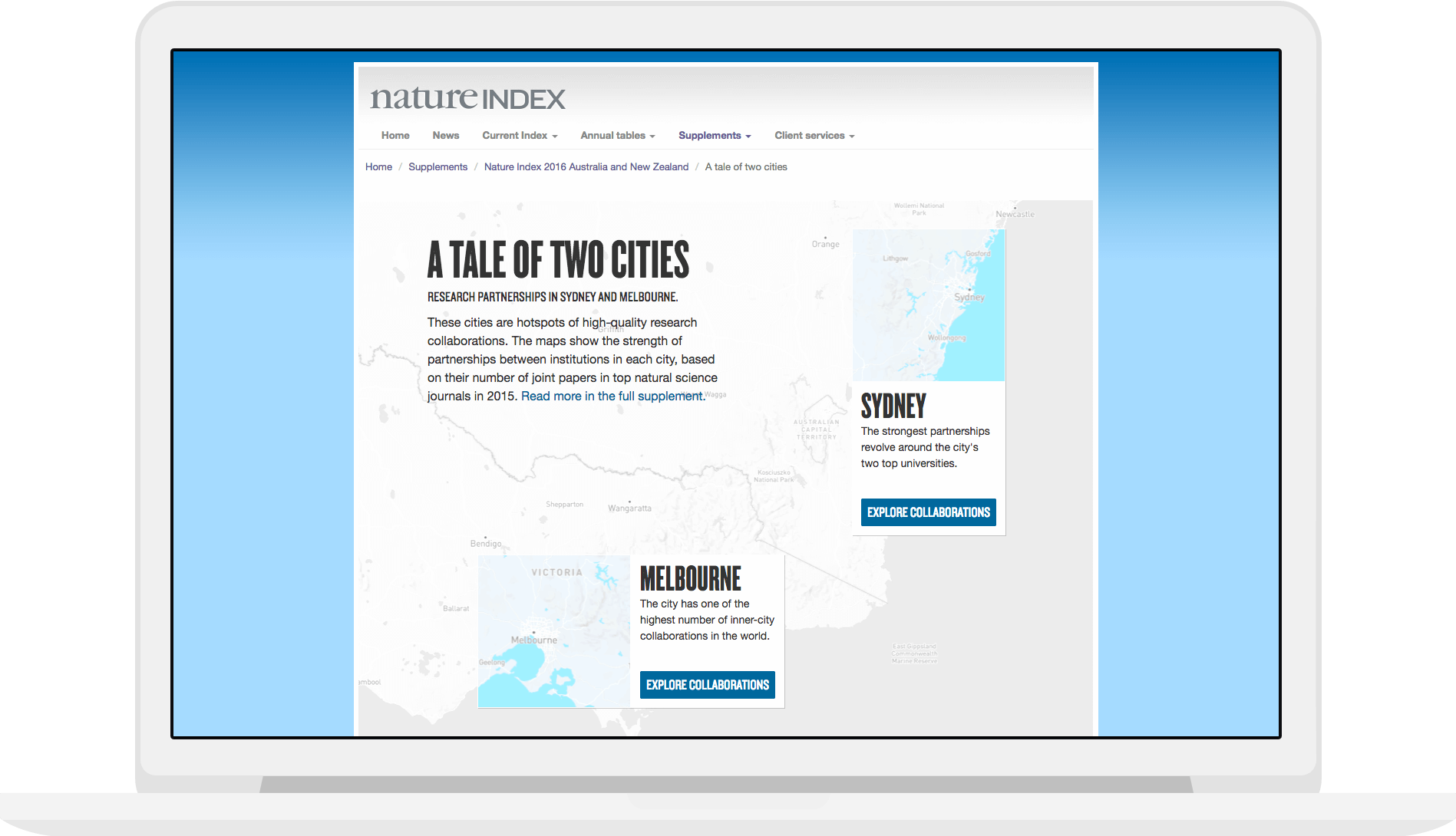
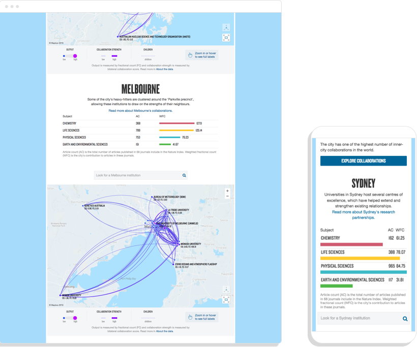
As part of a long-form article published in the Nature Index 2016 Australia and New Zealand supplement, Small Multiples were asked to create an interactive map to display each educational/research institute in Sydney and Melbourne with details not only about how much they collaborate, but how strong those partnerships are.
The Challenge
Melbourne had a high number of institutions that were clustered in one small area, whereas Sydney had institutions spread out over a large area. This created some serious challenges for design where we needed to ensure consistency and ease of navigation.
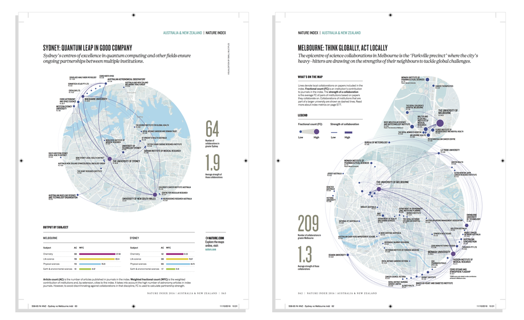
We were also asked to design the print version, which without any user interaction, had to display the same information with a consistent look and feel.
Our Process
After understanding the challenges posed, we did research on how other similar interactives worked through a comparative analysis.
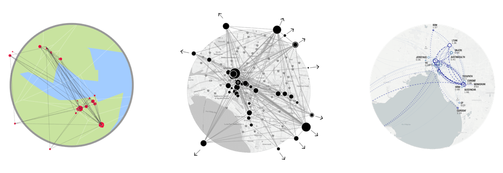
Armed with initial ideas and sketches, a storyboard of the map interaction was used to sketch out how we could solve the outlier issue, while prototyping was used to test the overlapping. The prototype allowed us to use real content and manipulate the lines and labels in a way that didn’t reduce the accuracy of the underlying data.
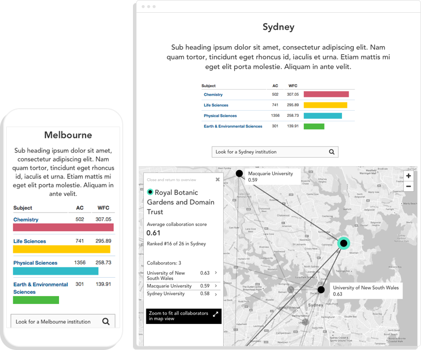
The storyboard and prototype informed visual design, which then fed back into the prototype and the final interactive implementation. The updated prototype was used as the basis for the print features, while the responsive interactive version was tested across devices and then handed over to Nature.
The Solution
The final product was elegantly designed fit for web and print purpose. The simple user interactions allow for easily consumable data and insights into these institutions.
Related projects and articles
-
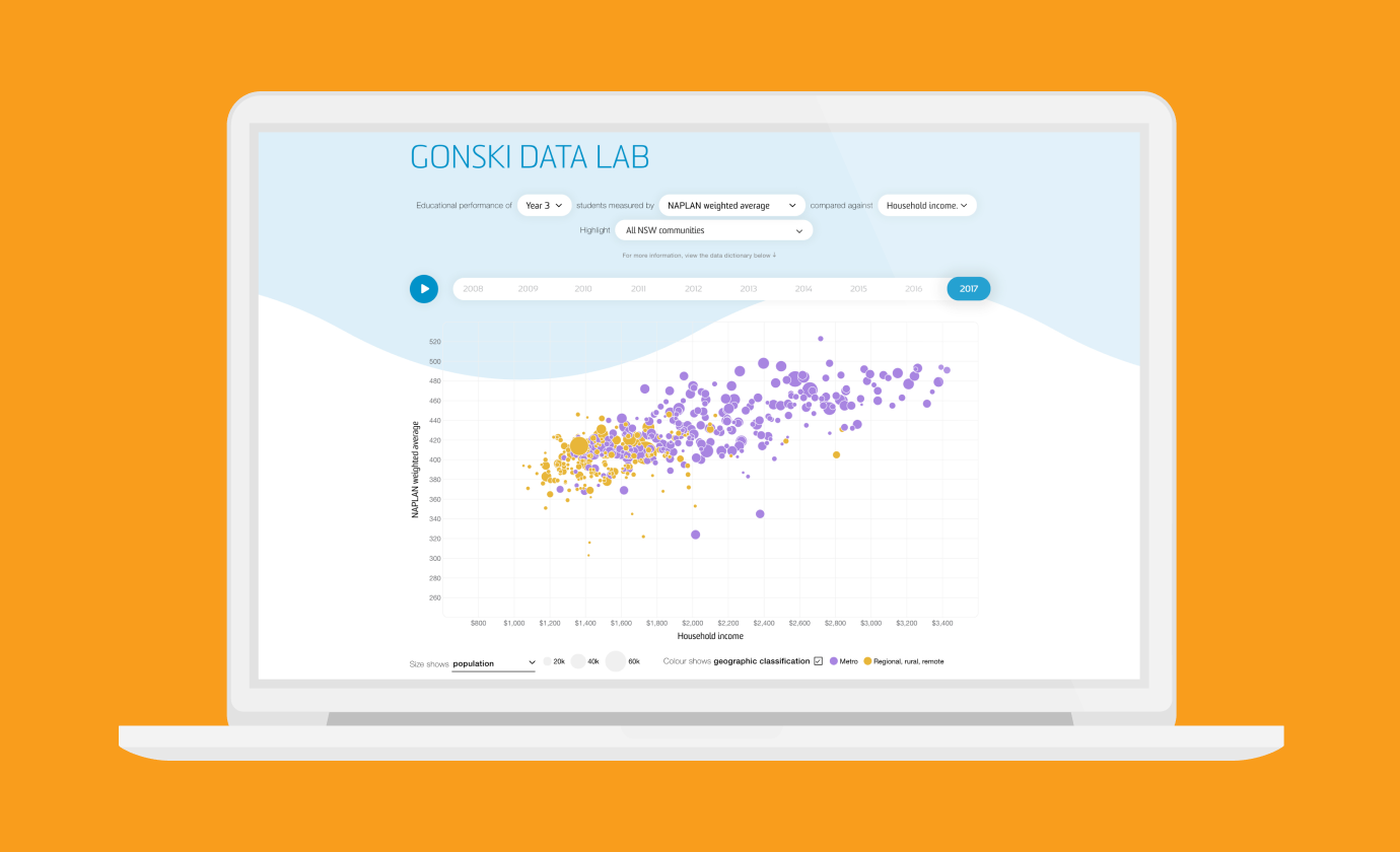
Revealing the social factors behind school performance
Gonski Institute for Education
-
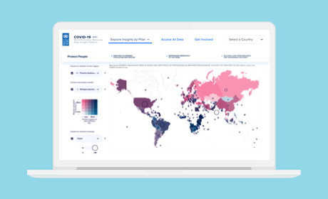
COVID-19 Socio-Economic Recovery Data Insight Platform
United Nations Development Programme
-
Using dot density maps to visualise complex population data
Article
-
What to think about when designing maps
Article