 View All
Visualising Digital Projects in NSW


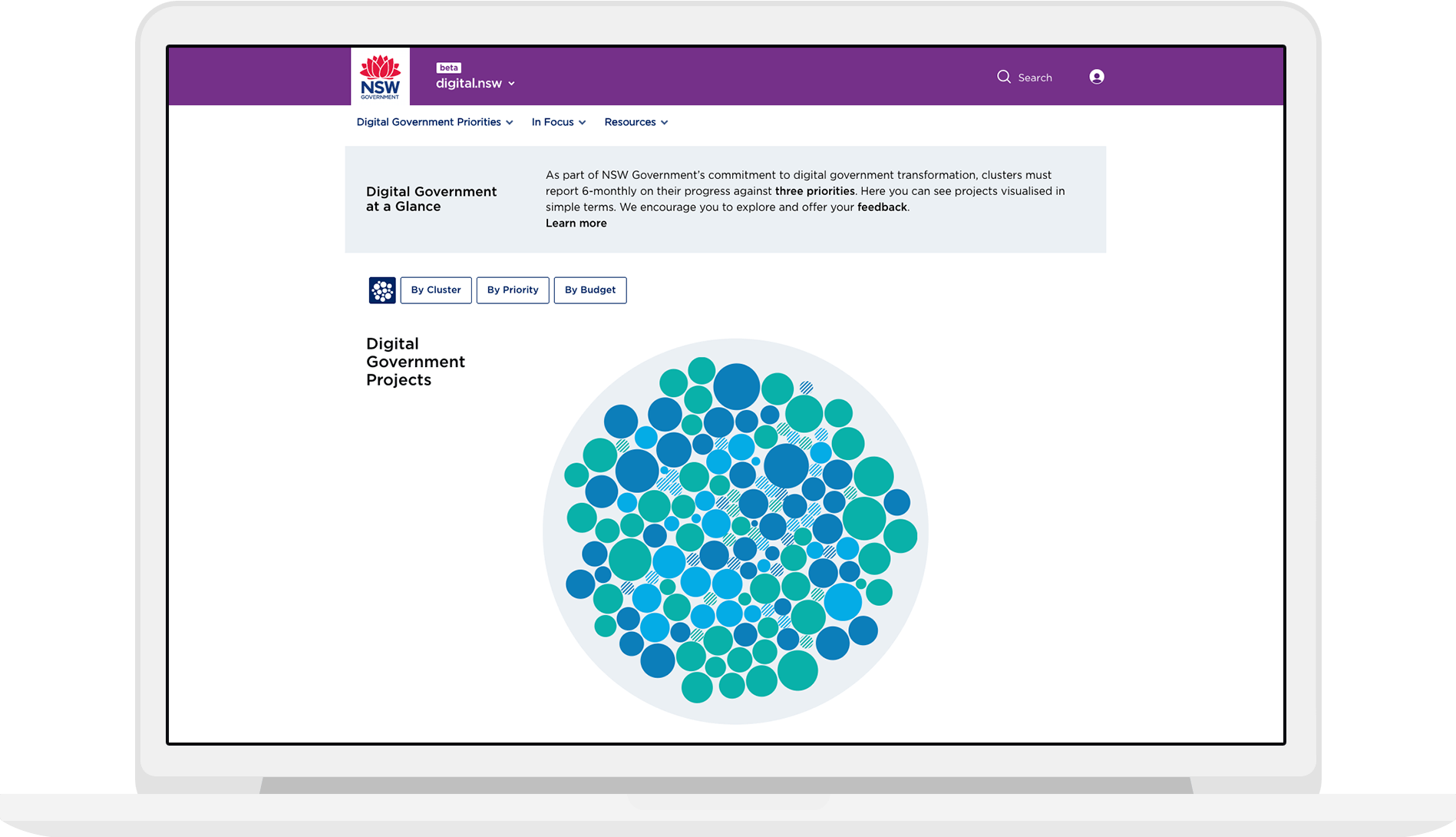
This project was part of a larger website overhaul. We worked closely with Adelphi (Website Developers) and the Department to build, embed and ensure these data visualisations were WCAG 2.0 AA compliant and responsive to tablet.
The tool had to be flexible enough to handle additional projects and still be easy to navigate and interact with.
The graceful design handles complexity with categorisation by:
- Cluster Agency
- Priority Pillars
- Budget Allocation
The project was launched on the home page, but is now in the “Projects” page under the “Data Visualisation” tab.
Dynamic Collaboration Links
The visualisation also needed to show how different government agencies were collaborating on various projects. The size of each ‘project’ bubble denotes budget, whilst colour represents the Government Priority Pillar.

Related projects and articles
-
Dynamic Dashboards for Data-Driven Policy Insights and Transparency
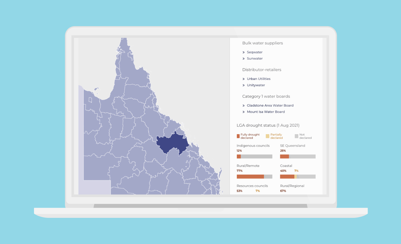
Queensland Audit Office
-
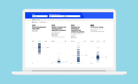
Interactive dashboard for the UN Development Programme’s 2020 HDR report
United Nations Development Programme
-
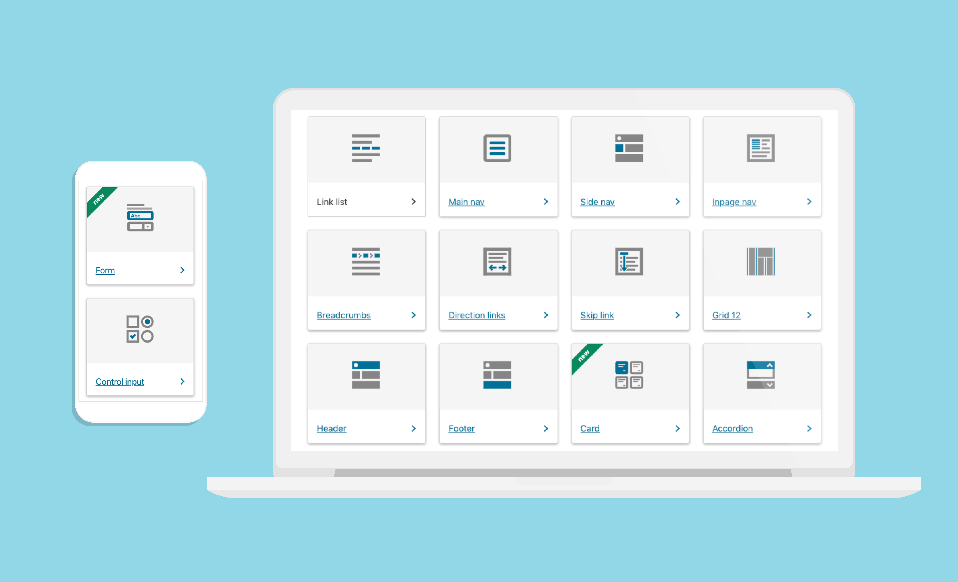
Data Visualisation in Government Design Systems
Article
-
Using dot density maps to visualise complex population data
Article