School Portal
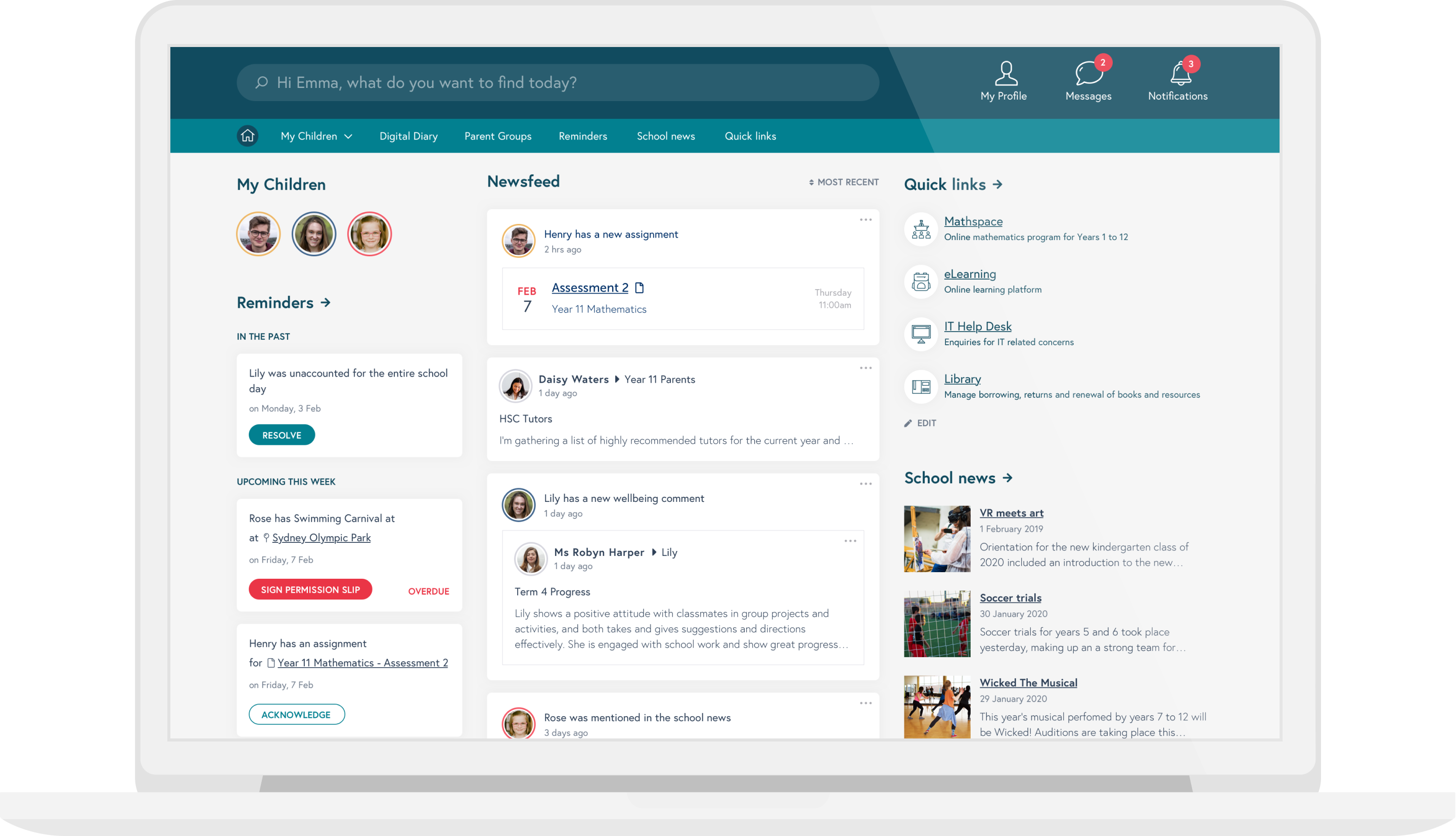
The Challenge
To create a school portal that would provide a gateway to all digital artefacts for students, teachers and parent/guardians, accessible on all devices. As a result, after initial pilot interviews, we determined the goals of each user group to be:
- A portal that helps students organise their school life, by keeping them up-to-date on their homework and assignments, as well as alerting them to any disruptions to their daily routine, such as timetable changes or upcoming events.
- A portal that keeps parents informed about the curriculum and their child’s progress, as well as being engaged and connected with the school through events and activities.
- A portal that allows teachers to conduct their daily routine as efficiently as possible, including marking attendance, homework and assignments, as well as being informed about any disruptions to their daily routine, including timetable changes and new events.
1. Stakeholder and user interviews
We talked to the school internal team in addition to interviewing principal to get more background on the project as well as their perspective on the portals.
We also conducted interviews with users of the system - specifically students, parents and staff. Our objectives in the interviews was to understand a little background of the participant to assess the context of the goals. We focused on extracting and understanding their pain points, what needs they have, and how they use the current portal and other technology.
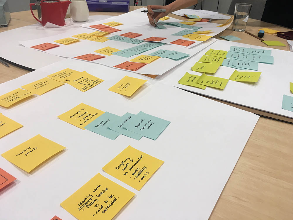
2. Co-design workshop
We conducted co-design workshop sessions with staff and parents of the school. As the needs of the students were the most well-defined, we did not conduct co-design workshops with them.
The purpose of a co-design workshop was to let a diverse mix of future users of the portal define issues and then specify potential solutions in order to discuss those among the group. This informed our future design deliverables.
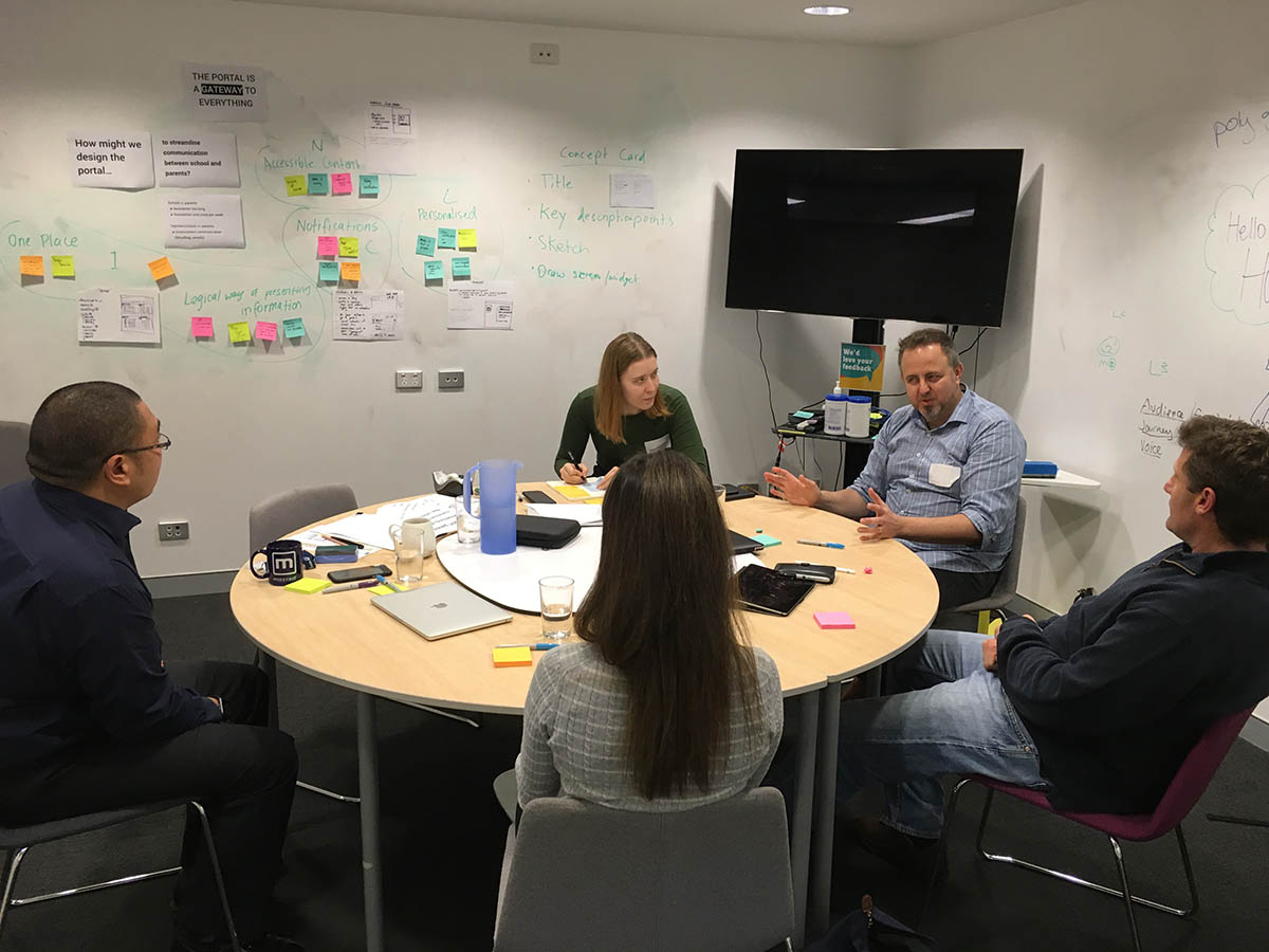
3. Wireframes and concept testing with users
We created high-fidelity wireframes to encompass all the needs and goals of the users that were discovered during user research.
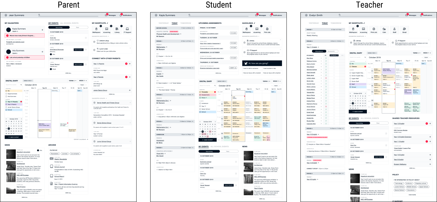
These wireframes were used in the concept validation sessions that we conducted with the 3 user groups, with the purpose of guiding designs moving forward and identifying considerations for build. The objectives of these sessions were to:
- Gauge first impressions of the portal
- Identify what users value about the proposed portal
- Measure how well the proposed design addresses the identified pain points and successes
These outputs were recorded and grouped by user type:
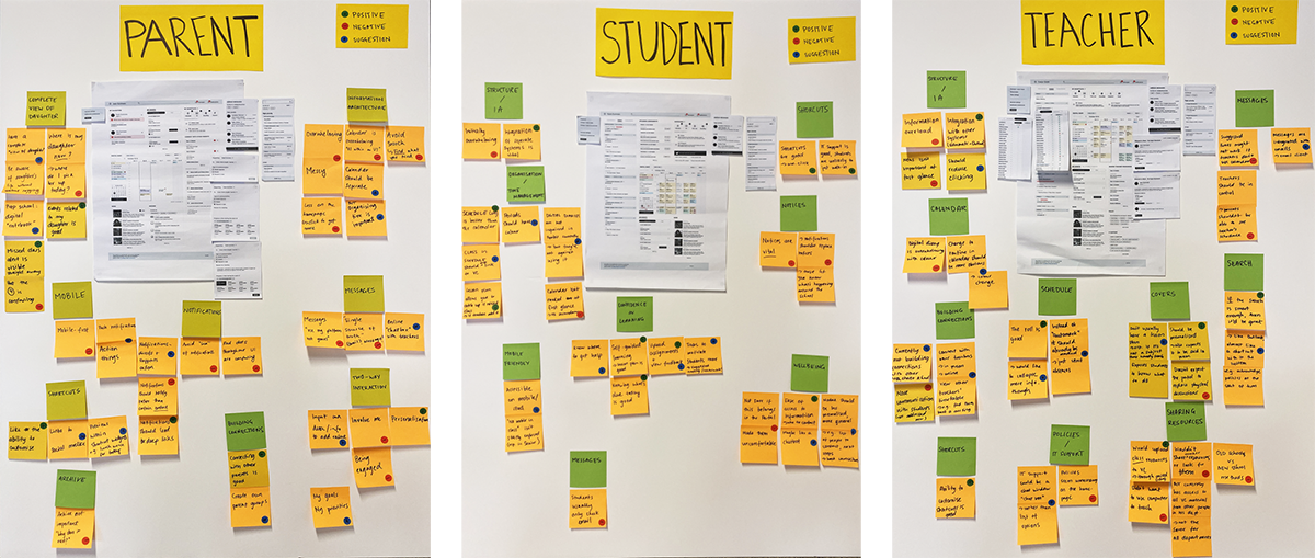
After gathering feedback and synthesising the results, we created a second version of the wireframes, ensuring to continuously improve the landing page so that it was inline with user needs, goals and expectations.
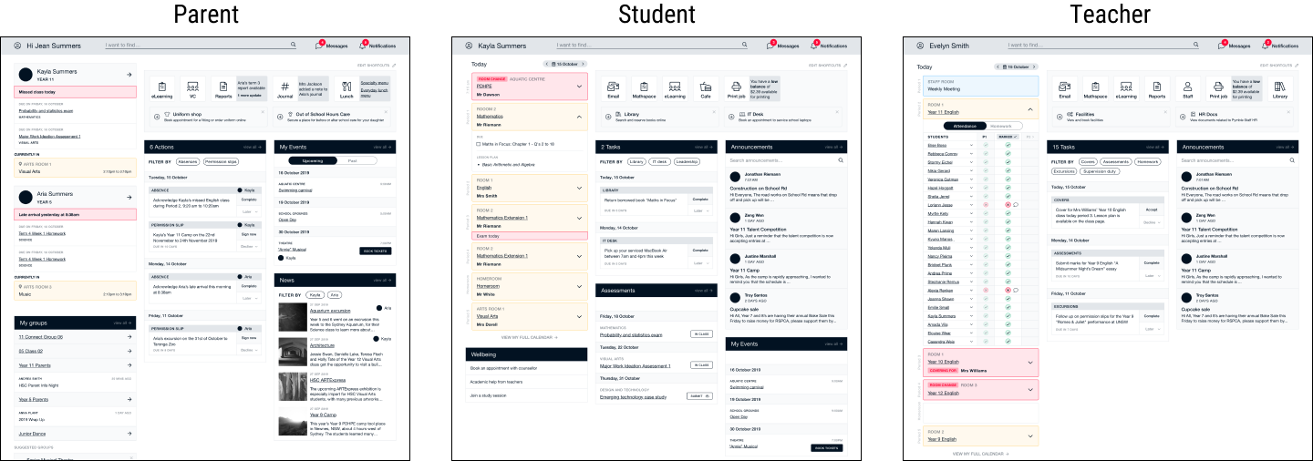
4. Visual Design
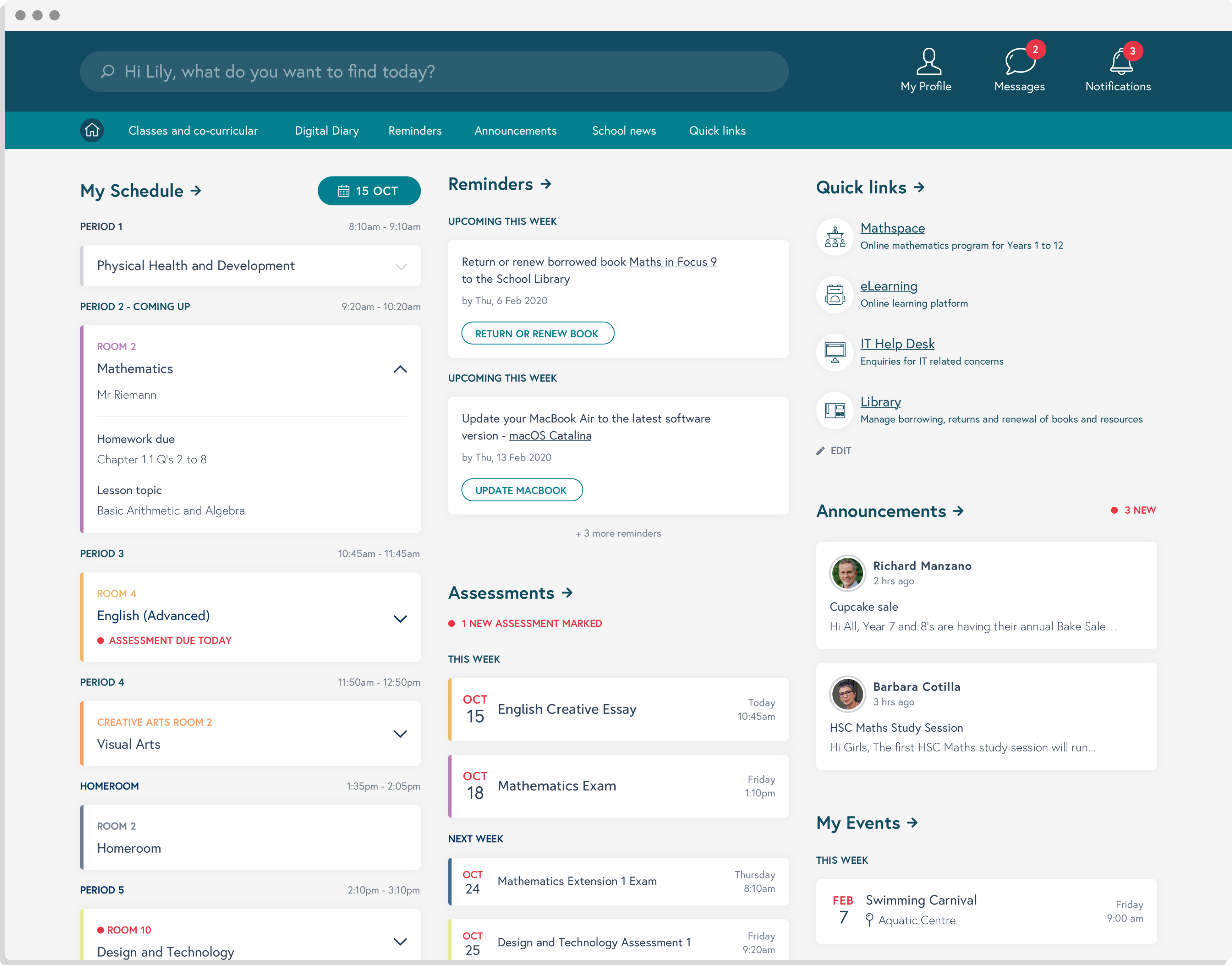
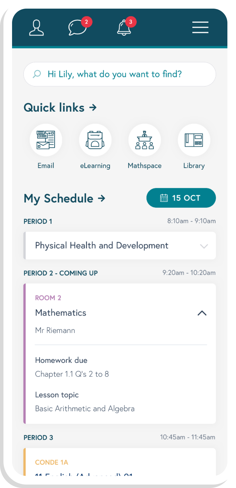
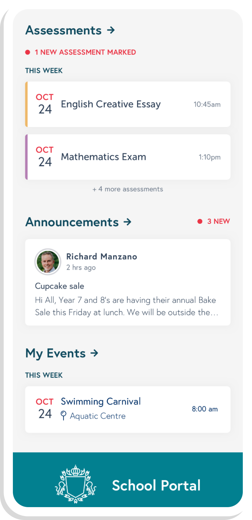
The next stage of the design process was to create visual designs for the landing page, making sure to reflect the brand and message of the school. However, since the actual designs are confidential, we have opted to change the colours and typography for this showcase.
Through visual design, we were able to further improve the user experience by using colour, typography, layout and iconography to better communicate the functions of the portal.
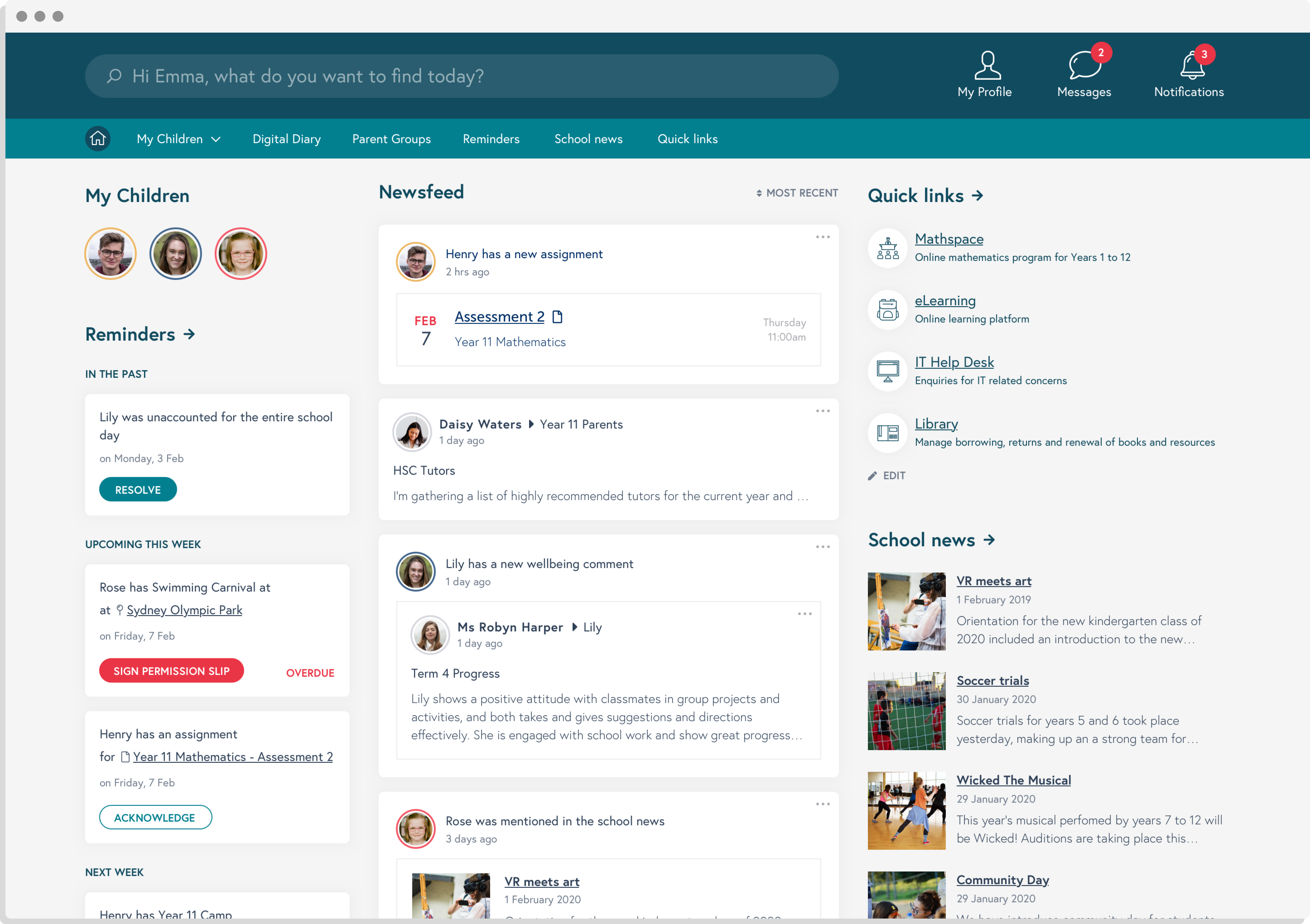 Parent’s portal landing page.
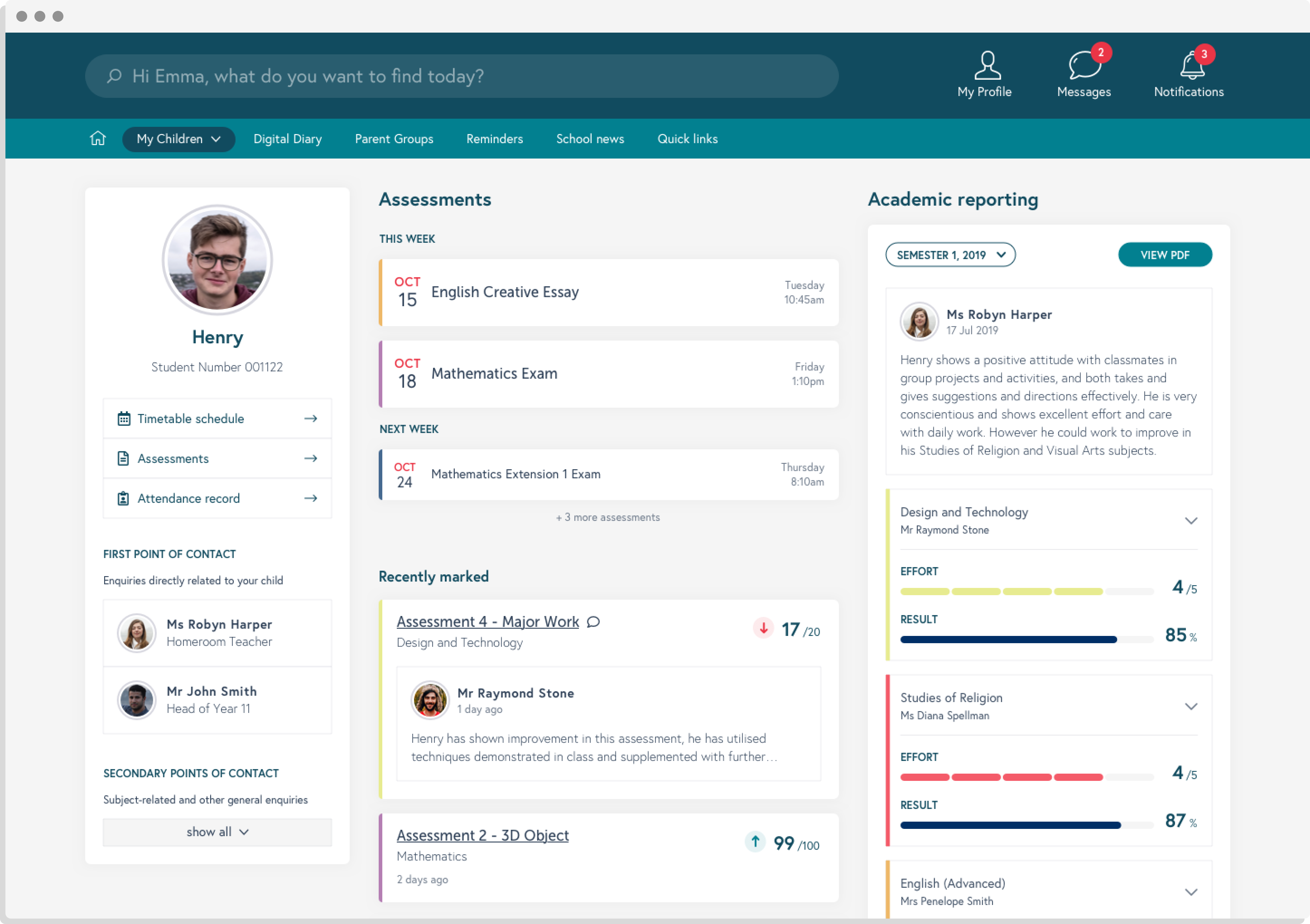
Profile page of student from the parent’s portal.
The Solution
- Detailed documentation of the user research process, that can be used as rationale for future pieces of work.
- Wireframes defining features and functionality.
- Foundations for the creation of a design system to be handed over to the development team.
 View All


