View All


Lorem ipsum dolor sit amet, consectetur adipiscing elit, sed do eiusmod tempor incididunt ut labore et dolore magna aliqua.
No I didn’t forget to add in a block quote - this article is actually about Lorem Ipsum. Well, a Lorem Ipsum of sorts.
You’re probably familiar with the Lorem Ipsum text, the famous pseudo-Latin placeholder text that can be used in wireframes and mockups when the real text isn’t available. Actually in doing UX for data visualisation, we often have the same task. We need to fill in a wireframe with something that gives a realistic idea of the data that will be displayed. So, how best to design our wireframe? Or: What is the Lorem Ipsum of data visualisation?
But first, a little background on the design process as we know it:
The design process
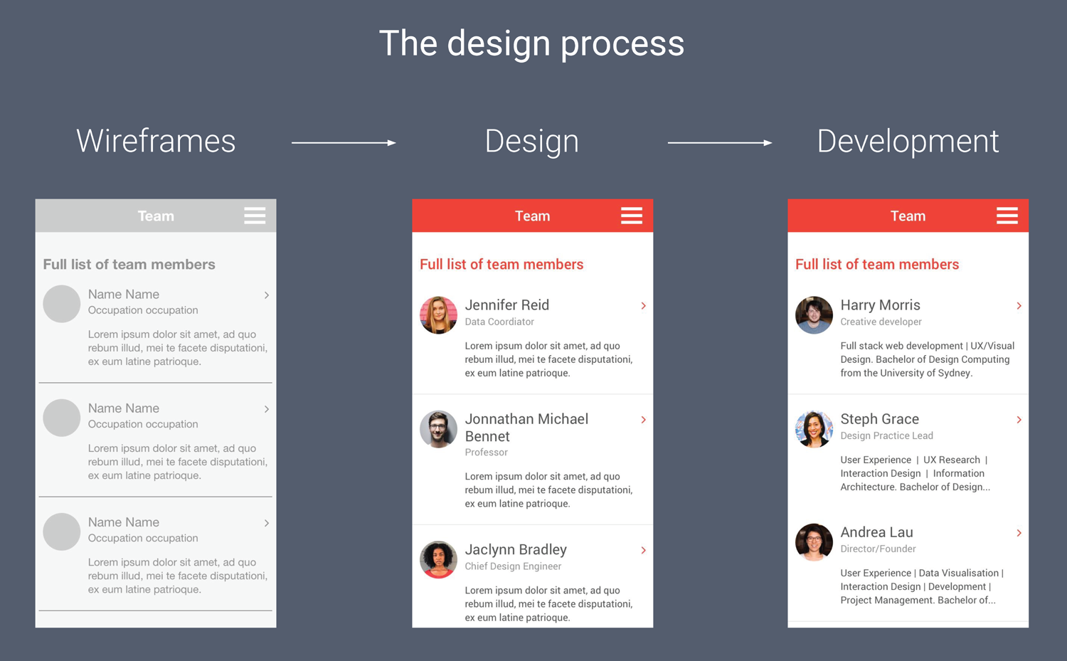
A regular design process is often carried out in three steps:
Step 1 - Placeholder content (Wireframes)
The first step in a regular design process is making the wireframes. In the first screen above, you can see the wireframe for a mobile application that includes a lot of placeholder elements - just ‘Name Name’ for the team member’s name, and Lorem Ipsum for the description.
Step 2 - Random but meaningful content (Design)
The next step is often to add “random but meaningful” content - stock photos, random names, random job titles and the like. This achieves two things: first, you get a good sense of how your page will look and feel, and secondly you can see if the content has any unexpected side effects on the design. For example in the second image, you can see that a long name has overflowed onto a second line.
Step 3 - Real information (Development)
Then the third stage is the actual development, and that’s when people normally introduce the real data.
In other words, wireframes contain the basic structure of a page very early in the process using placeholders, and then meaningful content is added later.
How the design process fails for data vis
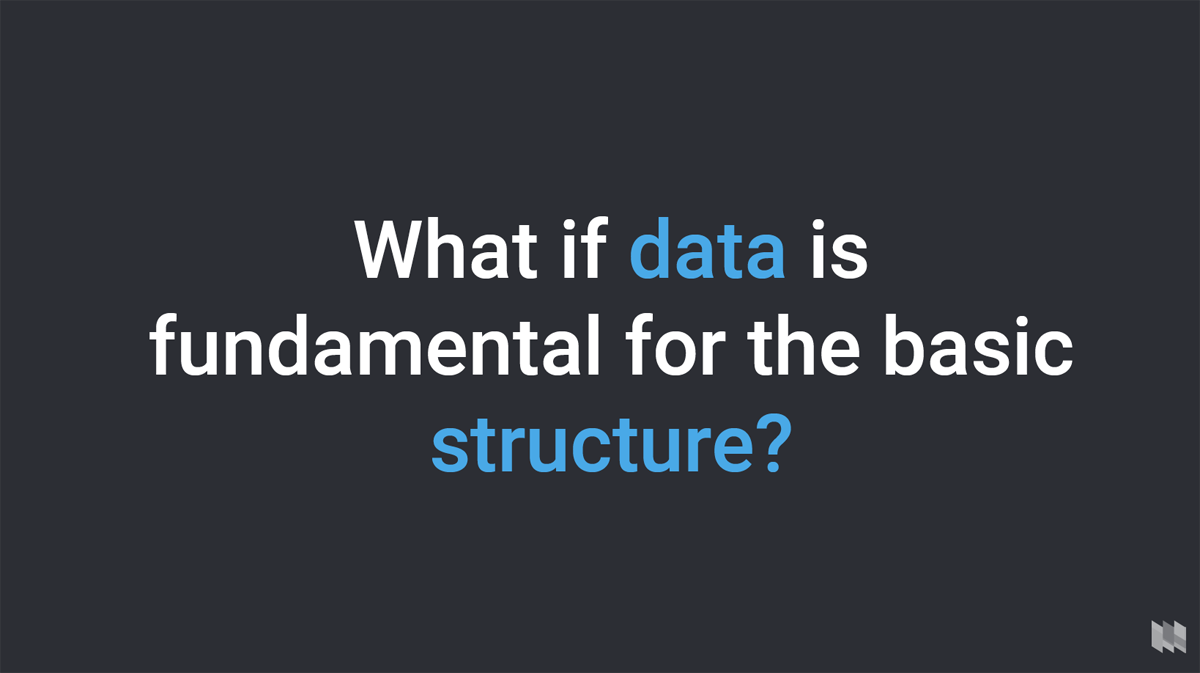
But what if the content (or in our case, data) is fundamental to the basic structure of what you’re building?
I think you can imagine the problem. Say for example we’re designing a complex interactive bubble chart - it’s easy enough to draw a wireframe with a series of circles, but when the real data arrives, it might completely throw out the design. What if there are too many data points? In that case, maybe we should have added a search function, or some visual hierarchy to make the important data points more prominent. What if some data is missing or incomplete? Suddenly we need to accommodate that in the design. Maybe if the data is too different to our expectations, we need a different kind of chart altogether.
What this means is that we often need to use real data right from the start, from the wireframe stage. If wireframes show the basic structure of a page, and data is fundamental to the basic structure, we have to put data into the wireframes. In other words, we have to bring parts of the whole design process into our wireframe stage - not just placeholder content, but also meaningful and real content.
In reality, using real data in wireframes isn’t always possible or necessary - depending on the project, it can be OK to start with ‘meaningful but random’ content, or even placeholder content. But the ideal case is normally to use real data.
When you should use real data
I would say that whenever data is fundamental to the structure of your application, you should use real data in your wireframes - providing it’s available, of course. Not only does this save development time by identifying problems early, but the client will also love it. There are tools that help add real data to your wireframes, and I’ll discuss those at the end.
Let me give an example based on a project we did at Small Multiples, where using real data at the wireframe stage saved us a lot of time in the development stage.
This is an app called FrogId that we designed for the Australian Museum. It allows you to record a frog call and its location, and send the data to experts at the museum so the species can be verified and added to the map.
The task was to build an interactive map of Australia with locations of all the frog recordings, and total occurrences by frog species, date range and LGA (Local Government Area).
We started with some sketching, and based on that we realised we’d probably have to put real data into the wireframes. In this case, the visualisations are fundamental for the interaction, and we had the data already, so this made a lot of sense. Using the Data Populator plugin for sketch (discussed below), I was able to populate the wireframe with real data.
Using this data in the wireframe stage enabled me to see where the data challenged (or broke) the original design ideas. For example in this case, there were cases where clusters of frogs were positioned in exactly the same place on the map.
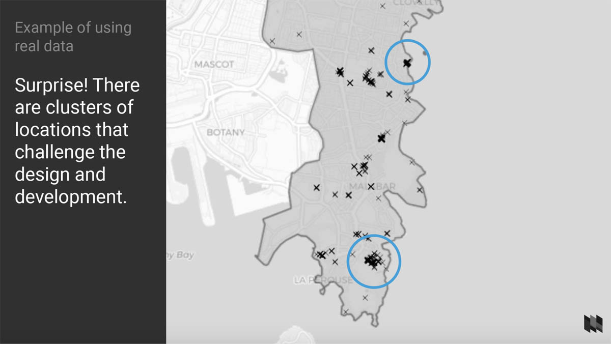
As a UX designer I was able to come up with a solution (a tooltip with a little carousel built into it), check the feasibility with our developer, and avoid a nasty surprise later in the development process.
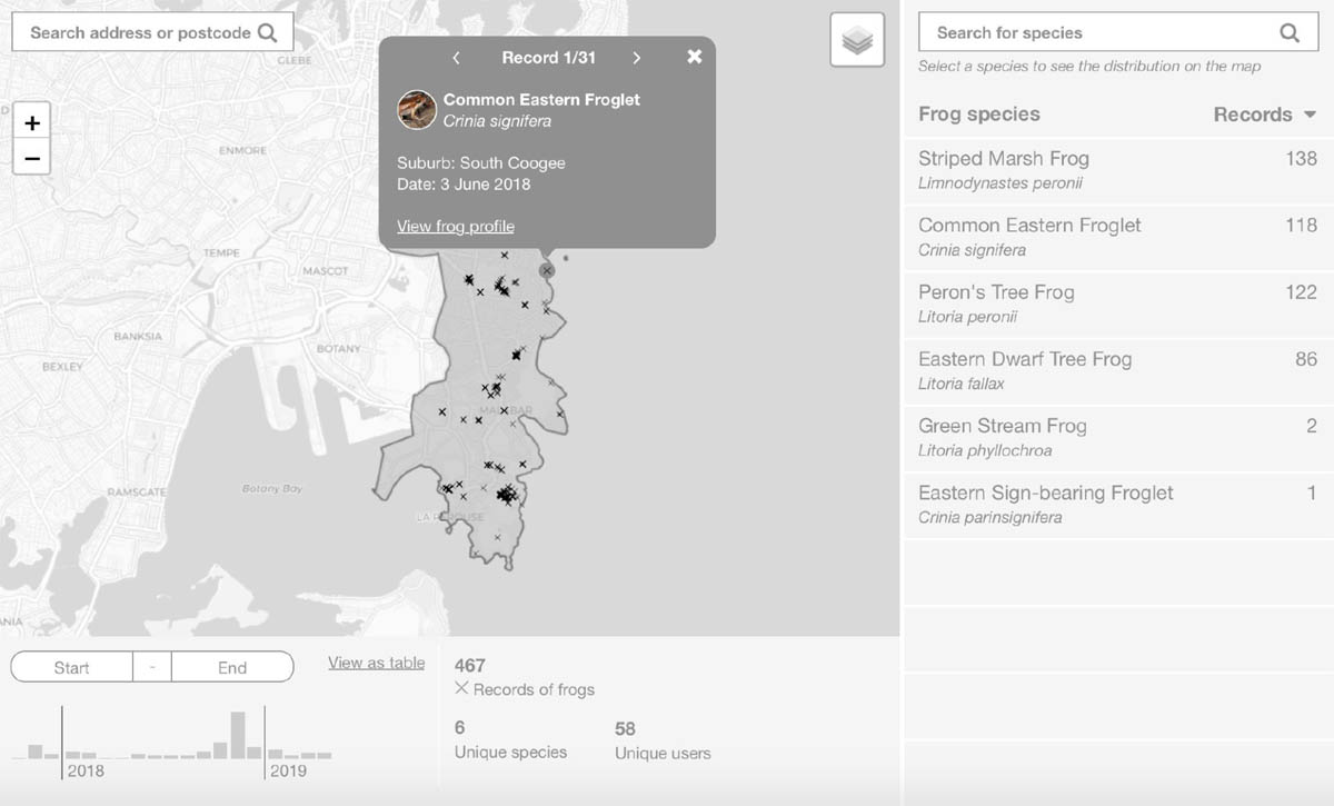
And you can see, the final developed project ended up looking very similar to the wireframes: even the numbers were similar.
When you should use ‘meaningful but random’ data
If there’s no real data available when you’re at the UX design stage, the next-best strategy is to use meaningful but random data. The meaningful part of this equation is important. Meaningfully random data means that even though you’re not using real data, you have some information about the data - the approximate number of data points for example, their range and spread, and so on. If you don’t have these things, then your data is just random!
Let me give an example based on a project we did at Small Multiples. In this case I thought I was using somewhat meaningful random data, but it turned out to be simply random. As you’ll see, that caused a few problems.
The brief for this project was to build an interactive online visualisation of New South Wales government projects, and show their alignment with the three priorities of the government’s overall digital strategy (Data, Digital on the Inside, and Customer Experience). We had to arrange the projects by government department, priority and budget.
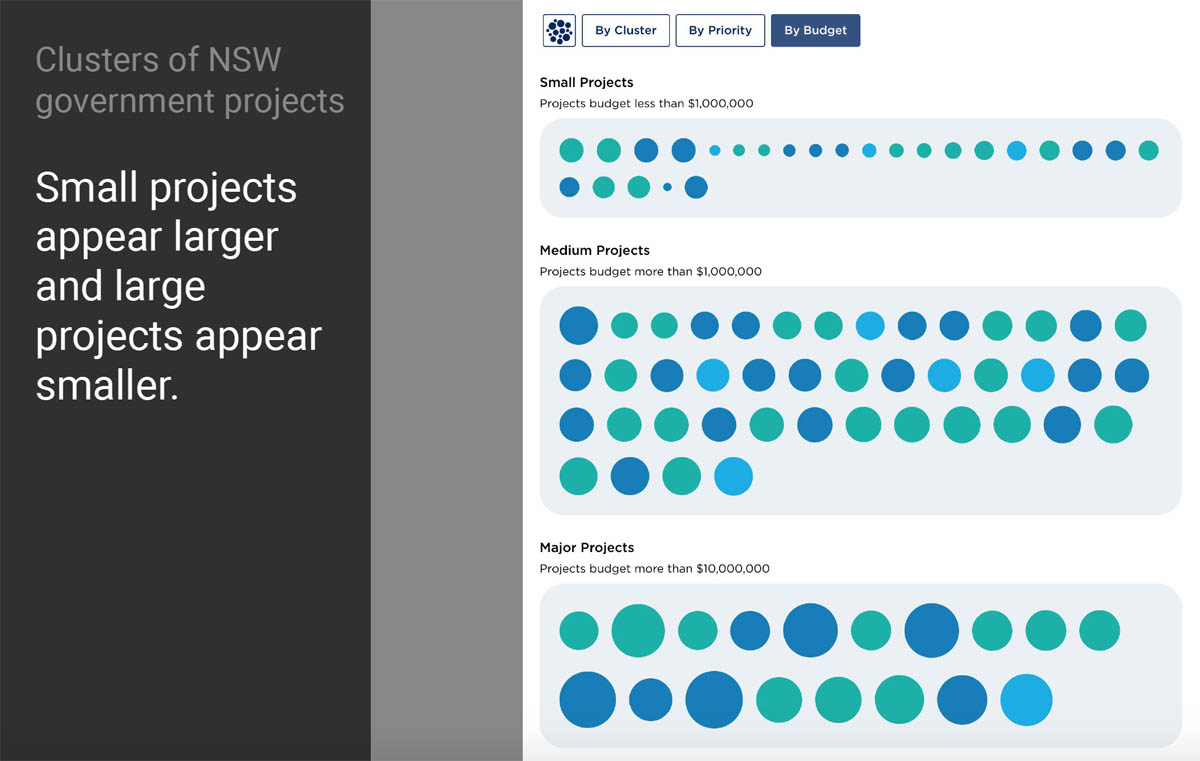
We decided to show the projects in a force-directed bubble chart - each circle or bubble represents one project, the size of the circle represents the budget, and the color (or shade of grey in the case of wireframes) represents the digital strategy they are aligned with.
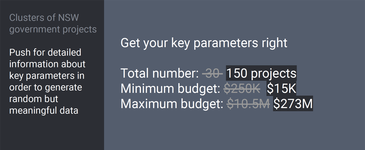
For this project we couldn’t use real data at the wireframing stage because we didn’t have any - the only thing we client told us was that there will be roughly 30 projects, grouped into these three strategies. So all I could do was distribute the projects evenly among the strategies, and randomly apply some budgets.
Of course when the real data came in, there were some surprises.
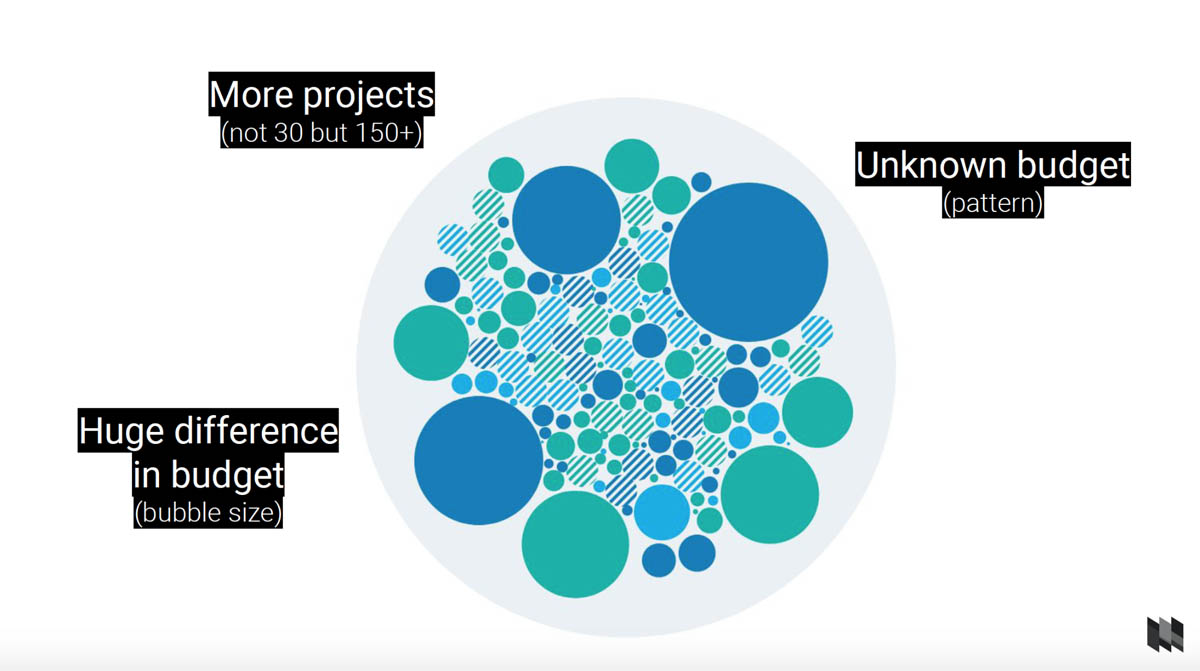
Actually there were three major surprises. The first was that there were way more than 30 projects - there were over 150 projects. That created findability issues in the graph, and if we’d known that from the start, we might have designed in something like a search function.
The second problem was that some projects simply didn’t have a budget assigned to them, and no budget means no bubble size. So our visual designer had to jump in again during development and solve the problem - assigning a default size to bubbles with no budget, and a special pattern to indicate that their status was uncertain.
The third problem was that there was a huge difference in budget between projects, much more than we expected.
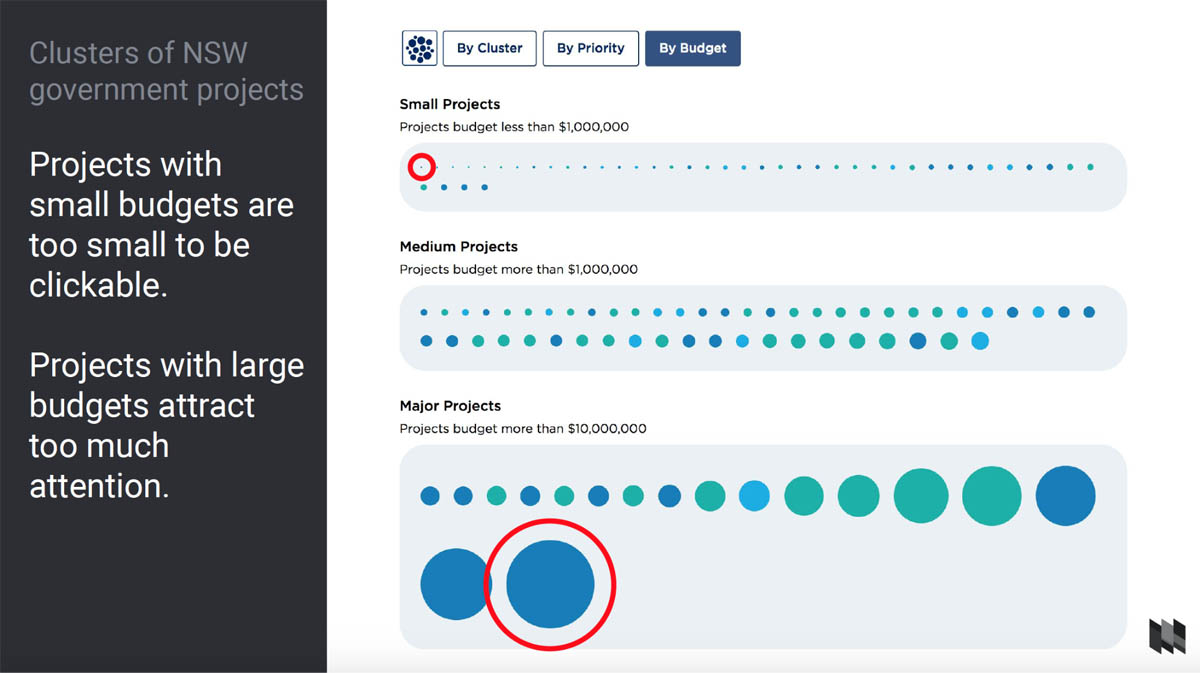
The largest bubbles were huge and drew all the attention, while the smallest projects ended up being barely one pixel wide, and impossible to click on. So we ended up applying a logarithmic rather than linear scale to the spread of budgets, so that the outliers were brought in closer to the centre.
So in this case although I was trying to use ‘meaningful but random’ data, it was actually closer to meaningless data. This meant a lot of disruption during the development process as the data came in. In retrospect, what I should have done was push a bit harder for realistic estimates of the data from the start:
When you should use placeholder data
Despite all the benefits of using real data in your wireframes, there are cases when it makes sense to just use placeholder content - grey boxes, empty squares and so on.
I do this when the data isn’t fundamental to the structure of the application, or the visualisation itself is fairly well defined before the project begins. In this case, adding real data to the wireframes will only waste time, while not really adding value. I’ll give you an example based on a Small Multiples project.
Poverty and Inequality Portal
The brief here was to create a website that showcases existing figures and charts about poverty and inequality in Australia, and to include filters so people can explore graphs by theme.
Even though this site contains a lot of charts, it’s not a case where the content of the charts determined the structure of the site too heavily. Basically the charts were all pre-existing, self contained items, and the main functionality to design was the filtering and categorisation of the charts.
We did include one key graphic that has a title in the chart, just to give our client (the Australian Council of Social Service) an idea of how it would look and what the placeholders actually represent. But including more charts wouldn’t have provided much extra value, so I think using placeholder for this was the right way to go.
When you should give up on wireframes altogether
The overall aim of my design process isn’t to create great wireframes, it’s to create great data-driven products. Sometimes, wireframes just aren’t the best solution. Here’s an example, based on a Small Multiples project:
Iggy Get Out
The brief here was to visualise and compare large amounts of genomic Information, exploring a network of chromosomes, mRNAs micro RNAs and proteins to support a studies about neurodegenerative diseases like Alzheimer’s. Here’s a screenshot of the finished project:
There’s a network visualisation in the middle, and a sidebar for filtering.
The visualisation contains four circles - from inner to outer they represent the chromosomes, mRNA, micro RNA and the proteins. There’s over 3,000 nodes and 6000 relations in this in this visualisation, which is already extremely complex, and even more so when you include filtering and clicking.
So how would you create a wireframe for something that complex? The answer in our case is, we don’t. So instead we created sketches with detailed annotations that communicate the data and the interactions.
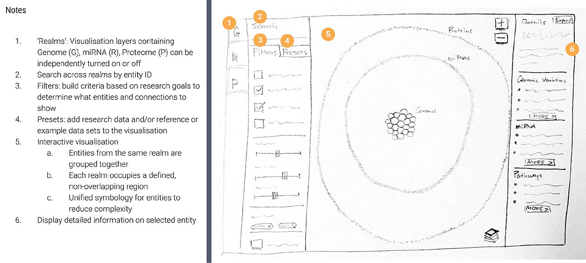
In this case, the scientists were so immersed in their data that they were able to validate the designs just based on our sketches. We did have a small surprise, in that there were a lot more nodes in the second circle than expected, so we had to switch to a denser ‘sunflower’ style arrangement.
Tools
So if we’re going to use real data, or at least meaningful random data, how do we get it into our wireframes?
One approach we often take is to create the charts or visuals in another piece of software, and then just import images or screenshots into our wireframes. For example in the case of the frog project we used the mapping software QGIS.
The second approach is to use plugins within your wireframing program, so for example we usually use Sketch in combination with the Data Populator plugin or Chippencharts.
For the frog map sidebar for example, we had to include the common and latin names of each species and the number of recordings. That would have been extremely tedious to do by hand, but all we had to do with Data Populator was give it a data file, click OK, and all the fields were populated.
Chippencharts is an open source Sketch plugin that we developed ourselves at Small Multiples. With Chippencharts, you can create bar charts with random or real data.
Final thoughts
I think it’s fair to say that if that if data visualisation is fundamental for the structure of an application, we should use real data. If we don’t have real data, then ‘meaningful but random’ data is a good and valid option - but only if it’s actually meaningful and within an approximate expected range, not entirely random. And finally if the data visualisation is not fundamental to the structure or interactions within the application, then it’s OK to use placeholder data. On the other hand, sketching can be a valid alternative where the data is too complex to effectively wireframe.
If you use real data in your wireframes though, you can really test your design, spot challenges and have educated conversations very early in the process. But most importantly - using real data is fun, and clients love it!