View All


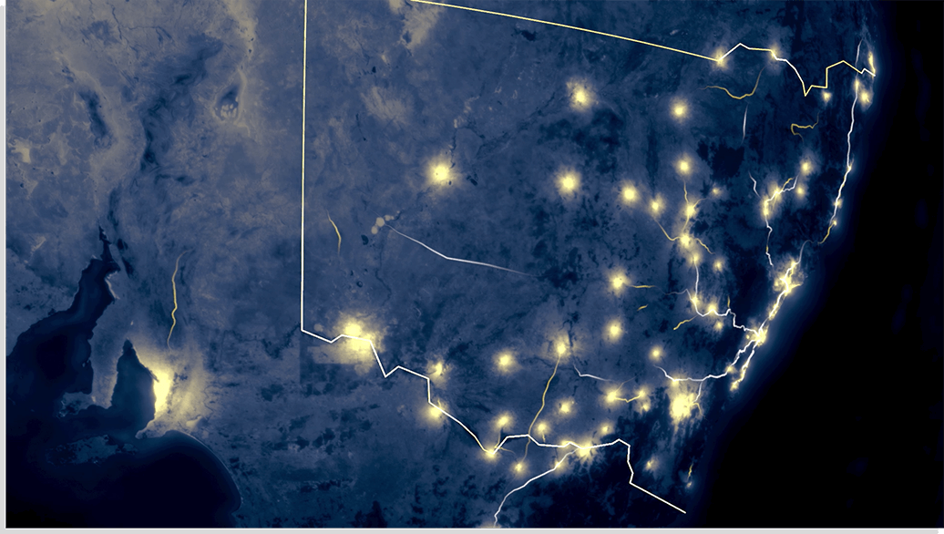
Animating spatial data is not as simple as making a screencast of an existing interactive map. As we’ve experienced while working on a recent project for Transport for NSW, it’s about creating a storyline that the viewer can follow, a journey through geographical space and time.
What makes the video medium powerful is that you can carefully orchestrate visual and audio cues to immerse the audience into the world of data. This allows you take advantage of and direct the user to the most interesting and important aspects of the visualisation.
It’s about being selective about what you show, and realise that there will always be a battle between data accuracy, visual aesthetic and the user’s attention span.
1. Design for your audience first and foremost - do they need a detailed explanation with a dense visualisation? Most times the answer will be no - unless you’re designing for an especially specific and expert audience, in which case an interactive is the best way to go. Video spatial data visualisation is more about hinting at the potential insights that the data can provide, rather than giving away everything it contains.

2. Length and timing are key where user attention span is a precious resource. You want scenes to be short and to the point, but not so fast that the viewer misses key information. Consider continuous camera movement - how do you evoke the right emotional reactions from the viewer? Perhaps slowly following a single object in view as it moves through the space, and then exponentially speeding up as more objects appear, building up anticipation and excitement.
3. Zoom is a vital component in animation, where the camera can start at the most detailed level, focusing on a single aspect that can describe the dataset, and then gradually zoom out to show the big picture. In both of those instances it’s all about focusing on the small - a single aspect to grasp the concept - and the adding more elements to create context and communicate the scale of data. This allows the viewer to understand the meaning behind the data, even when more elements are added.
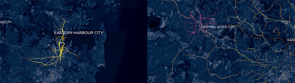
Collaborative use of zoom and movement to show the most interesting aspects of the data, in this case public transport routes connecting all 3 cities together within a 30 minute travel time.
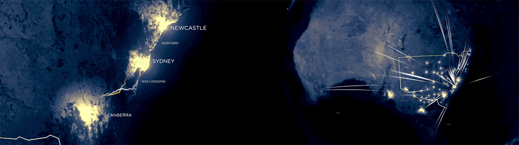
4. Storyboard and prototype to get the timing to perfectly align with the concept. This allows you to iterate quickly and plan your storyline; but you can also take it a step further by combining it with rapid prototyping and with data. Google Earth Pro is an excellent resource that allows you to visualise spatial data, with complete control over the camera view. You can import geolocation data in almost any form (lines, polygons, even 3D models) to create a rough cut of your visualisation using their Movie Maker tool. As a bonus, animation is possible if you know a bit about code and KML.

Storyboard - created using Google Earth, Transport for NSW data, and custom Google Map routes
3D Animation Video - created using Unity with processed data from Transport for NSW
5. Test it and test it again. Much like getting user feedback on a design and implementation, a good indicator of a coherent story and timing is to get someone unfamiliar with the video to watch it, and then relay what they have understood. Is the feedback you’re getting what you want your audience to take away from the video? If not, adjust your timing, audio and perhaps even camera movements to narrow down on your concept.
3D spatial data visualisation gives us a whole new dimension to experiment with. The key is to apply basic filmmaking techniques - such as camera angles, movement, transitions - as well as UX principles to convey the story.
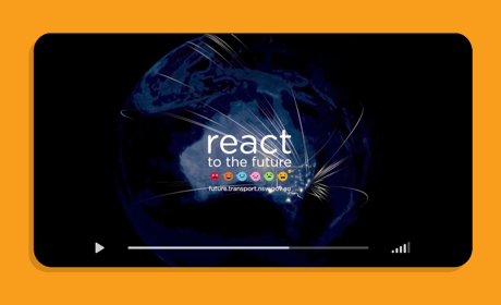
Take a look at our final spatial data animation video for the React to the Future project below.