View All


It’s said that artists and scientists, no matter which subject they’re researching, are always investigating themselves at the same time. In the case of Jack’s projects, at the same time that he’s crunching census data and scraping newspaper articles, he’s often using data to make sense of his identity as a Chinese-Australian in the context of Australian society.
He’s noticed that public conversations around Chinese-Australians are often coloured by links to national security (shades of the ‘Yellow Peril’ hysteria of yore), and that Asian Australians are underrepresented in politics. Jack wanted to know - was he imagining these problems, or were they real? So he turned to his tool of choice - data visualisation.
Jack first showed visualisations attempting to map the true diversity of Sydney. Conventional choropleth maps tend to paper over the fine details with general averages, and using conveniently available boundaries (such as local government areas) which may not be directly relevant to the data set at hand. In the case of mapping diversity, it’s important to see how different cultures live side by side, as well as how they concentrate in particular suburbs. So Jack chose a mapping approach that used one dot for every 5 people speaking a certain language at home.
Looking at the average faces of Liberal and Labor MPs however, the same diversity isn’t quite as apparent:
These were generated using open source Face Morpher software, using photos from Australian Parliament House. Jack first posted about this project earlier this year.
How are different cultural groups are spoken about in the media? Jack scraped newspaper articles that included the phrases ‘Chinese-Australian’, ‘African-Australian’, ‘Lebanese-Australian’ and ‘Indian-Australian’ to find out.
Sure enough, articles with the phrase ‘Chinese-Australian’ showed a high number of noun phrases such as ‘defence’, ‘foreign investment’ and ‘communist party’, (as well as ‘Mr Fitzgibbon’ - the former defence minister whose connection to a Sydney businesswoman came under scrutiny for her supposed links to the Chinese government). It seems the public conversation around Chinese-Australians does exhibit some signs of ‘Yellow Peril 2.0’. Conversations around ‘African-Australians’, on the other hand, were ominously tinged with many mentions of ‘CCTV’, ‘police officer’ and ‘young people’.
Branching into other subject areas, Jack has recently been looking into gambling in Sydney. One interesting connection he turned up was the link between Star Casino shuttle bus routes and corridors of Chinese Australians living in Sydney. Is it a strange coincidence that the bus seems to stop mostly in areas where Chinese is spoken at home - or rather a savvy business decision?
With the help of Small Multiples intern Beth Koulyras, Jack also turned his attention to the general connection between gambling machine locations and social disadvantage:
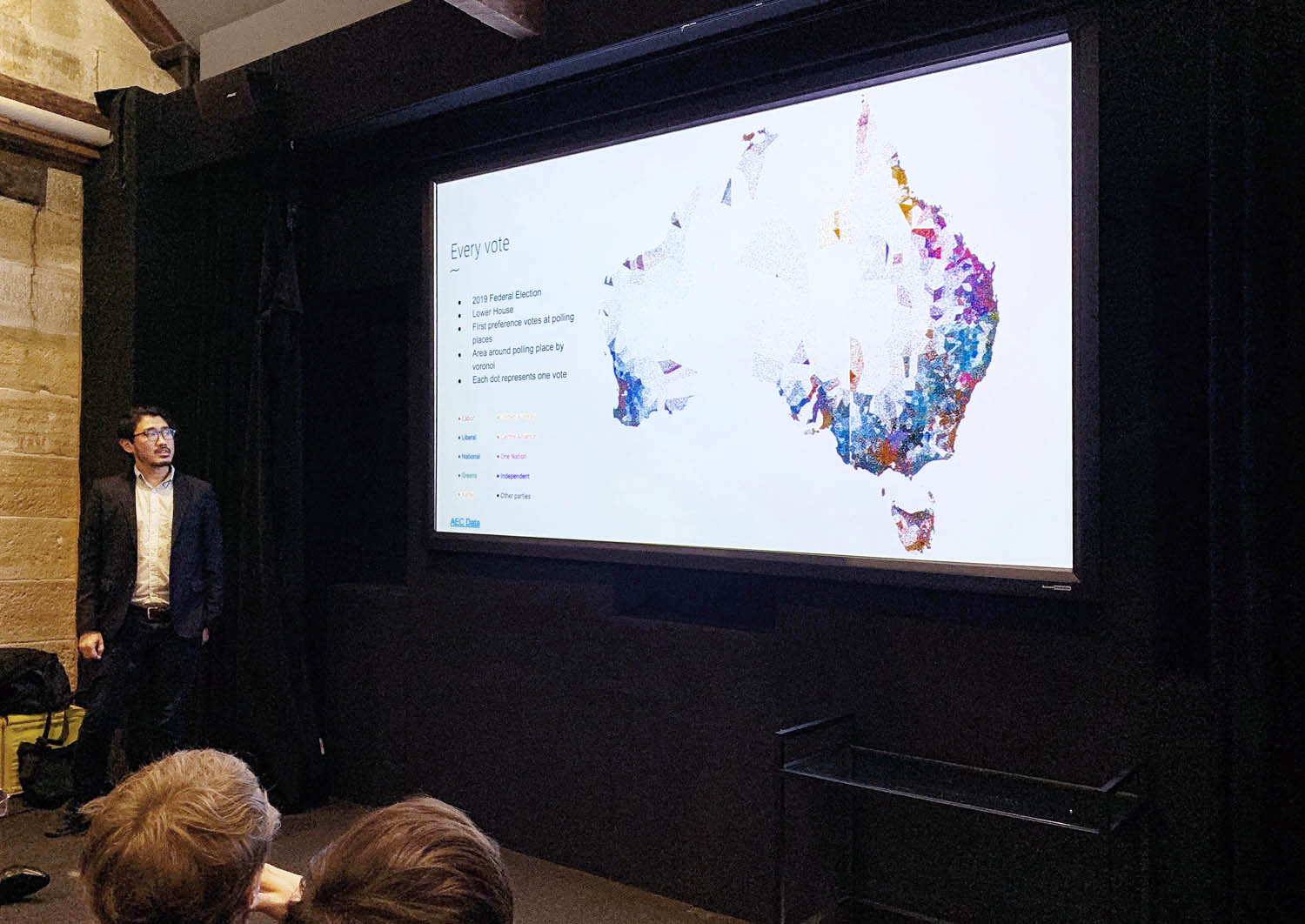
He also used the dot mapping technique to provide voting pattern maps at the highest resolution possible - one data point per person:
As Jack concluded: Making sense is hard, but luckily we have data visualisation to help us make sense of the world - and groups of people like last night’s attendees who are passionate to use it. Especially with topics that tend to generate heated and polarised opinions, perhaps data can help balance the debate and bring us together.