View All


Selling complex policy to an often disinterested or disdainful public is hard for politicians of all stripes, including the public servants responsible for turning these plans from the theoretical to the practical.
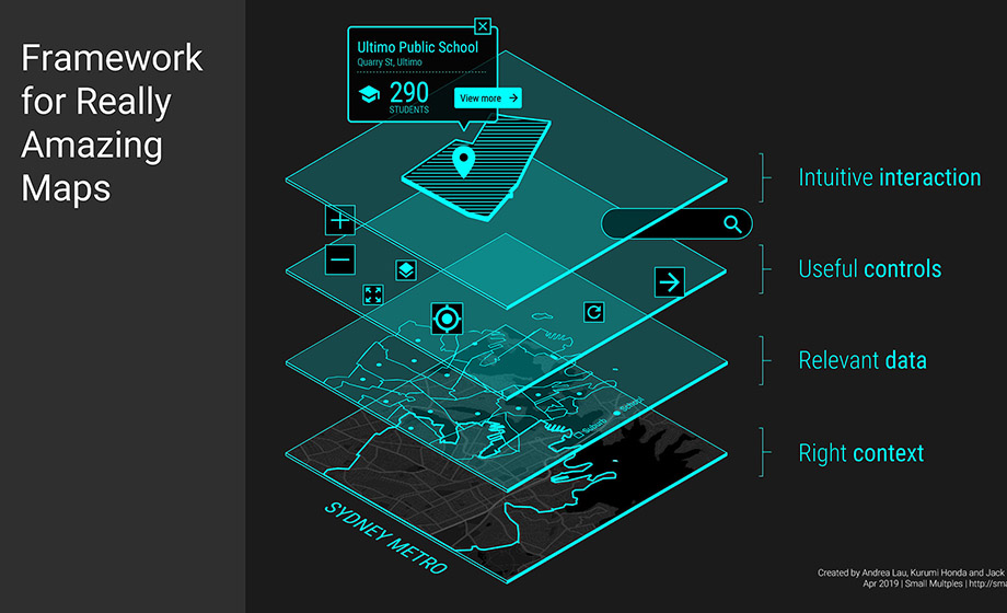
When the then new Prime Minister Malcolm Turnbull promoted a more innovative culture in Australia through his ‘Welcome to the Ideas Boom’ campaign, it was a matter of preaching to the converted. What if the government had instead used its free National Map data visualisation tool to show the wider community how this map could be used for day-to-day business, work, and school?
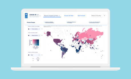
Today, we citizens produce more data through digital transactions than ever before. For governments, this data holds huge potential to inform better policy for both the community and the agencies that service them. Through driving smarter city planning by understanding exactly when, where and how public transport is used, to better allocating education funds by forecasting student population growth, data visualisation is an invaluable planning tool in its own right. But it is even more powerful in its ability to rally the community around new public policies.
Read the full article by Andrea Lau on The Mandarin