 View All
Poverty and Inequality in Australia


The brief
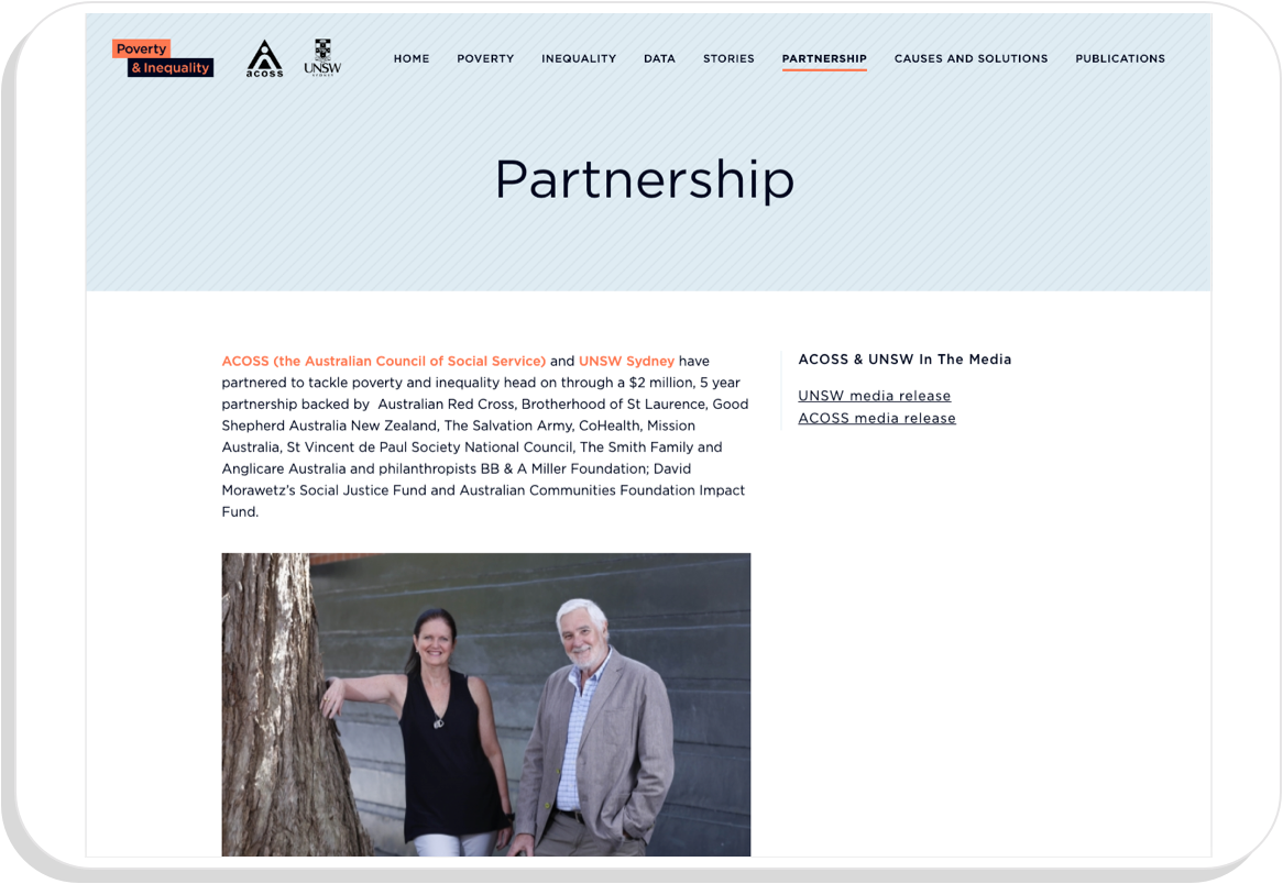
ACOSS (the Australian Council of Social Service) and UNSW Sydney announced a 5 year partnership in 2018 to tackle poverty and inequality. They’re aiming to focus national attention on these issues and inspire change, using a combination of high-quality research, policy development and advocacy. Their research monitors trends over time, explores causes, and develops solutions.
The team has produced a number of detailed publications, such as 2018’s ‘Poverty in Australia’ and ‘Inequality in Australia’ reports, but wanted a way to showcase their data in a more interactive and easily searchable format.
Our solution
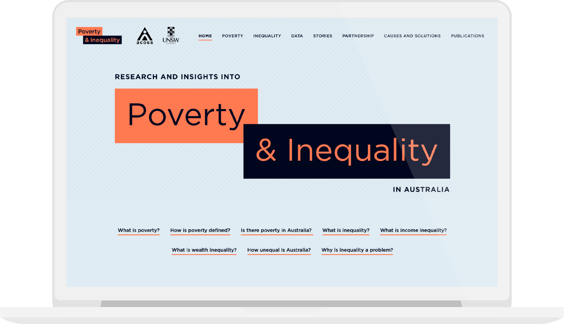
The website we designed and developed, in close consultation with ACOSS, allows visitors to explore and break down the causes of poverty and inequality in Australia today. The site’s data page allows people to explore over 100 charts, using a combination of intuitive filters and a search function:
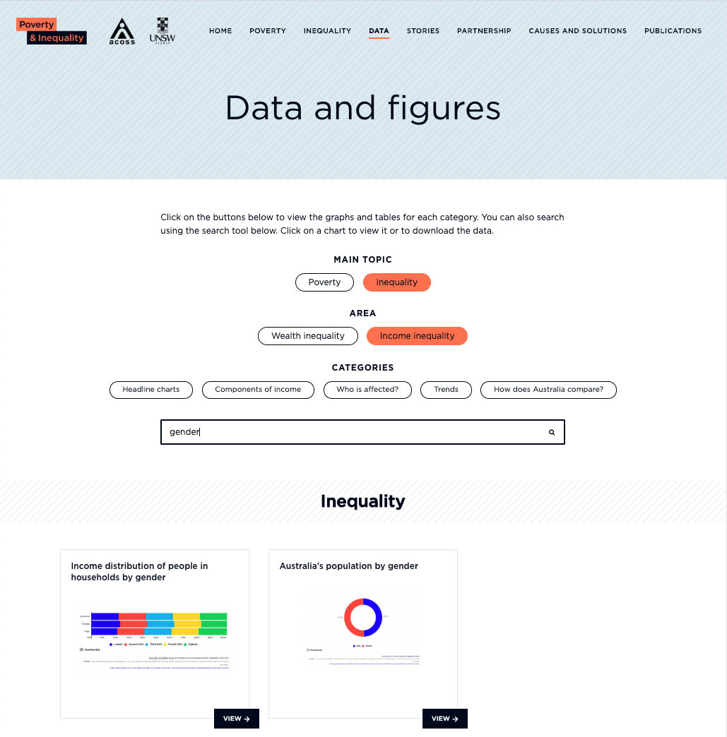
These charts can then be explored in greater detail. All charts are built using Infogram, which allowed for the simple creation and maintenance of a large number of charts.
Did you know for example that in 2014, 46% of Australia’s wealth was held by just 10% of people? The USA is in a worse position though - the top 10% of Americans own 78% of its wealth, and the bottom 60% only 2%.
Explanatory pages around poverty, inequality, “People behind the statistics”, “Causes and solutions” and more give the data greater context. There is a simple navigation to various parts of the data page from the sidebar of the poverty and inequality pages, as well as links to relevant reports and media items. The site is built using Wordpress, which means that it’s easy to keep content up to date into the future.
Like to upgrade your website? Have information that needs better presentation? Get in touch
Related projects and articles
-
Dynamic Dashboards for Data-Driven Policy Insights and Transparency
Queensland Audit Office
-
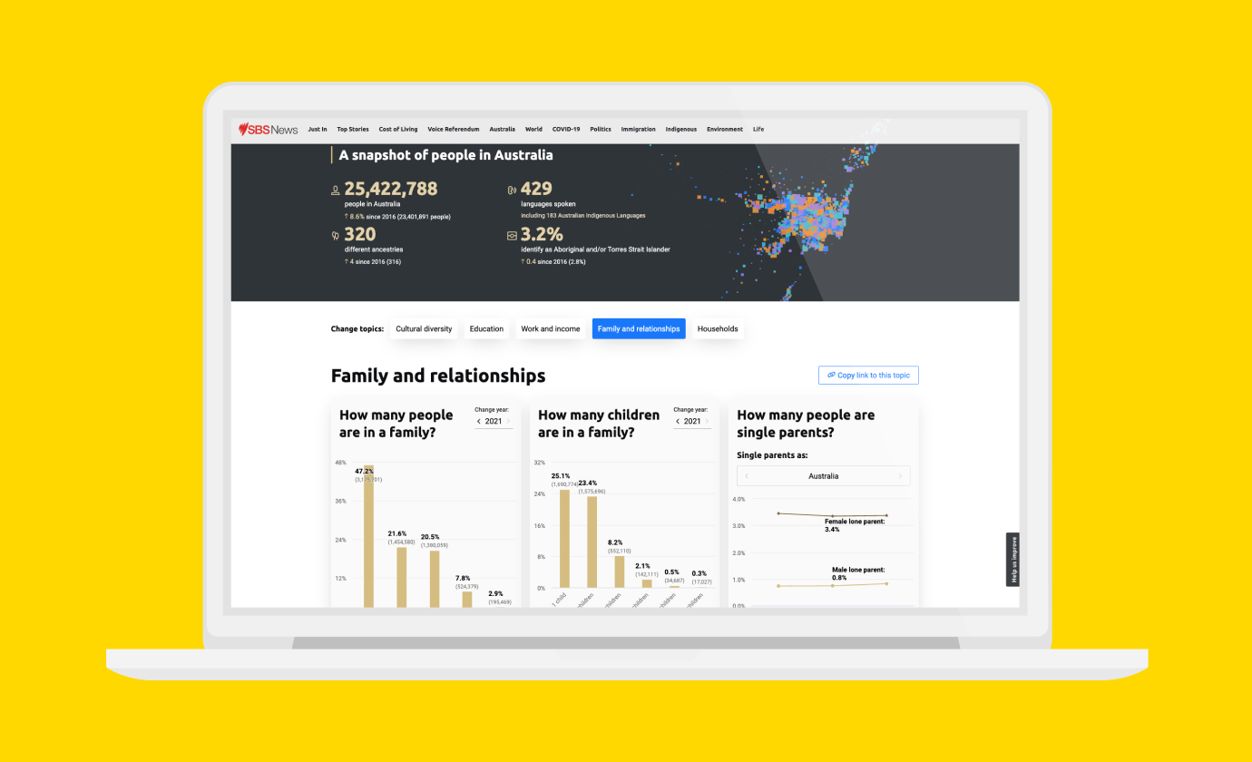
Improving Community Access to Census Data
Special Broadcasting Service (SBS)
-
Introducing the new Small Multiples website
Article