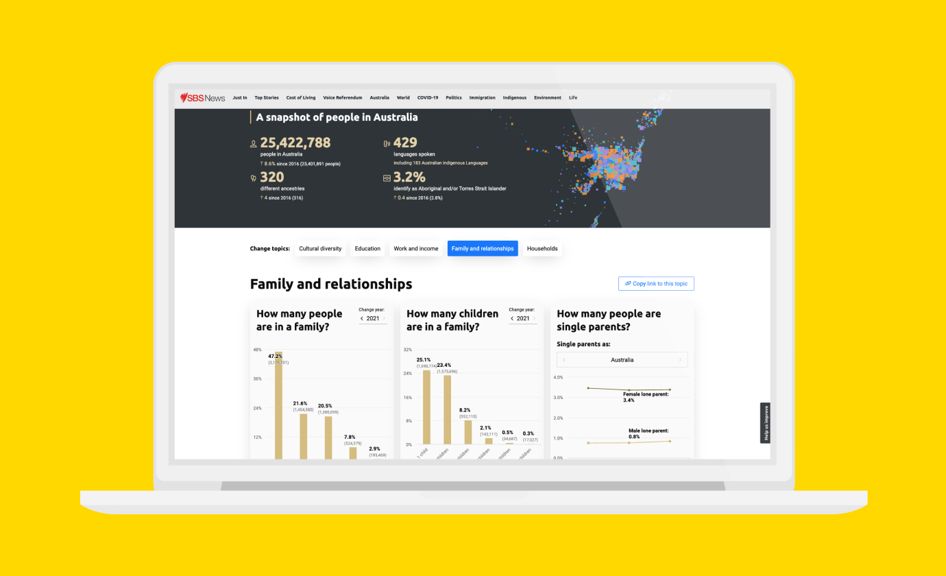
Explore the Australian Federal Budget
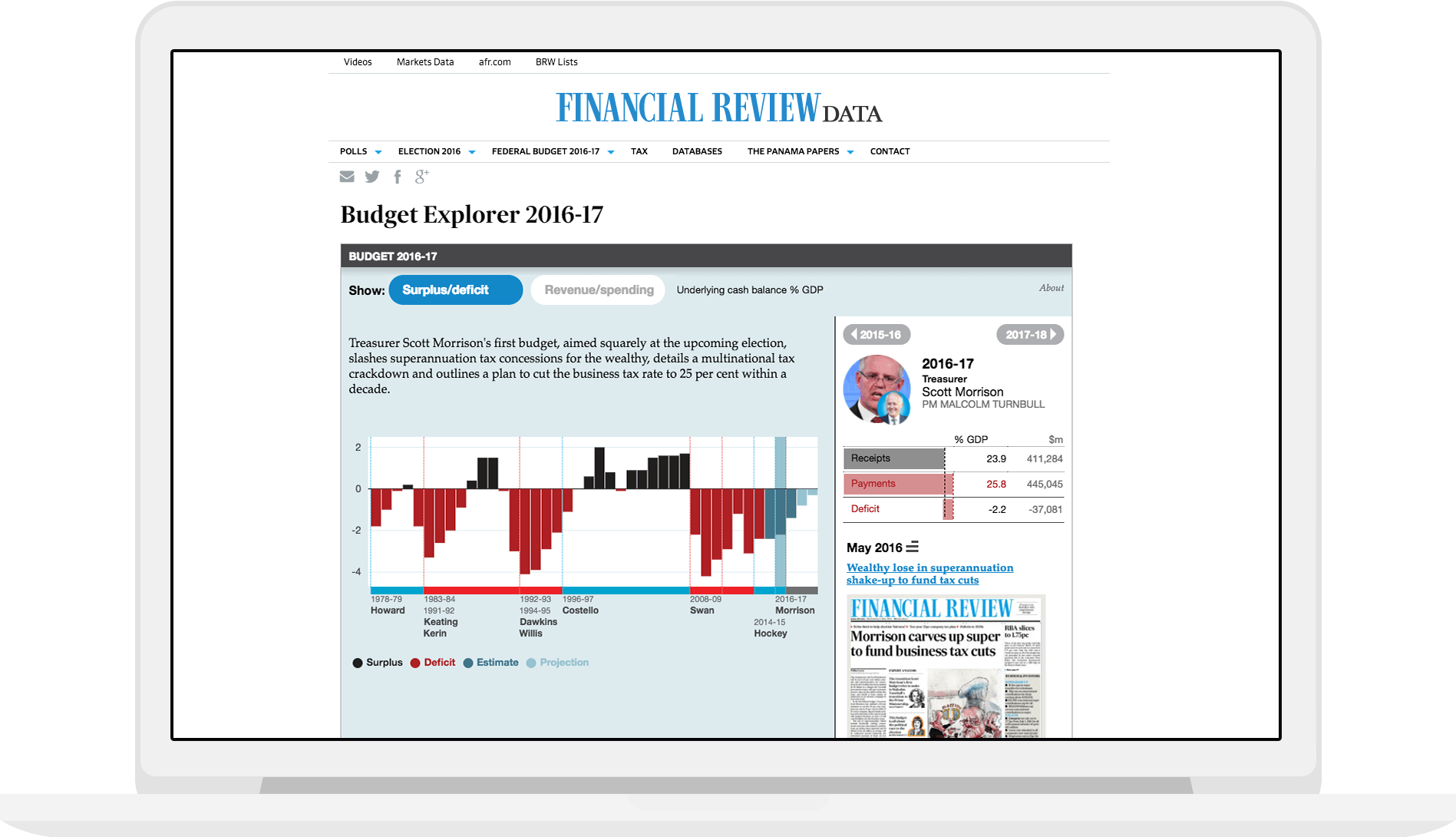
Visualisation to clarify the complex world of budgets
Our design approach builds on Ben Shneiderman’s Information Seeking Mantra: overview first, zoom and filter details on demand. Providing content such as historical events and explanations helps readers understand the budget in its broader context.
The visualisations helps people make sense of the budget from multiple perspectives, drawing on a database of the latest budget figures and archive data going back more than three decades.
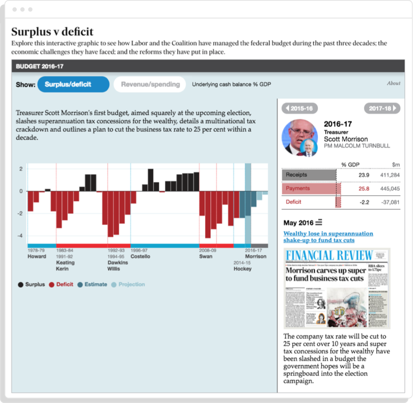
Surplus v Deficit
See how Labor and the Coalition have managed the federal budget during the past three decades; the economic challenges they have faced; and the reforms they have put in place.
Revenue & Expenditure
Explore the government’s budgetary juggling act by comparing major policy initiatives with major spending cuts.
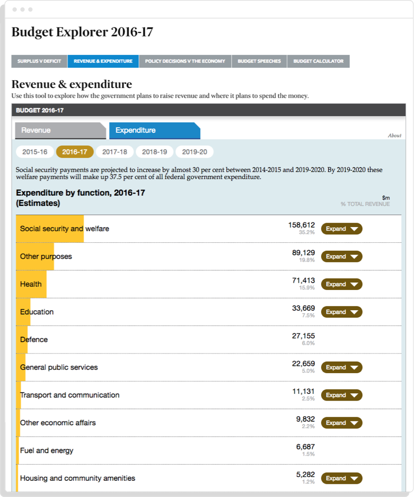
Drill down into the detail of how the government raises revenue and where this money is spent. It also highlights the significant changes to projected revenue that the government has had to manage while planning policies.

Policy Decisions v The Economy
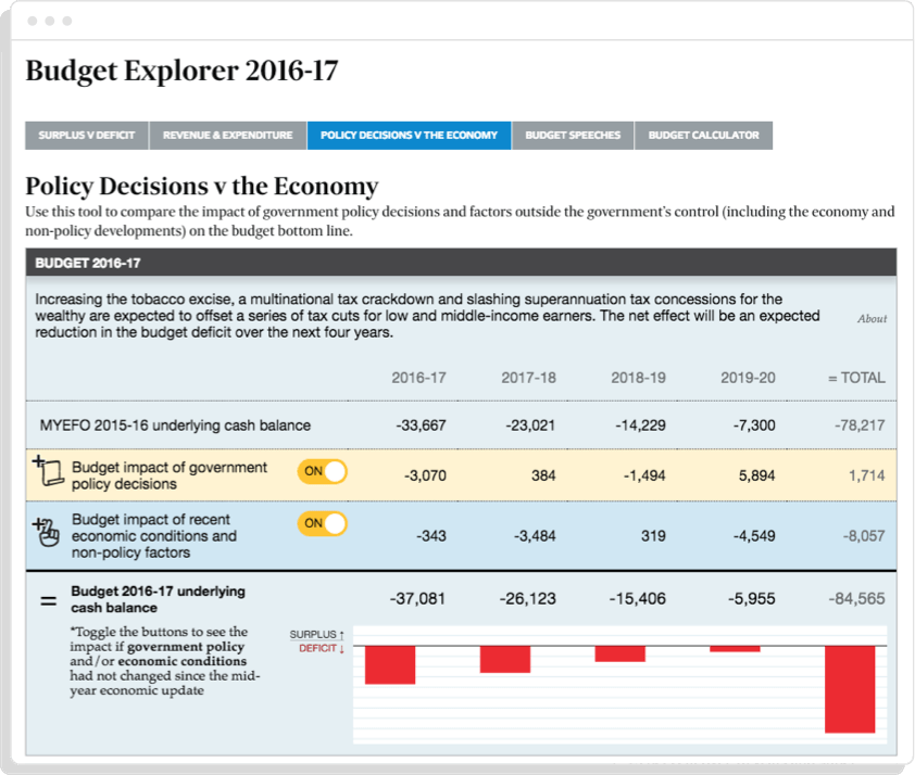
See what would have happened if the government didn’t make any policy changes or if the economy developed as Treasury had forecast.
Many thanks to data journalist Edmund Tadros and the team of journalists and researchers at the Australian Financial Review for all the hard work that went into this project! We’ve also worked with the AFR exploring national polling data and visualising possible election outcomes. Need to visualise complex data? Want to work with us (or for us)? Get in contact.
 View All


