View All

Where do Sydney's rich and poor live, and who are they?

Click to view full size map

Sydney is one of the top 10 most expensive cities in the world to live, according to The Worldwide Cost of Living Survey by The Economist. Previously we've talked about the economy and housing in Australia, now let's look at income inequality in Australia's most populated and multicultural city.

Using ABS total personal weekly income data, every Sydneysider who has one of the ten most common ancestries and is from either the highest or lowest income brackets is mapped to their residential location as a single dot. Each individual's ancestry information is grouped into broader representative regions: Asian, European, British, and Australian. Each dot is then coloured by its ancestry region, which is used as a proxy for ethnic background.

The four groupings used for these maps, based on the top ten ancestries, are:

  • British Isles: English, Irish, Scottish
  • Asian: Chinese, Indian, Vietnamese
  • European & Mediterranean: Greek, Italian, Lebanese, German, Dutch
  • Australian

Why ancestry is relevant

While a person's ancestry doesn’t absolutely determine his/her socioeconomic status, it has an influence at a macro level, for example:

  • When did they arrive, and how long have they had to establish themselves? (Chinese immigrants were refused entry until the 1970s)
  • Under what economic circumstances did they arrive? (a skilled migrant from a high GDP origin country compared to a refugee from a war-torn nation, for example)
  • How many obstacles would they have faced post-arrival? (e.g. lower language and cultural barriers for British and Western Europeans)

This map shows place of residence of individuals who are earning more than $AUD 104,000 per year or more (click to view full size map).

Hotspots of wealthy people of British background are evident around Elizabeth Bay and Woolloomooloo, as well as Manly for example. Pockets of wealthy people with Asian ancestry are visible around the CBD, Chatswood and Hornsby, among other places.


This map shows place of residence of individuals who are earning less than $AUD 33,799 per year or less (click to view full size map)

In this map the Eastern Suburbs and Northern Beaches go fairly dark, although the central Sydney area is still lit up with people of Asian ancestry (students, perhaps?). The Western suburbs are lit brightly with people of Asian, European and Mediterranean ancestry. Pockets of less well-off British are scattered throughout, with concentrations on the fringes of Sydney such as the Sutherland Shire.

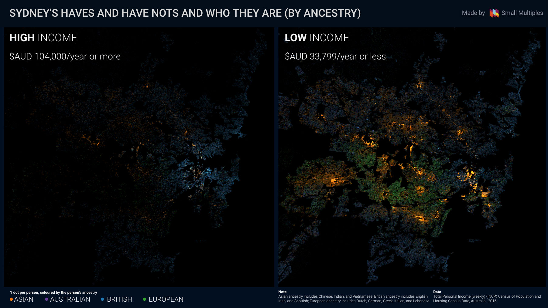
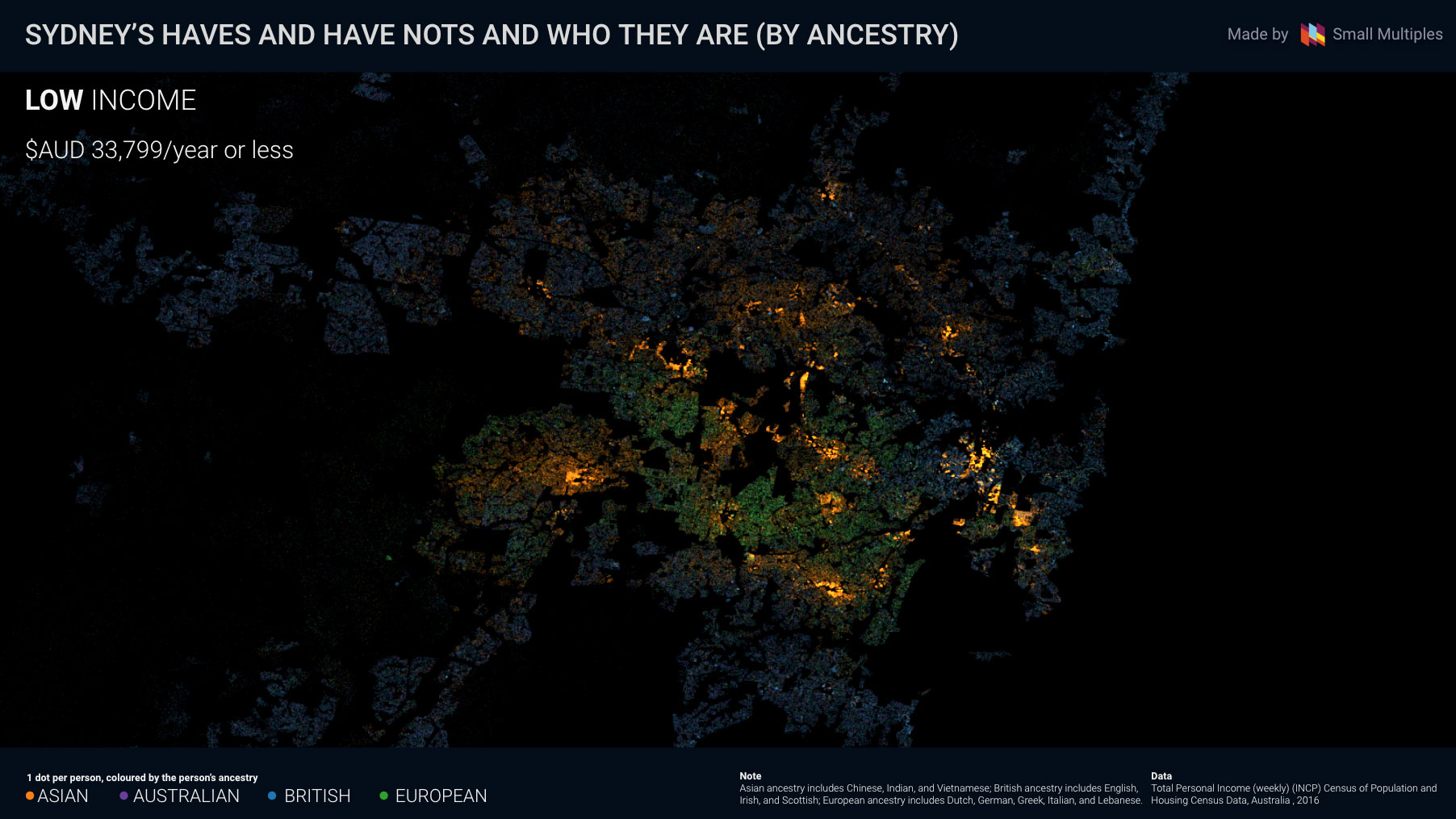
More than just rich against poor

Every happy family is happy in the same way. Every unhappy family is unhappy in different ways. ― Leo Tolstoy
Every rich person is rich in the same way. Every poor person is poor in different ways. ― Me

No matter their background, better-off Sydneysiders are relatively concentrated in the coastal and leafy suburbs of the East and North. Poorer residents of the city are widely dispersed and seem to have a wide range of reasons for living where they do - whether it's affordable housing, social housing, universities or employment opportunities.

Australia is a country of immigrants – people come here from all over the world looking for a better life. Australia is perceived to be a relatively egalitarian society, and many believe that immigrants are given a 'fair go' - showcased by the many success stories in the media. Common sense tells us though that success stories are not representative of the whole population. What remains invisible is the hardship experienced by the majority of immigrants, resulting from language barriers and the lack of generational wealth.

I made these maps to pay respect to the newcomers, the old timers, the fortunate, and the dispossessed. With an open mind, let's look at how we are all living together and apart in this city. I hope these maps can help you look beyond the obvious income and ethnic divides and seek more meaningful explanations in the patterns you see.