View All


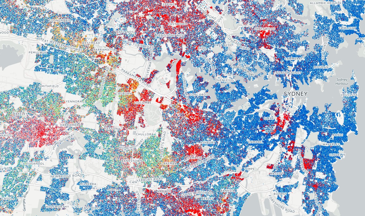
These maps visualise the Language Spoken at Home (LANP) data from the 2016 Census. Data was available at the most granular geographic division possible (mesh blocks). This enabled us to produce a dot density map that vividly shows how people from different cultures coexist (or not) in ultra high resolution. Each coloured dot represents 5 people from the same language group in the area. Highly populated areas have a higher density of dots; while language diversity is shown through the number of different colours in the given area.
Do you live in an area that’s heavily intermixed or segregated? Do you think language diversity is a benefit of multiculturalism in Australia? Ping us on Twitter @smallmultiples
The maps have been featured in The Age article Blue and red, with green flashes - map reveals Melbourne’s kaleidoscope of languages with detailed analysis by Craig Butt