Why use realistic data at all?
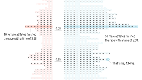
When dealing with data visualisation, using realistic data for text and charts can be very beneficial for testing if your design actually works, for example:
- Data irregularities like extreme values or missing values are spotted early
- Design solutions for unexpected data points can be tackled early in the process instead of applying ad hoc solutions later during development
- You can quickly check if your design and choice of chart type help you gain insights from your data, or if other choices might be better
- Prototypes are more meaningful, which makes communicating and presenting to clients more effective
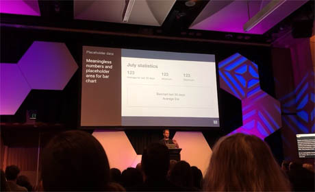
If you want to hear more about this be sure to check out my talk at UX Australia about The Lorem Ipsum of Data Visualisation and how to design data-driven wireframes.
Ok cool, so now that we're all highly motivated to add real data to our mockups the next big questions is: How do we do this? Let's tackle this question in two steps, 1. text and 2. charts.
1. Importing text into Sketch
There are two plugins that are very effective in importing text to Sketch, Chippencharts and Datapopulator. Chippencharts does not require a distinctive data format and simply works with copy/paste, while Datapopulator requires a JSON file which can be more efficient.
Import text using copy/paste and Chippencharts
The Chippencharts plugin is the perfect choice if you are working with symbols, have your data available (in a list or spreadsheet column) and want to alter just a few overrides.
Simply copy your data into the clipboard, select the desired symbols in Sketch, Run Chippencharts > Paste clipboard text into symbols and voilà, your overrides should contain the data you copied. Note, this only works for symbols of the same kind.
If you have to replace content for not just a few overrides, but many overrides, then working with Chippencharts will do the job but there are other plugins out there that do better. This applies for example if you're having a table with many columns where each cell is its own symbol. In this case Datapopulator might be your preferred option.
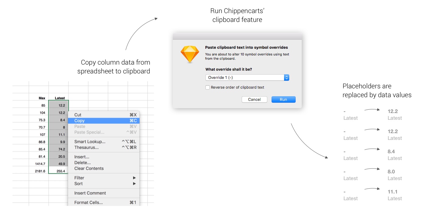
Workflow of using Chippencharts plugin to paste text into symbols from a spreadsheet
Import text using JSON file and Datapopulator
The Datapopulator plugin might be the right fit if you want to replace multiple overrides or text layers at the same time and are not afraid of creating or dealing with a JSON file.
In contrast to Chippencharts, Datapopulator works for both symbols and regular text layers. However, your layers have to be named a certain way that matches the keys in your JSON file. If your key is for example Region, the layer needs to be named {Region} (yep, with curly brackets around it). You can use an online tool like Mr. Data Converter to transform CSV or spreadsheet data into a JSON file.
If you did all this, then the rest is a piece of cake. Simply select all Sketch layers, run Datapopulator > Populate with JSON, select your desired JSON file and hit Populate. If naming of layers and JSON keys is correct, you should see all text content being replaced by the data from the file.
2. Adding charts into Sketch
There are probably dozens of ways to add a chart to your Sketch mockup. I'll talk about two key methods: 1. Creating all the elements solely in Sketch, and 2. Importing elements from a vector file. I will use Chippencharts for the first, and a PDF generated with R code for the latter.
Create bar charts directly in Sketch using Chippencharts
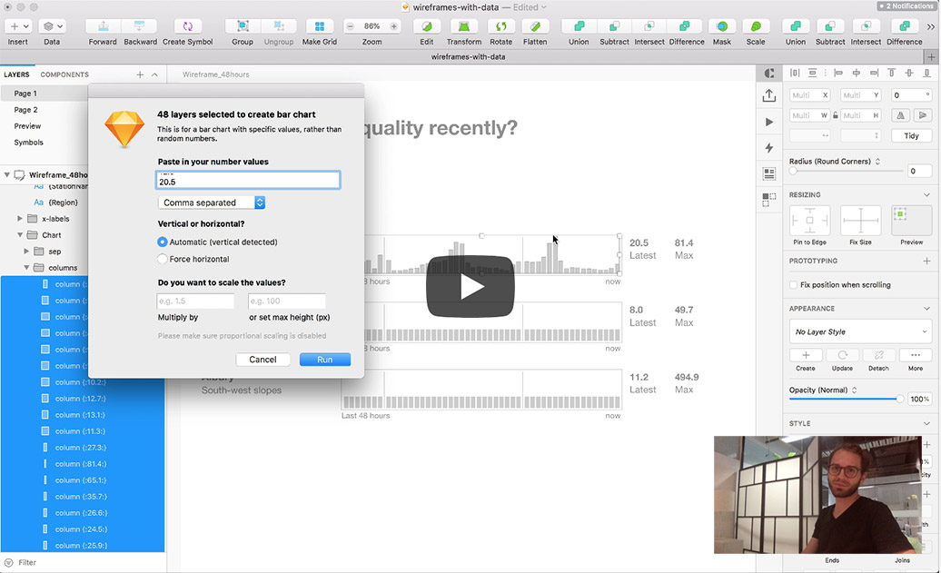
Chippencharts is your friend if you have a bunch of rectangles in Sketch that you want to transform into a bar chart, and you have data available either comma separated, in a row, or a column
First, copy the desired data to the clipboard and then simply apply the data values to the rectangles by running Chippencharts > Defined bar chart from selected layers.
The data is conveniently saved into the layer names, so if you rescale, you won't lose track of the original value. Pretty sweet, ey?
There are two options for scaling the values, defining a multiplier value or defining a maximum value. By default, the data value is translated directly into a pixel value. So if the value is 10, the rectangle will have a height/width of 10 pixels.
Chippencharts seems to be the Swiss Army Knife of datavis plugins, so why would one look any further? You might have guessed it, in terms of creating charts the plugin only works for bar charts. If you are after another chart type like pie or line chart, you have to use another plugin. Or, you can create the chart elsewhere and import it as a vector to Sketch.
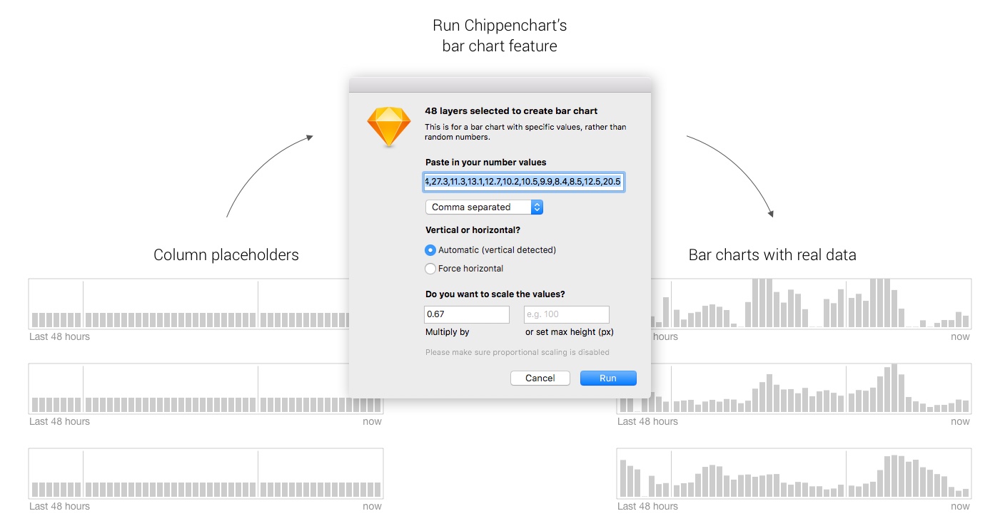
Workflow of using Chippencharts to alter the height of elements based on data input in order to create a bar chart
Import vector charts from other tools like RStudio
If you want to add a bespoke chart to your mockup, and you know how use programs that have a vector export feature like RStudio or Tableau, then this option might be for you.
Sketch is vector based and when you import a vector graphic you have the ability and freedom to alter all elements. This includes deleting or changing the colour of elements. This is perfect news!
Simply export your chart as SVG or PDF, import it into your Sketch file and adjust elements as desired. You can also change dimensions or ratios if needed. If you want to replace a placeholder layer with your freshly imported vector chart, I can recommend the Sketch Mate plugin. Copy your vector chart, select the placeholder and run Sketch Mate > Misc > Replace Layer and your graphic will be in the right position.
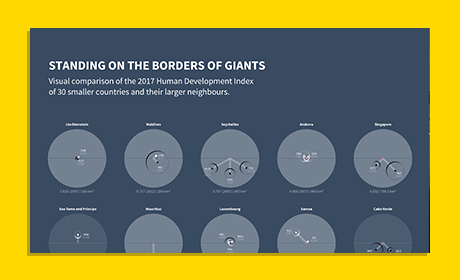
Creating a vector graphic outside of Sketch requires bit of effort compared creating one directly in Sketch. However, you'll be able to add and edit graphics that are too complex to be created in Sketch and the result will be a realistic high quality mockup.
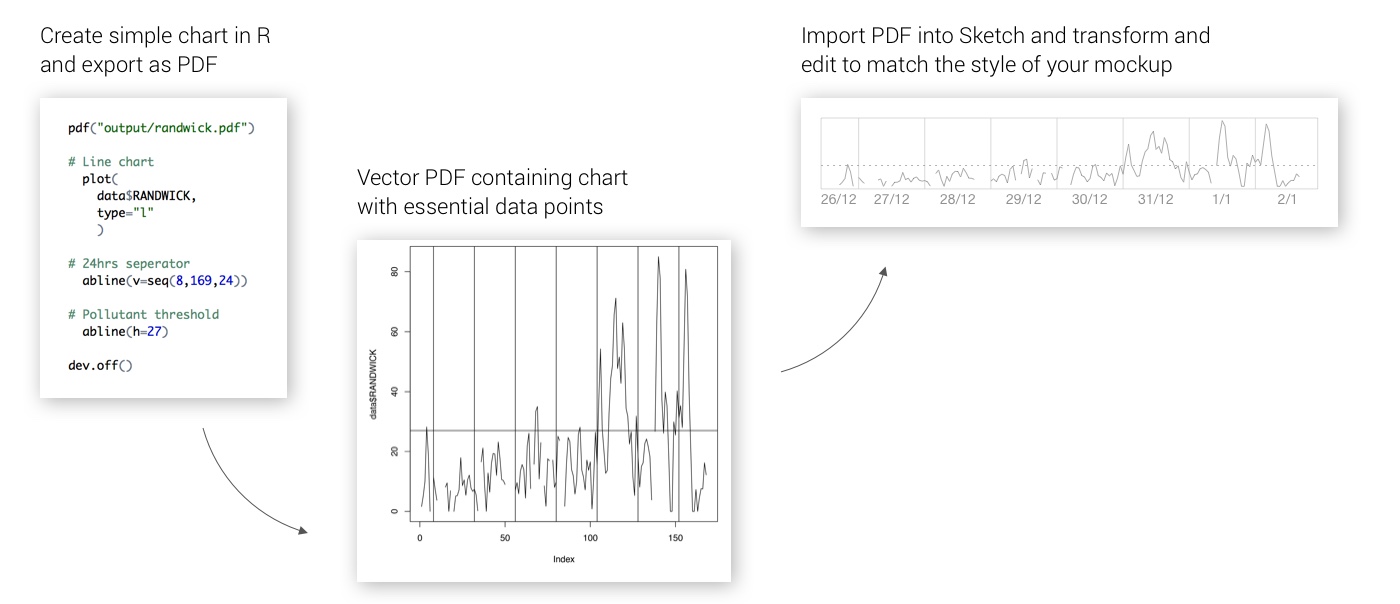
Workflow of using RStudio to create a chart with essential data points, exporting as PDF, and importing to Sketch
Create the prototype
Create an InVision prototype using the Craft plugin
Once all data has been imported into Sketch and the mockup looks good, it's time to add some links in order to add interactivity and make the prototype come to life.
When using Sketch, the Craft plugin is a great choice. Its prototype feature allows for a quick and easy creation of hotspots that link pages. The Sync feature is a convenient way to publish the prototype to InVision. InVision is a good choice if you want to test your prototypes in the browser and share it with others. Once all screens are uploaded make sure everything looks and behaves as expected.
Congratulations! You're now done creating a Sketch mockup using real data for names, numbers, bar charts and line charts.
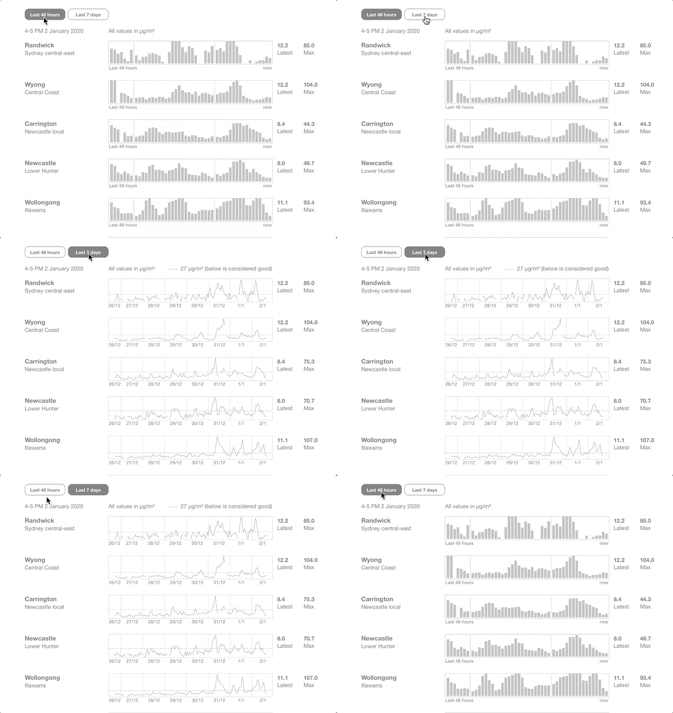
Final click-prototype containing real data for names, numbers, bar charts and line charts
Takeaways
There are several ways to import data (text, numbers) and charts to Sketch. Adding real data to Sketch in order to create realistic mockups is not only beneficial, but also fun, and easier than you might think. Write us a line on Twitter if you want to share your opinion about the presented workflows or plugins.
Resources
- Sketch App for Mac
- Chippencharts plugin
- Datapopulator plugin
- Sketch Mate plugin
- Craft plugin
- InVision
- RStudio
- NSW air quality data (used for this tutorial)
 View All


